MATS part B Week 3 - Scrapbooking

I didn't realise so much time had passed since my last post and I've only come round to writing about the next week of the MATS whirlwind.

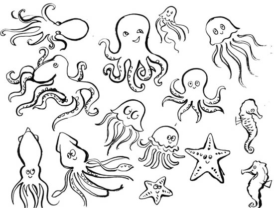
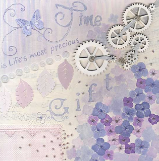
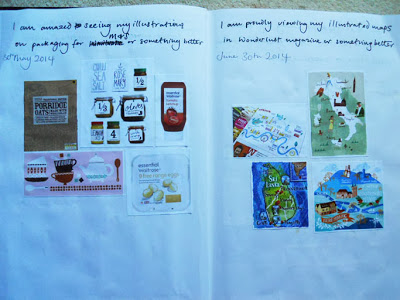
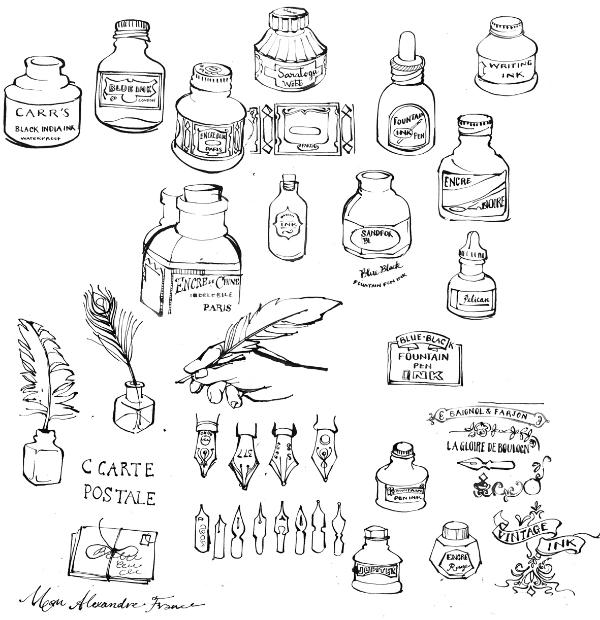
I have only a vague understanding of scrapbooking, its not really that big here in the UK. I felt I did a lot of research into this market as I was rather lost in this market. I understand that its really recording special events or occasions in a pretty way so that it can be kept for future reference. To begin with we are asked to draw vintage ink pots, and other related items. Thankfully there is actually a website choc full of these little antique items.

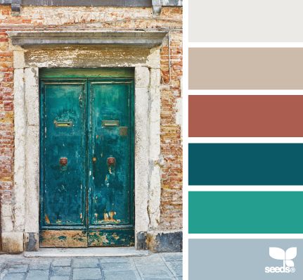
There were some technical issues which meant the assignment was posted very late in the day, which meant I had literally 30 hours to complete that weeks assignment before Easter break. I worked my butt off, first starting with THE colour palette -inspired by my FB friends. I chose one from Design Seeds - I love this website and started a Pinterest board just for colour chips for future projects. Its certainly the way forward to me - palette as I was discovering is key.

Luckily I was able to pull everything together as I had played some more with the mini waiting for the delayed assignment. Also a major player in scrapbooking is sentimental words - however in my case I leaned towards inspirational words. Then it was a matter of jigsaw-ing the different icons together. Phew I uploaded in super fast time and was able to enjoy my Easter weekend .

...beneath my taste level...

I am continually astounded by how much I am growing as the second part of MATS progresses. I already feel so much more confident about my abilities and capability to come up with half decent ideas. Sometimes it feels like wheels were set in motion and cannot be slowed down. 

Earlier this month I signed up for the Right Brainers Business video summit as Lilla Rogers and another wonderful MATS artist , Nicole Piar would be featured on one of the days. I only had a vague idea of Jennifer Lee's work with The Right Brain Business Plan - a creative visual map for success or turning your dream into a profitable business. On the second day of the summit I eagerly listened to Jennifer's video with Lilla, then replayed it again so I could make notes. There were so many gems as expected....only doing commercial work could take you away from your core...feed the beast ...keep looking collecting/ learning/ stay passionate were some. 

However it was Lilla's definition of selling out that kept going round and round in my head for days..."doing something beneath your taste level for money" That was me for a few years - I sold out. Its the first time I've written that statement down as it caused me great anguish. I have no excuses it was what I chose to do of my own free will. 

A friend of a friend asked for a few black and white illustrations for a exam paper so I did it as a favour. They came back and asked if I could illustrate for the whole exam paper, and then later several sets of exam papers. I need to put this in context - my husband at the time was trying to set up his own business and I was newly pregnant. FEAR flashed before my eyes so I took the work,  despite knowing I was capable of more than this. Stupid hours were involved, and soon I was turning down editorial work just to keep up with the relentless pace.

There is an awful lot of guilt associated with this particular period as I seemed to be 'fighting' on many fronts ( also see blog post 'Overcoming a mental block') I worked stupid hours, didn't sleep much as I was in a fight or flight mode - it wasn't a pretty.

Almost a year after my son was born I chucked in the towel pretty much as. Selling out had really messed with my head, I felt so embarrassed I resorted to that and a bit of a failure. Maybe thats why there huge gap between then and just thinking about taking MATS. Lilla has shown me that there are many ways to make meaningful art.

So I'm now open to letting go of this guilt as I find myself in a safe, nurturing and supportive environment, with creatives who really understand some of the processes we all go through from time to time. Writing this has been like exorcising my demons which is certainly a good thing from where I'm standing

Lessons I learnt as a in-house greetings card designer

I breathed out with utter relief, then danced round the room ( which I'm apt to do in times of high emotions) as a mini celebration that Lilla chose my holiday greetings card design in her assessment.  I had given greetings cards a wide berth for a number of years and its only now that I'm able to identify & understand my motives for this. The so called lessons I learnt from several years in the industry have been weighing me down like excess baggage for a long time. 

I was supremely naive & fresh out of uni when I started as a in-house designer for Tigerprint ( before Hallmark), and didn't fully understand the role of account handlers, marketing or production staff. Initially my role was to support for the more experienced designers, mock up products, and make tea. Quite quickly I was able to carve out a niche as icon cutter extraordinaire with fine scalpel handling skills - this was before Macs ruled the roost. 

LESSON 1 Artists are not worthy of celebrating success with.

It transpired that one of the toy/ jigsaw products that I had a small part in had won a major industry competition. There was a celebration in one half of the open plan office but none of the designers involved in illustrating the product were invited to sip champaign. That rather pained me.

LESSON 2 Your creative worth is measured in output.

Some time later the art director who was very vocal with her views, would openly discuss each designers 'productivity' with the other directors. What it boiled down to was how many cards could you produce in the 7 hour allotted budget. ( Incidentally this was the same art director who slated my character attempt in New Skills with Skillshare post March 10th)

LESSON 3 Major clients are more important than the welfare of designers.

The big name clients were becoming more exacting in what the wanted, how and when. Often it was a case of imitating what was already out there, leaving little room for creativity or exploration. It was a pretty miserable studio towards the end, and I left just as my maternity leave set in.

It been over 10 years since these events took place yet it has taken me this long to fully realise the effects of working in a sometimes belittling environment had on me. Just the act of writing it down has lessened the impact and put it all into perspective. Don't get me wrong the other designers I worked with are still some of my best friends and we had some rip roaring times. The best part is looking back and knowing I never want to produce art under those conditions. 'People buy your joy' Lilla will say at every opportunity - I say would never have had the opportunity or confidence to produce my gingerbread house card 10 years ago. 


Baby Apparel WEEK 2 Make Art That Sells

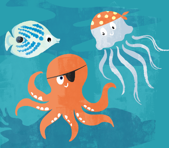
From the slight wobble I had in month 1 of Bootcamp when we were asked to design bolt fabric I decided to go easy on myself and ignore the word 'pattern'. Lilla has stated over and over again that a technical repeat is not necessary these days. With that in mind I just enjoyed the mini for this week. We were asked to draw anything associated with pirates. There was a very lengthy debate about the skull and crossbones motif, whether it was appropriate.

Another aha moment between part A and B is my realisation that the linework or playing around during the mini can and should be incorporated into the finished art. OK that sounds pretty obvious but back in October it was clear as mud to me since I didn't know what the heck was going on. This would make working on the actual assignment so much easier than my experience had been last year! I also could resist paying with some butterfly fish as they are my favourites, despite not being kitted out with eyepatches.

AHOY LOW.jpg

I was very pleased with what i was able to achieve this week and had so much fun with experimenting with character. I was able to learn from Lilla's review that perhaps I had too many secondary colours and not enough neutrals - thats been my downfall in the past. And also creating a super cute character is very much a art form that requires a bit more practice on my part. I'm thinking perhaps the mouths maybe less weird with a suggestive line. Finally I'd like to rework my co-ordinates to give better 'value' so to speak where I bring in unused icons.

Paper Week - MATS part B

So with anticipation, excitement and a little bit of nervousness, part B of Make Art That Sells finally came round. I felt more prepared mentally and physically this time round, as I knew what to expect, so stocked my freezer accordingly.

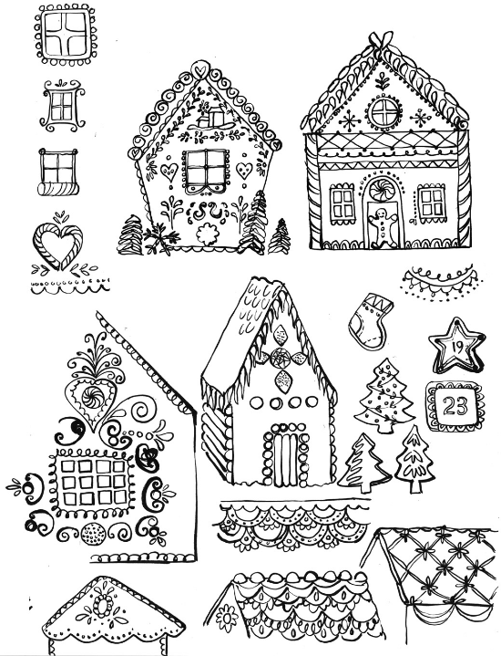
Monday's mini was to draw gingerbread houses. Keeping in mind what makes these houses so distinctive - starting with candy or gum drops dotted around or totally covering the roof in some cases. I always enjoy this first day and got friendly with Pinterest. There was so much to explore and I became fascinated with some of the folksy type icing thats found on gingerbread houses and cookies that are sometimes used as decorations.

There were huge hints before the assignment brief that I would be based on a winter holiday theme. I already knew wanted to create a winter landscape, but hesitated to begin with because the house would not be the main attraction. Since doing several Skillshare courses I've gained much confidence with exploring character work - and I felt this would be a great opportunity to apply what I've learnt. What happened afterwards was a sheer labour of love. My PS file just grew and grew as I added clipping masks upon layers, upon layers, of textures. My greatest hurdle was making all the different elements pop by making sure there was enough contrast. 

I was so very pleased with the end results.  Also in week one of MATS A I was a dreadful mess and felt overwhelmed with the weight of expectation I placed on myself. This time I was a lot easier on myself and understood the power of a deadline and timekeeping. See I'm still learning - learning is good.

JELLYtastic - MARCH Bootcamp

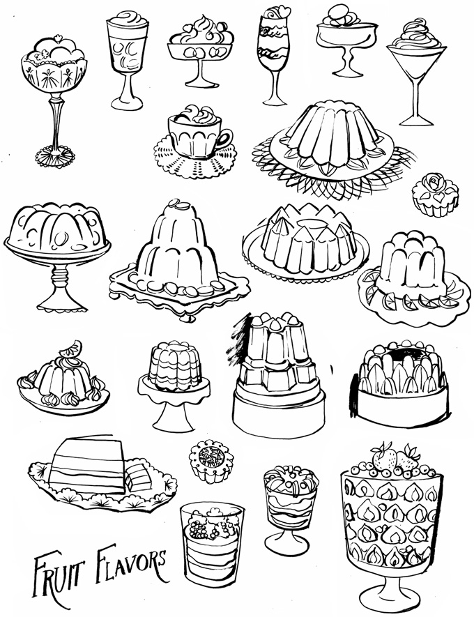
This months assignment started with a mini project to draw jelly moulds, and any associated desserts, and kitcheny stuff ( if we wanted) I left it quite late to start because of greetings cards commitments but had a blast researching the weird and wonderful world of gelatine based foods on Pinterest. I used my trusted brush pen to explore all kinds of translucent beauties.

jelly low OMW

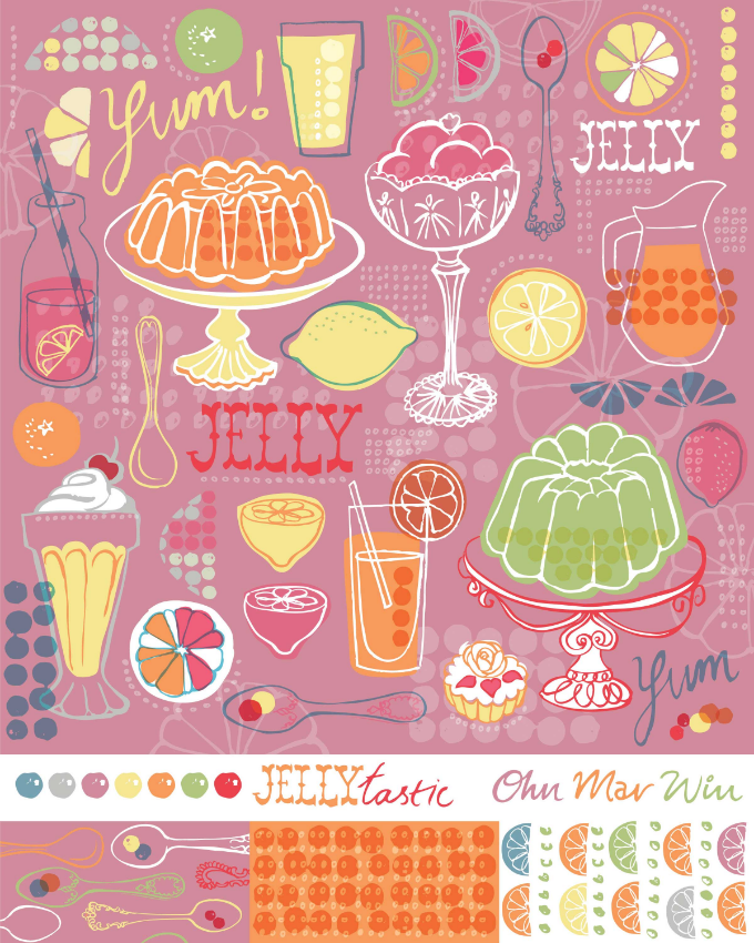
I did have to fight back a small wave of panic when it was revealed the brief was for bolt fabric. I tried to concentrate on Lilla's slogan that 'people buy your joy' and pushed ahead with trying to capture the jelly colours. My 4 year old decided I needed help and joined me in some painterly textures. I was able to use a clipping mask to achieve a really great effect. I'm pretty new to Photoshop so I did find layers & changing hues etc all very frustrating at times.

Week 3 of the course Lilla surprised us with a 'Nougat' colour palette of dusky pinks & neutrals. And a little exercise to create 50 Shades of Taupe !! I've got to be honest this just threw me off course. I just could not see a way through with my icons the way they were - I abandoned them for a few days. I decided on a different path, stick to the basics and enjoy the process rather than getting caught up in making a technical repeat. I was also determined to use some of the new palette and let go of the need for super brights.

Jellytastic OMW

This only the second time I've ever designed for bolt fabric so I'm pretty proud of myself. I'd like to make it into a repeat and mock them up on an apron -just to see if I'd actually wear it! This was a very challenging assignment but I did keep going back to 'finding my joy' core and working from there as its a good place for a flow of ideas. And just keeping the faith that a solution will present itself.

We have a weeks grace before I join MATS B. I have filled up my freezer and plan a mass laundry-thon based on what caused the most domestic headaches last time. I'm learning all the time from the many challenges that MATS and motherhood present.

They Draw & Cook illustration party

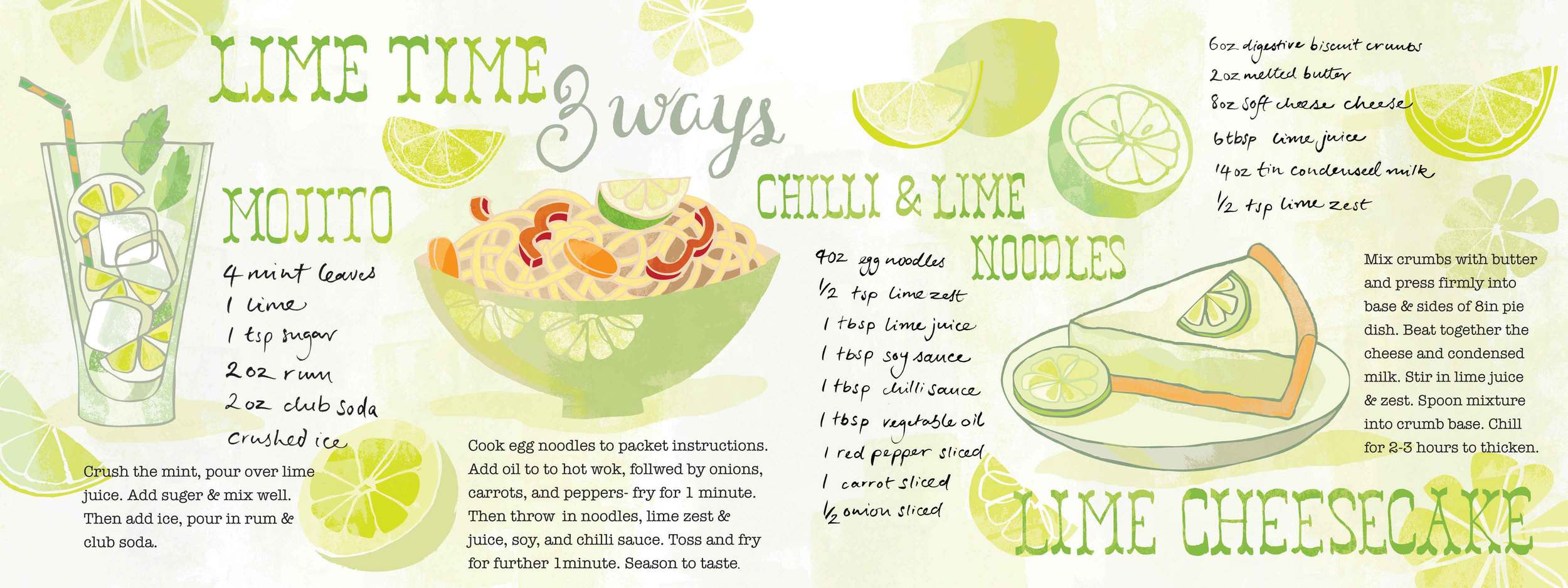
So this is my second competition - they're really making me 'pull my socks up' as we say in the UK. I have been wanting to enter for years, but never had the courage until now. A fellow MATS mate had already entered this Glad sponsored competition where you have to illustrate 3 recipes using the same ingredient. Time was short so I choose lime as I'd drawn quite a few citrus icons for Bootcamp ( more in next blog). I choose the recipes for their easy methods and maximum flavour, and also personal favourites. I really had so much fun and I think it showed. I tend to think about food and travel a lot and very much want to include more in my portfolio. (I'm working in a hush hush foodie illo project that I'll be able to reveal soon)

Mojito OMW
Lime 3 Ways OMW

Tigerprint Competition

I decide that in 2014 I would start putting myself 'out there' entering a few competitions. I felt it would give me an opportunity to respond to a brief my way & add to my portfolio.The first was Tigerprint's monthly competition called 'The Colour of Love' in collaboration with the Society of Dyers & Colourists. They wanted a exciting colour palette that '....captured the feeling of love whilst pushing the boundaries to create a new and different look...' Below is my entry. I wanted to explore hand linework with different textures, and I surprised myself with what I produced YEY.

hearts-layout-BG-colour.jpg

Well it turned out that myself and another MATS mate had reached the top 60! We were so pleased. 

NEW SKILLS with Skillshare

I've become rather addicted to Skillshare classes, which I'll be blogging about in the next few weeks as I've signed up for so many. First I'm starting with

Matt Kaufenberg's Character Illustration

. It was to design & illustrate a pirate character using Illustrator and Photoshop.
Delving into my past again now. Many years ago my art director ( at a greetings card studio) had said the boy character I'd drawn for a birthday card was 'scary' and the client would be horrified. It didn't go any further than that. In the intervening decade I didn't draw anymore characters as I'd been so put off by that negative response.

So with this course I wised to overcome that fear. Its not that I don't want draw kids, or things with faces, or cute -I just felt they would all look scary! I ignored the pirates and concentrated on some Christmas designs I was excited by. Matt's instructions were very clear, and he had so many cool tips. It starts by tracing your sketch in Illustrator, releasing it as layers then exporting to Photoshop.

That's were the fun really begins. As part of the package were links to Photoshop brushes which I greedily uploaded. OOohh the fun I had - I had missed texture so much. I was extremely pleased with the results, I couldn't believe I had made this art. I had felt it was just beyond me. Now I can see other applications for this wonderful technique (for me) - expect to see more of it in the coming months.

NEW WEBSITE & overcoming a mental block

I can at last reveal my new

website

. Its been years in the making for many reasons that I feel comfortable sharing now.

Before my kids were born I there was a long period of time when I illustrated elegant but

homogenized

looking women. That was the prevailing trend for figurework ( in editorial) so I jumped on the bandwagon. Financially it was a abundant period but my heart was heavy. When I left uni half my portfolio was printmaking based. I felt I had let myself down and felt

embarrassed

my style was so far removed from those joyful days in the printroom. It all came to a head after my son was born. I pretty much cut ties with that slick style and just enjoyed being with my baby.

However it did leave 'emotional scars'. It may seem illogical but in my head I thought if I had a website I would attract the same clients and be called upon to produce figure work in a style that had its day. It was a very real fear - that maybe difficult for non- creatives to understand. During Wall Art week of MATS I produced this.

It has taken me a long time to accept and give myself permission to allow figurework in my art MY way. Its clear that there is a way. Thanks for reading this - its taken me a while to filter out all these feelings.

GOING CUCKOO - FEBRUARY BOOTCAMP

This is my first proper post in the blog as part of my FIRST EVER website.

The last 3 weeks have just zoomed by. I almost forgot I had signed up to Lilla's Bootcamp many moons ago - but then the excitement started creeping up as the FB group was revealed. So many of my MATS mates were taking part it, like the start of a new term. And so many other wonderful people were taking part. I have to say I was in awe at some of the talent.

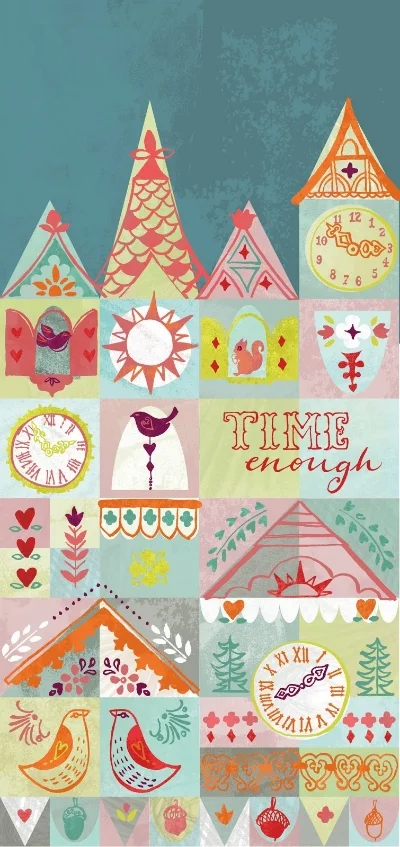
Lilla revealed on the first Monday were were to take a detailed look at cuckoo clocks. From the lil bird inside, decoration, clock face and basically anything decorative or of interest to us. Unlike MATS when there was 7 days to complete an assignment we had 21 days so I thought there would be less pressure......uummmm in a way.

I would say the same emotions I felt, sometimes lack of direction, sometimes terror as I posted on FB were still present. But it was all s-t-r-e-t-c-h-e-d out over the 3 weeks which was great as I now had a pile of other exciting work to content with. In week 2 Lilla revealed the brief was to design a phone case using the images from our first week's mini.

I liked the mock Tudor vibe that appeared on some of the clocks and found myself looking at informal grids and triangle arrangements - especially roofs ( getting geeky I know) Lilla surprised us in week 3 with a super 'on trend' colour palette that I found very close to one I had chosen already ( yey getting better with colour) I combined this with a new found technique ( for me anyhow) for importing line work from Illustrator to Photoshop then adding texture.

I was SO pleased with what I had achieved that I breath a sigh of relief. However as the week wore on and more and more folks were posting their designs I REALLY started to doubt that what I'd done was enough. Sure I had done what I wanted, and it wasn't a literally representation of a clock- more of a dissected version. I even sketched up a alternative and asked the FB group. It was half and half, some said do this new version others told me to listen to my gut. Well my intuative gut won the day - the design stayed as it was.

Make Art That Sells Blog - World Tour


My mind is still boggling from the whirlwind that was MATS, and that was only part 1. Today I'm taking part in a blog tour with my fellow class mates from this amazing course. I'm sharing this tour with three incredible artists...

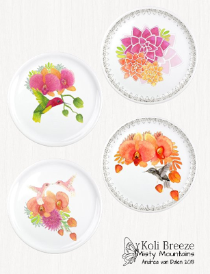
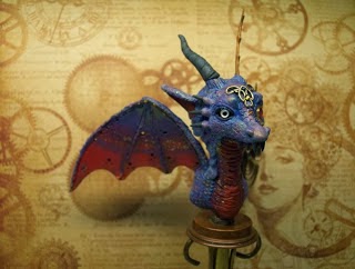
Starting with Andrea van Dalen Not only did she produce beautiful work for MATS she was also working on a 'steampunk dragon' - just blown away by the detail.


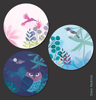
And now for the turn of the wonderful Diane Neukirch. Her colour palette on the plates and wall art are fabulous - great work.


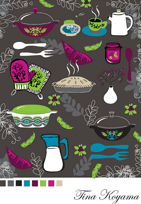
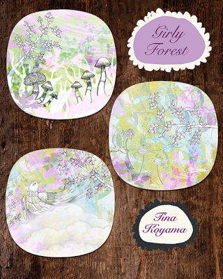
And also Tina Koyama who designed a set of beautiful plates for Home Decor week- cute oven gloves.


I also wanted to take this opportunity to give a brief summary of my background. In some ways I would consider my illustration career to have been an unexpected journey ( no orcs, dwarfs or goblin kings in my version) It hasn't always turned out as I imagined....

- I never meant to stumble into the then London based Tigerprint Studio where I was a cutter & paster of all things Christmassy

- When they were taken over by Hallmark I ate, read, and danced my way round India and the Far East on a 6 month backpacking tour

- I started drawing people which morphed into rather attractive ladies so I wouldn't have to eat beans all the time. It proved to be very successful (not the eating beans)

- Further down the line I thought I could work silly hours with a new born baby, and keep the same lifestyle. I eventually realised I didn't want to so decided to put illustration and greetings cards on the back burner and have another baby.

So here I am - baby no 2 is in nursery so I HAVE TIME TO PLAY AT MY SCHOOL!! And Lilla was my dream teacher. She so thoughtfully provided us with great reference and trends. However starting with Bolt fabric in week 1 it felt like I'd jumped in the deep end (think Pacific) and I had no option but to swim to shore ( think Lillaland) I needn't have worried - I shared my virtual classroom with the most wonderful, engaging, generous artists I've had the luck to meet who offered immense support.  I feel we all shared the joy, satisfaction, and sheer abundance that this course brought forth. And I'd like to add the exhaustion too - this course is not for the faint hearted - it became a dominant part of family life too! Lilla herself described it as 'bootcamp' -how else could you learn about 5 different markets in 5 weeks and produce gobsmacking schmazing work? 

MATS has come at the best time, when I feel I'm geared up for another chapter in my adventure. I am dreaming, planning, making more art and come Jan 2014 its all going to take shape. And of course I'm sure MATS part B will be another whirlwind.

Below are other super talented artists who took part in the Make Art That Sells blog tour, take a peek...you will not be disappointed.


November20
Jill Byers-  www.jillbyers.blogspot.com
Aisha Khan-  www.aishaandherwork.blogspot.com
Linda Tordoff - www.paintlovestudio.blogspot.co.uk

November21
Martina Lenhardt-  www.ma-len.blogspot.com
Melissa Doran-  www.melissadoran.com
Sarah Gager - www.sarahgager.com

November 22
HungYu CHEN - www.rainbowfishchen.com
stephanie corfee - www.stephaniecorfee.com
Sophie Verhille - http://blog.sophie-verhille.com/

November 25
Jo Chambers - www.studiolegohead.blogspot.co.uk
Son Atwal - www.applekaur.com/blog
Angie Sandy - http://www.angiesandy.com/blog


November 26
Rachael Schafer - www.rachaelschaferdesigns.com
Sarah Ehlinger- www.verysarie.com
Jordan Vinograd Kim-  http://www.foundandrewound.com/blog/

November 27
Jen Burbridge - www.madebyburbs.co.uk
Carolina Coto www.carolinacotoart.com
Aileen Tu: http://aileentu.com/blog/
Kim Fleming: http://www.lil-kim.blogspot.com.au/

November 28
Claire Lordon - www.clairelordon.blogspot.com
Eva Marion Seyffarth - www.eva-marion-seyffarth.blogspot.de

November 29
Anna Whitford - www.rosanna-rossi.co.uk
Mary Tanana - www.groovitydesigns.com

December 2
Jennifer Wambach - http://jennartdesigns.blogspot.com
Victoria Johnson - http://victoriajohnsondesignblog.blogspot.it 
Emily Dyer www.emilydyer.com/blog


December 3
Nic Squirrell - http://nicsquirrell.blogspot.com
Melinda Hopkirk - www.crouchriverstudio.com
Deb Trevitt - http://www.debtrevitt.com/blog/

December 4
Danielle McDonald - http://reddogandjude.blogspot.com.au/
Jennifer Appel http://www.jaillustration.com
Antje Martens-Oberwelland - http://antjeart.com/

December 5
Wendy Brightbill - http://www.agirlandherbrush.wordpress.com
Renske de Kinkelderwww.renskedekinkelder.com
Nicole Piar- http://www.ghostkittendesign.blogspot.com/

December 6
Andrea van Dalen - http://dreamkeeperfae.blogspot.nl/
Ohn Mar Win - http://illustrationsouljourney.blogspot.co.uk/
Diane Neukirch- http://dianeneukirch.blogspot.com


December 7
Lisa Deighan - http://www.lisadeighan.com
Tina Koyama http://tinakoyama.blogspot.jp/

GIFT Week 5 Make Art That Sells

I've been slow in writing up my experience of week 5 of the Lilla's MATS course as there's been so much to think about. My brain is trying to process everything and needs to have a spa break or similar.

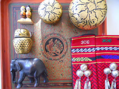
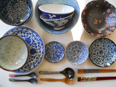
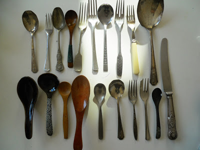
So Gift week was another area I had little experience in but was looking forward to immensely. The mini was to think about collections. I gathered up what I felt were the most interesting collections ( as I have far too many lurking all over the house)


The bowls especially had some great patterns and linework. Also the patterns within the Burmese laquer work were so beautiful and I loved the way they repeated outwards. For some more research into this market so I paid a visit to my favourite gift shops.


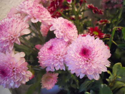
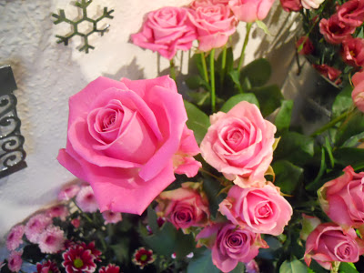
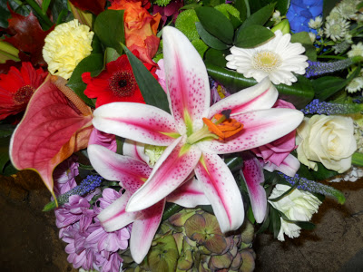
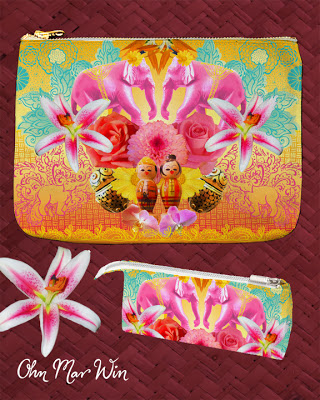
When the assignment came through it was the create a zipper pouch based on a trend that Lilla felt was emerging. Something she called 'hyperlush' seen in catwalk fashion, and would soon be filtering down to other design fields. Once again flowers were going to be large part of this look, so I asked some very kind local florists if I could photograph their beautiful displays.


I realised at this stage I would be called upon to work with Photoshop a great deal in order to incorporate & manipulate the pics I'd taken. It was enormously frustrating to begin with as I hardly venture into Photoshop- I had to Google so many basic techniques about masks and changing hues.

I won't bore you with the details but I had a deadline of Friday night due to a very hectic family week end. I was so pleased with he end result - the ONLY piece that turned out the way I had imagined when I first made sketches. Despite having left my home country over 30 years ago I grew up surrounded by Burmese craft and I wanted to combine this with my vague memories of living there. I called it 'The Road to Mandalay' after Kiplings famous poem about exoctic Asia.


When Lilla chose this in her assessment I ran round the office screaming that I didn't hear what she actually said about it !!!  I never imagined that I would have client ready art after all these years out from the creative industry. All those late nights and self doubt - well I never believed it until then. OK I'm ready to believe I can do this.

My Goals Book....

I just wanted to write a quick note about my Goals Book that I started in January of this year. I contains pretty much everything I want to achieve in the next 1 -20 years of my life. In terms of career, family, finance, and vacations. Also just personal stuff like reaching a calmer state, not based on fear.

I find it immensely satisfying looking through it whenever I can. Although I can  almost recall every page in my minds eye as I attempt to meditate on them & other affirmations every night.


I mentioned my Goals Book in the MATS Facebook group, and received a warm response. I am delighted that in some small way I was able to inspire others, even if it was just to plant a seed of an idea. It certainly helps me to focus and map a path towards these dreams. I placed the images I collected in my book in a file that pops up as my screen saver just to remind me throughout the day, which works wonderfully for me.


WEEK 4 Make Art That Sells - Wall Art

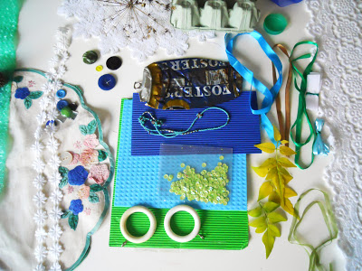
I was rather nervous about Wall Art week as I haven't painted in years, and never with actual paint. However the week did start promising enough with a scavenger hunt of sorts, textures, papers, and other odd bits I had laying around the house. We were limited by colour scheme, based on our star sign, mine was apparently blue and green for Aquarius. I also put together a sheet of textures and shapes- which was satisfyingly messy.As always I had no idea where Lilla was going with this.


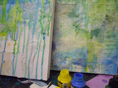
Lilla put together a great PDF collection of wall art that she hoped would inspire us, based on several themes. Geometrics, painterly, collage and mixture of all three. I've been very drawn to geometrics as the course progress and decided I wanted to concentrate on this in some way. As mentioned I don't paint as a such but gave two canvases my best shot. It soon became apparent that they were lacking in some sort of focal point or cohesive element. A bout of flu made me step away from them for 24 hours, however I was able to see where areas were lacking and hoped to make up for lost time.


I'm not sure if it was my cold & flu medication wearing off or my brain function returning because I decided early Sunday morning, approx 12 hours before the assignment was due I DIDN'T LOVE THEM. I very much enjoyed playing with paint and collage but I felt my skills just didn't match the grand plans I had for this week. 

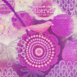
I took many deep breaths and had a long hard think about what I could achieve in the next 12 hours. This was like a job for the A -TEAM, although I created a file called 'Plan B'. This time I chose the quote BEFORE I started creating and very much kept it in mind in the following hours. I had to call in the help of Photoshop and scanned in almost every bit of art I'd produced that week.


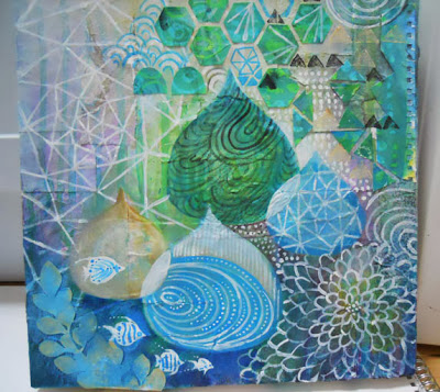
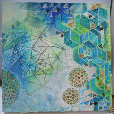
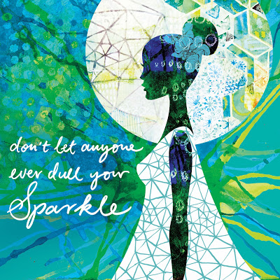
Thankfully I really LOVED what I created, and despite the long hours and complete turn around it was worth it. This course is teaching me so much about myself and calling up reserves of energy I din't know I had. Also I learnt that it really is important to love what you do, and I still enjoy creating aesthetically pleasing ladies even after many years away from editorial illustration. 


WEEK 3 - Childrens Picture Books

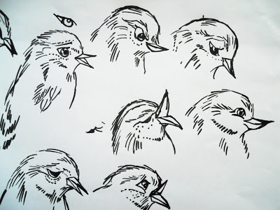
As explained in post below I was very much looking forward to this week. I always harboured a wish to illustrate a picture book from an early age. Once again Lilla provided us with loads in inspiration & insight into this field. The mini brief was asking us to draw many birds with various expressions and develop them into a character.


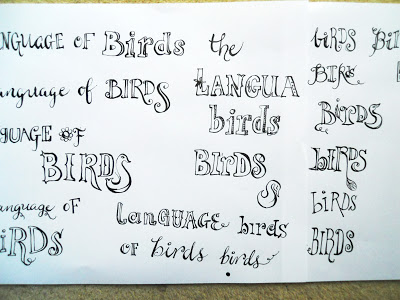
The second half was to work on some hand type that read 'The Language of the Birds'  Again another area I really find enjoyable, and got quite carried away late one evening.


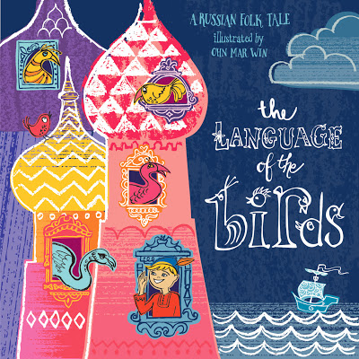
Well it turns out the story we would be basing our assignment on was a Russian folk story about Ivan who is taught wait for it...the language of the birds...by a magical bird after he saves her chicks. Then Ivan has a eventful journey to a new land where he ends up marrying the kings daughter after helping out with some irksome crows.

I had many ideas for layouts and which parts of the story I could illustrate, and did become very bogged down with it all. Lilla came to the rescue with a post on FB. She wanted us to interpret this story however we wished, and make it 'easy' for ourselves. We also had to be mindful of the deadline ( if we wanted to post in Flikr) and having spent a huge amount mental & physical energy on weeks 1&2 I decided to just step back a bit, and just ENJOY the JOY of this process and use it as an springboard.

I have decided that a few days produce client ready pieces is a tall order for me. I have time enough after MATS to go back and tweak, and explore more styles and techniques. And there will be other courses I'll be taking in 2014 to help me achieve my goals ( thats another post)

Back to Ivan - ummm character work for kids was always a challenge. So it was time for Pinterest- I looked at everything from early Disney to 1960's book covers. I think I drew Ivan about 20 times, with dots for eyes? with freckles?  with a neckerchief ?..and what sort of folkys outfit should he wear?


Towards the end I did seriously SERIOUSLY doubt my layout - maybe there were too many birds or the colours were too much? And I called into question what my hand type was really trying to convey. I tried to push them to one side and just remembered I did have lots of fun and had been kinder to myself. Further more I was here to learn by letting go of what I thought I 'SHOULD' do. I do adore my book cover and am already thinking of layouts for this story.

Children's Picture books & me

I had been looking forward to this the most in this half of Lilla's course...picture books are very close to my heart. It goes like this....

I'm 8 years old and reading in a prefab shed that serves as an extra class room for my school. Although its really reserved as a boot camp for kids who find reading, writing and comprehension very challenging. Having immigrated to the UK aged 5 I still found following lessons in class tough, and spent a few hours each week in that musty prefab.

However I have discovered the great trick of scanning the faces & body language of the picture book characters and hoping the words match! I ended up reading picture books for many many years to catch up with my classmates. They would be on Famous 5 and I was pouring over The Hungry Catapiller. Whilst improving my reading skills they also bought great delight. Picture books with humorous characters, fairy tales, strange animals, strange lands, there was so much to choose from- thats why I simply adore them. I tried to channel that inner child when working on this weeks assignment.

These are Octobers best sellers...

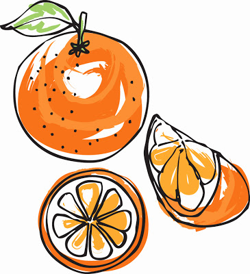
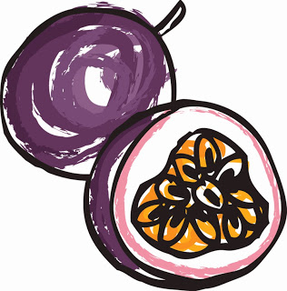
I recently worked on single fruit images to Shutterstock, something I've been been meaning to do for ages. They've been selling well, with oranges and passion fruit doing the rounds, and very popular in China ?!


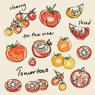
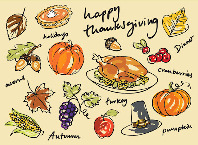
And surprisingly these tomatoes and this particular Thanksgiving image.


WEEK 2 Home Decor.., finding my way forward with drawing

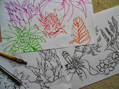
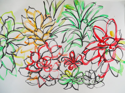
I was really looking forward to this module, and I was not disappointed. It was another very intense week but also incredibly fun. With the starting point of bromeliads as a mini assignment, I explored these funky succulents further. There were so may shapes, with spikey and almost geometric elements. And the colours stunning - so much to get into.


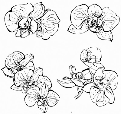
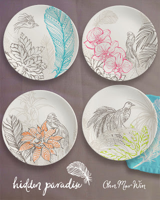
The home decor assignment was to design a series of plates. I was concerned the examples in Lillas overview were very painterly- something I have a resistance to ( but that's another blog) I feel drawing has always been my strength, however I was uncertain if this would enough to pull me through. It wasn't until I viewed Lillas about 'finding joy' that I believed I could tap into my sheer gleeful happiness when drawing. Also I just adore orchids, my grandma kept hundreds of the ( in Burma ) and I have a few in my kitchen.


As I drew them I came to 'understand' the lines dots and markings towards the middle of each flower head. I feel this was a mini breakthrough because I find it a challenge to 'abstract' a drawing or develop them further. Yet I became fascinated by these markings and doodled a page of abstract marks inspired by these orchids. Then I started 'seeing' in feathers too, inspired by birds of paradise. I was so enamoured by these new found dots and lines they featured in the background of my plate designs.


Dream home decor job...a half forgotten joy

Lilla starts each module with a generous overview of the market we'll be concentrating on that week. Also in the home decor overview she mentioned to pursue anything that interests you, as that genuine joy will come through in your work. And its all part of what makes me, ME & unique, which of course is incredibly important. It set me thinking down this path...

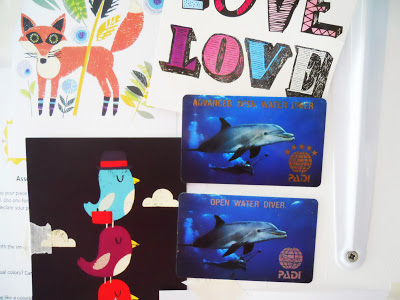
I'm a Advanced Open Water diver & I love tropical fish & I'm proud of it.


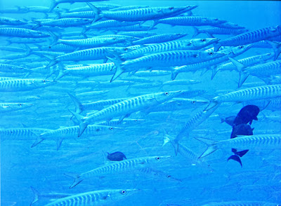
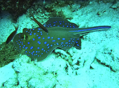
My other half though I was crazy when I announced I wanted to learn to dive off a tiny in Malaysia - I can barely swim! However I was totally hooked. That first dive was so colourful, vibrant, & the vast array of wondrous new stuff that was out of this world almost blew my mind. Maybe it was the weightlessness or the yoga like mindful breathing that also contributed to this passion.


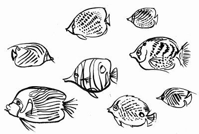
My BCD, wetsuit & weights are long gone but I often think about the cobolt clear waters & dazzling fish. A dream home decor assignment would be a collection based on tropical fish studies. I just had to quickly doodle butterfly fish - so my different markings, and funky eye masks, some look mournful, some look cheeky ooohh...