4 Tips from a New Skillshare Teacher

Last month I launched my first ever Skillshare class entitled 'Food Illustration: Design your Favourite Fruity Recipe' I will admit it sure was a challenge and a long journey, before I hit that final 'publish' button. Here is the intro video to this class.

You can access the class HERE

These are my points to remember if you are considering becoming a Skillshare teacher

TIP 1 - DO NOT BE DAUNTED BY THE CLASS NOTES

Do follow the step by step approach laid out by the Skillshare team. Their advice is plentiful, far reaching and sound - they really want you to succeed !!! If in doubt just email them and they are happy to help.

TIP 2 - DECONSTRUCT THE PROJECT

Think in terms of producing a project that would be EASY for you e.g. watercolour whatever  and turn it around, so you look at it from the eyes of a relative novice student. You may want to ask yourself:

-what materials or programs would they need

-how can I make the class videos as short and to the point as possible without leaving out important content

- what technique(s) will they learn

- what prior knowledge would they need for successful completion of the project ( e.g. basic Photoshop?)

Ohn Mar Skillshare drawing fruit.jpg

TIP 3 - RECORDING THE CLASSES IS EASIER THAN YOU THINK

Make friends with the Modify>split clip> delete step in iMovie to rid videos of all there 'errs' and awkward pauses. I soon realised it was much better simply repeat the sentence again if I fluffed it than to record a whole new screencast ( where you record the screen of the Mac) When it came to editing it was much smoother.

TIP 4 - DO NOT UNDER ESTIMATE THE MARKETING

Skillshare point out that it is vital to have 25 student enrolments in the first two weeks to show in their trending classes.  Here are some of the methods I used to bring awareness to my class:

- a week before the launch I linked my intro video (on Vimeo) to the profile of my IG to direct followers to it

- there were free class enrolment giveaways

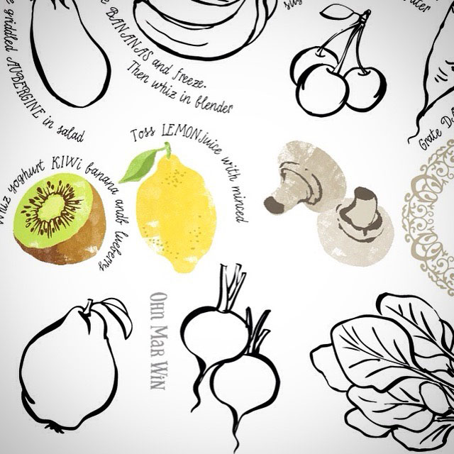
-  I created short animation which played on a loop in IG using the food icons created for this class

-  I have reposted illustrated recipes created by students on IG to remind folks of my class 

-  had a giveaway of a set of my foodie postcards for the 1000th student to sign up


As mentioned right at the beginning it has only been a month since this first class launched however I feel that its been a worthwhile undertaking. Such has been the overwhelming positive response I felt compelled to work on another one with more guidance from Skillshare.

Again I chose a particular strength of mine which is drawing, and tried to condense it into a challenge with pen, paper and a timer. It is not a new concept but as creative sometimes we overthink and get in the way of ourselves. Committing to just drawing in three minutes can help with gaining fluency and confidence with drawing, and impact in other areas of your art life. You can watch the intro video to 3 Minute Drawing Challenge below.

And you can access this drawing challenge class HERE

Toronto Waterfront Artisan Market

I really need to ask a really big favour for folks who are in Toronto area. I worked with The Toronto Market Company again for another foodie based event. Artwork was needed for promotional material and banners for an artisan market that would be held along Toronto's waterfront.

The booths would be a mixture of food, crafts, jewelry and plant stalls. And the opening of the the event would coincide with the launch of a new cycle route along the waterfront. The concept was a bike laden with goodies ( although most are falling out) after visiting the market.

As you know I am based in the UK and I'd be eternally grateful for anyone who could take some nice photos of the banners when the market runs one weekend in June/July/August/September. Please email any snaps to ohnmar@ohnmarwin.com.

Many many thanks in advance.

Image by indie88toronto

Image by indie88toronto

Tiny steps to 'They Draw and Cook' book

As soon as Nate sent me a link to 'The Most Gorgeous Cookbook Ever' on Amazon I ordered several copies and waited eagerly for their delivery. And they did not disappoint, I was overwhelmingly excited and proud to see my work in print. It had been a long time in coming.

Lets take a look at my first submission though from March 2014...

As you can see I hadn't quite found my style and I was still working out the finer details of PS. If you followed my self imposed TDAC challenge I set myself at the beginning of last year to have 30 recipes submitted by the end of 2015 you'll remember my IG feed being full of food! One of the marvelous outcomes of drawing so much food was I became very quick at it, flitting between dip pens and brush pens, which in turn made me swifter in PS and that in turn gave me further confidence to explore and refine my style.

To reach that magic 30 took over EIGHTEEN MONTHS - the same amount of time I was pregnant my two kids. It was a true labour of love because I knew the goal was worthwhile. Each time I sat down to dip that pen in the ink for the sketching or hand lettering, played about with page layouts was a tiny step towards this book. Goals take time, in some cases some longer than others.

The most important thing is to KEEP taking those steps, however small, to make that dream happen!

I was prepared to be consistent, keeping my eye on the prize, despite the many detours, leading up to that major goal. You can use this approach in most areas of you life. If you allow yourself to take small steps, one day at a time, you are least likely to overwhelm yourself. Planning also plays an important part, plan for progress not perfection!

I don't suppose the returns from selling this book on Amazon will be huge. But I plan to send a copy to many, many art directors in the future so they can reference my style and approach, and fingers crossed send briefs my way.

You can order copies of this book from Amazon.com US

Or Amazon UK

Considerations for Tall Pins and (one) Easy Way to create them

Since folks found the last post about tall pins useful I've added a few more details you may want to be mindful of...

1 - Try to keep the essence of the original illustration/ pattern

This was for the Feast aspect of They Draw and Cook - the normal layout spread....but now rearranged first to this....

...but also this to make best use of viewing in different social media platforms and devices...

2) Create in 'squarish' and 'tallish' formats

3) Make it 'decorative' and appealing

4) Don't forgot your watermark logo

5) Pin all versions for better chance in searches

6) Don't forget to add a brief description to describe your work with key words when you pin

Depending on how I feel about the layout I often place PS artwork into Ai which makes it easier for me to move aspects around....especially when it comes to re-formatting image options for my website and pinning...

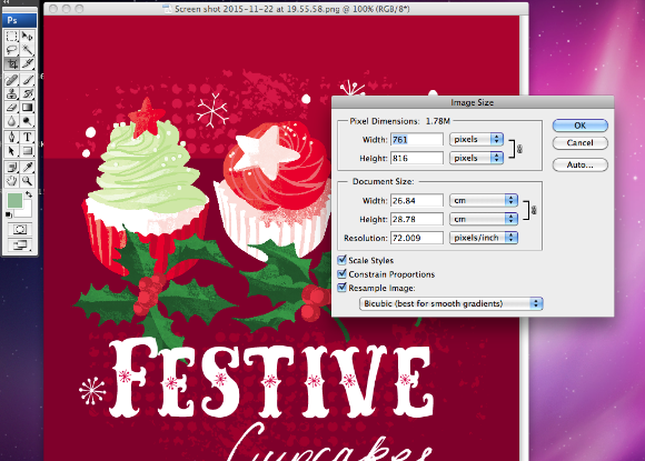
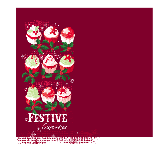
....I take a SCREEN SHOT of the group on the left...

....the screen shot comes out at almost 72dpi. You can leave it as it is or reduce the dimensions slightly .....

Screen shot 2015-11-22 at 19.55.58.png

....arrange the cupcakes into a tallish format and take a screen shot....

I'm sure there are other ways to set up images for portfolio websites but this method works for me. So I have just uploaded these images onto my website and pinned directly from there onto my Love Food Illustration and Food Pattern boards on Pinterest.

Screen shot 2015-11-22 at 20.00.50.png

Playing with 'Creative Playgrounds'

Some of you know I take part in daily arty challenges. Last August it started with month of hand lettering daily, then a month of food, then desserts and biscuits. There was no major thought process behind them, it was to keep up with my drawing skills without engaging my brain as to its final use, if any.

I am still taking part in daily doodles #365doodleswithjohannafritz if I can, and sometimes mashing it up a daily watercolour in my moleskin and even further mashed with #alittleart that Victoria Johnson started (tiny art in any medium no bigger than 2.5") Indulge me I'm getting to the point...

It wasn't until last month when I took part in Build a Freelance Illustration Business that I realized this kind of approach has a name...'creative playgrounds' . I am simply 'playing', its done freestyle, its quick, maybe messy but I'm always having fun. I never realized that also submitting to the Spoonflower and Tigerprint competitions even taking part in Inktober and #the100day project was this 'creative playground. Submitting to They Draw and Cook...some of you know I submit to them a lot... is also a 'creative playground'  

I made a commitment to myself to just spend 10-30mins each day to explore or try something new. You simply don't know until you try how its going to turn out...that new PS brush, shifting the images to 'colour burn' or drawing with a toothpick. And the super outcome is connecting with others who are joining in too, supporting their art and vice versa.

So I said I drew without thinking too much...well I want to show you some outcomes..why its good to play.

First up are these donuts I drew at the suggestion of picture book illustrator Claire Lordon during 'dessert a day' month (November 2014)...

....so these donuts ended up in at a foodie event banner in Toronto, each about 3 ft wide!

Next these very British biscuits were designer Harriet Mellor's request during food doodle month (October 2014)...

...which ended up in a UK adult colouring in publication earlier this year.

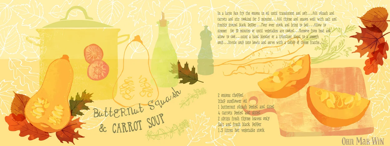
And just this week I started on Este MacLeod 'Explore Colour' painting course. The first assignment much to my delight was simply to draw swiftly the structure of fruits and vegetables, sections, slices, every angle. The butternut squash sketch ended up in this weeks They Draw and Cook submission.

And finally this is one of my very first doodles during hand lettering month last year (on vacation in Cornwall in a old sketchbook)....which will be appear in a publication later this year....

I feel its been truly beneficial to put ward work like this, letting go of the need to always know how the end result will pan out. Some of my doodles take days to a year to be worked into something that can be placed in my portfolio. If you would like to know more about the value of creative playgrounds watch Salli and Nate HERE


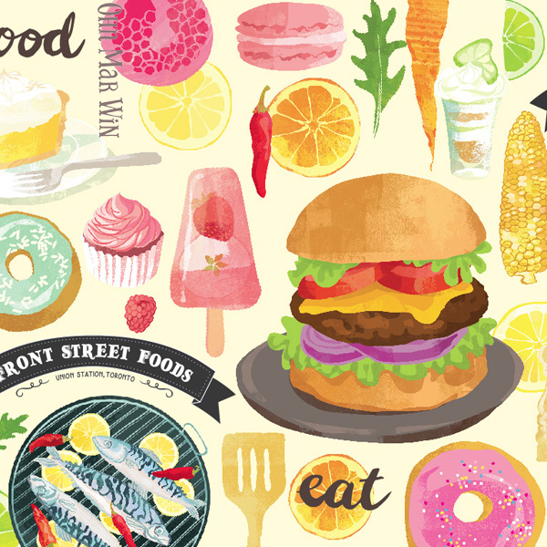
Front Street Foods Banner - Toronto Union Station

Today will be the opening day of a 8 week long foodie event outside Toronto's Union Station. Run by the Toronto Market Company, the Front Street Foods @Union Summer will feature over 28 food and drink vendors. It will showcase some of Toronto's best chefs, restaurants, bakers, and food entrepreneurs showcasing their delectable fresh food & drink items.

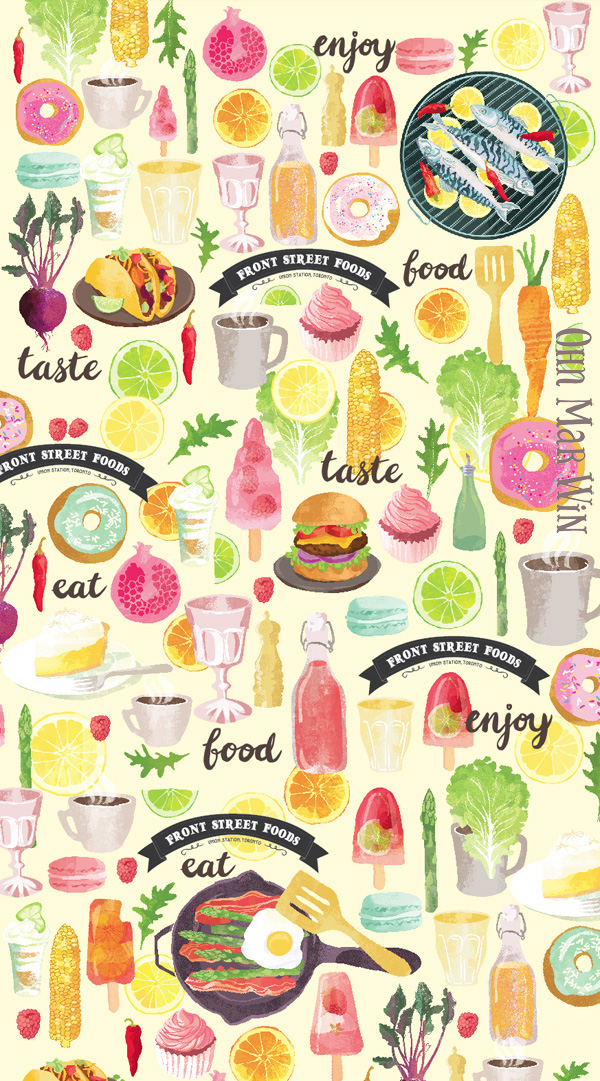
I'm very excited to say I am involved with this summer venture. I illustrated the 80ft x 9ft banner that wraps around some of the food booths. When FRS first approached me we talked through some of the options for the layout of this banner - how best to maximize the dimensions. In the end it was decided that arrangement of food icons in a pattern of sorts would be best to fulfill the need to incorporate as many different foods and beverages.

One of the major considerations was the resolution of all the different images used - potentially a donut could be enlarged to over 2ft across while a raspberry popsicle could be 3 ft high !! The FSF logo also had to be incorporated at various points along the banner together with larger than life gourmet burger, tacos etc and hand lettering. Being mindful of these considerations I randomly repeated over 40 different food icons across the length of the 80ft.

As I am based in the UK I would be most grateful if anyone who lives or will be visiting Toronto between now and August 30th ( maybe during the PanAm Games?) to please email, or post any pics of this banner, and enjoying themselves at this foodie pop up.

Instagram @torontomarketco . Tag me in @ohn_mar_win 

#frontstfoods #frontstreetfoods #unionstation

Email any pics to ohnmar@ohnmarwin.com

MANY MANY THANKS in advance !!!


Deli2Go snack range for Shell garage & providing options

These days you hear much talk about adding value to your work, so you are better placed to find ideal customers or clients. Whilst illustrating a commission for Shell garages' Deli2Go range I was able to explore this theme further.

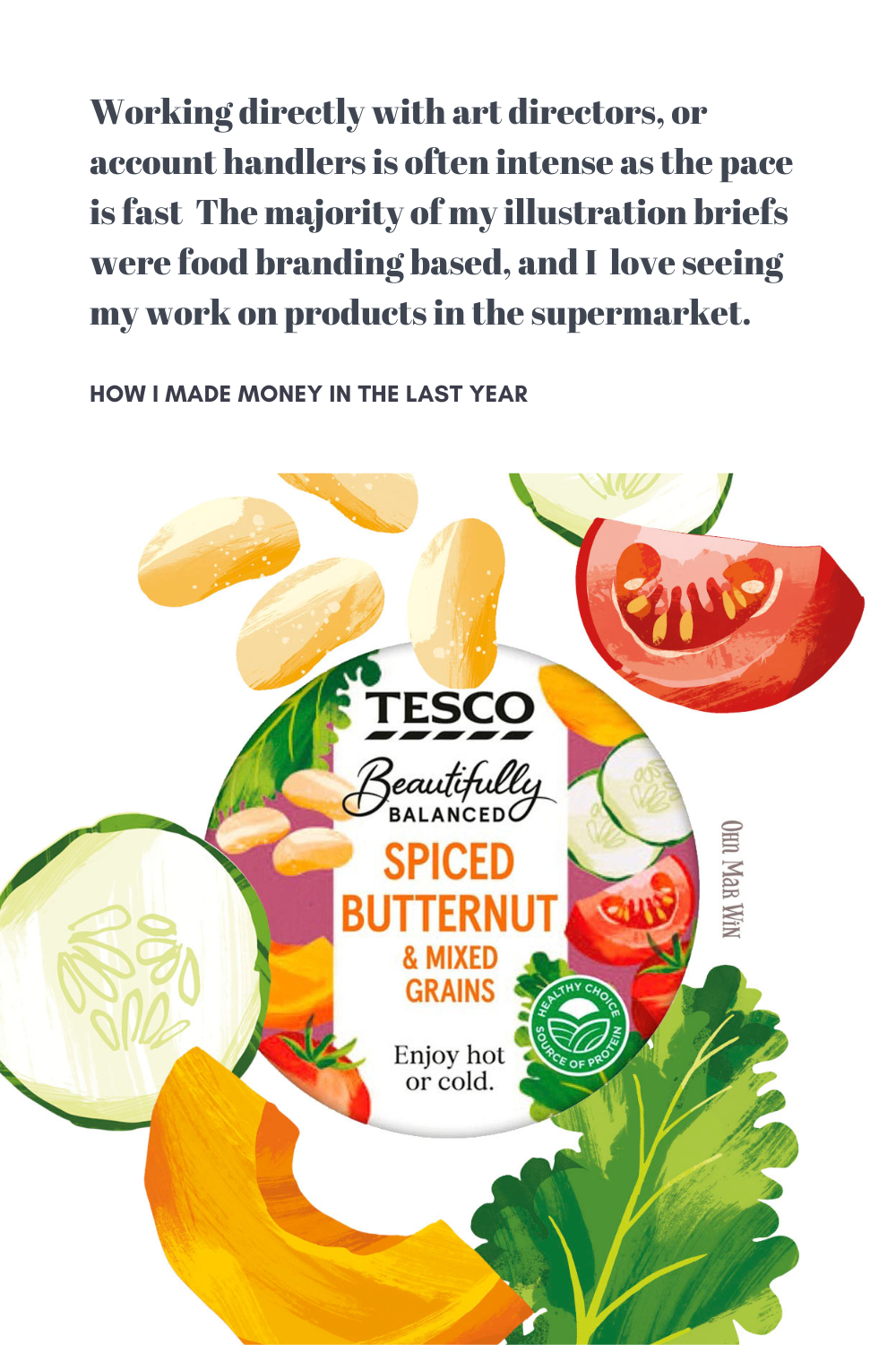
I have always been interested in packaging, especially those of food and drinks. So when I was asked by Conran Design to illustrate a snack range at the end of last year I was delighted and very excited to be involved.

I worked in house for two days at their design studio off Camden High Street in London. On the first morning I was met by the account handler and introduced to the senior designer who would be overseeing this project. Shell launched their Deli2Go range a few years back and have been expanding with new products every year. They already had a 'house' style and I was to illustrate a extended snack range with the same feel. Images would be needed for 6 small snack packs including Bombay Mix, Chilli coated peanuts and Trail Mix.

There was a long list of different ingredients for each pack, which would include a wide range of foods from dried coconut, salt crystals, chilli, peanuts, lentils, and dried papaya to name just a few of the 17 separate ingredients. I set to work with my trusty brush pen as always. They remarked how great it was to see hand drawn elements & pleased I would be lifting artwork from these sketches - they really enjoyed seeing my brush pen drawings.

The designers were mindful of the tight timeframe and wanted the almonds arranged in such a way so each icon could be viewed easily & pick out which were working the best. So I arranged them like this after adding textures...

Two days of in house illustrating to produce 17 different illustrations with many textural options as seen above was a challenge. I was not asked to work on the actual design layout for the packaging - but I played around with some of the Pantone reference from the Shell style guide. At the end of the two days - we were in a 'happy place ' as they designer put it. It had been a fantastic learning curve and I learnt more about process of illustrating for packaging. So if you pull up at a Shell garage look out for these and I would be delighted if you could send me a pic!

deli2go packaging Ohn Mar.jpg

Since this project I have been providing my clients with a few different versions of the same icon. I thoroughly enjoy drawing and am blessed with fast drawing ability and since clients like to have options - that's a win/win. The image below is part of a recent illustration project where I've sketched several different versions of the same icon. This expedites the process, reducing the need for additional rounds of revisions. And it also shows that I understand the project from their perspective and am eager to work diligently to accomplish fine artwork.


They Draw & Cook Challenge -update

So last month I wrote about my plan to create a illustrated recipe every week...in the hope of having a book published by They Draw and Cook...well its working out so far. Recipe No 3 was Raspberry & Passionfruit cupcakes which was featured on their Valentines recipe collection. I was able to use the hands making the heart shape from a short animation from last year. And the cupcakes were from a doodle a day exercise from last year also. I'm finally understanding the value of leveraging!

Screen shot 2015-02-20 at 18.25.28.png

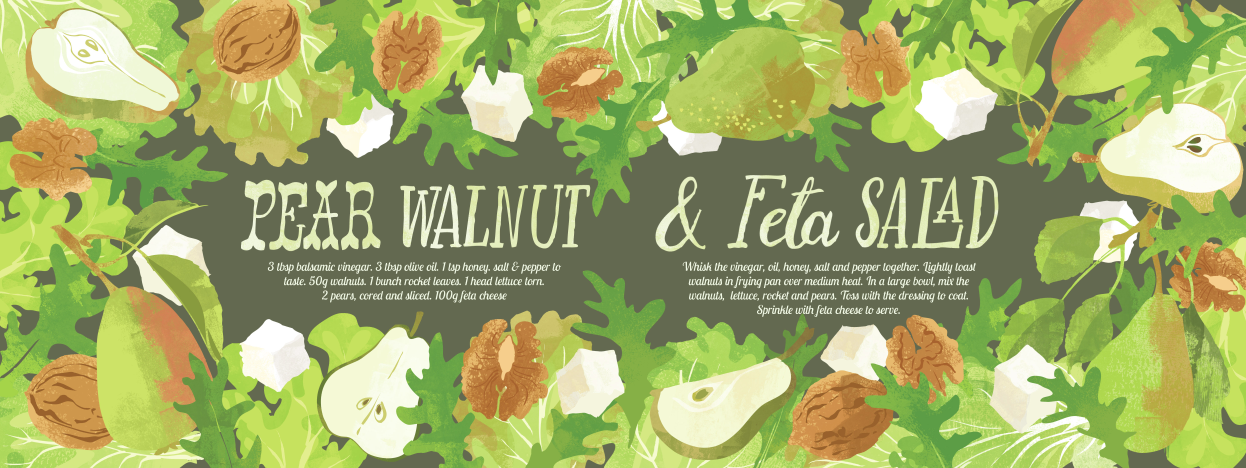
Next up was a crunchy Pear & Walnut Salad. Again the pears were from a Doodle a Day from last Autumn. I did have to come up with rather a lot of various salad leaves and the walnuts.

The next week was Grilled Mackerel with lemon & Chilli. I loved illustrating these mackerel- they are wonderful to cook when super fresh. I was able to use the chilli peppers from a greetings card project. Below are the sketches that I worked from. I have a loose framework of ingredients that I want to work with an have started planning two or three weeks ahead.

Screen shot 2015-02-20 at 18.19.40.png

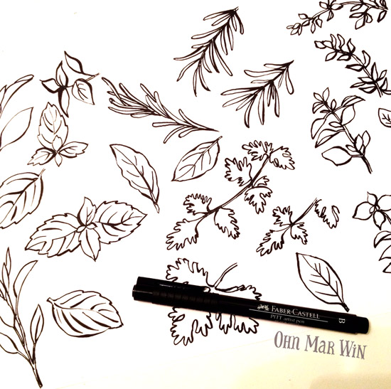
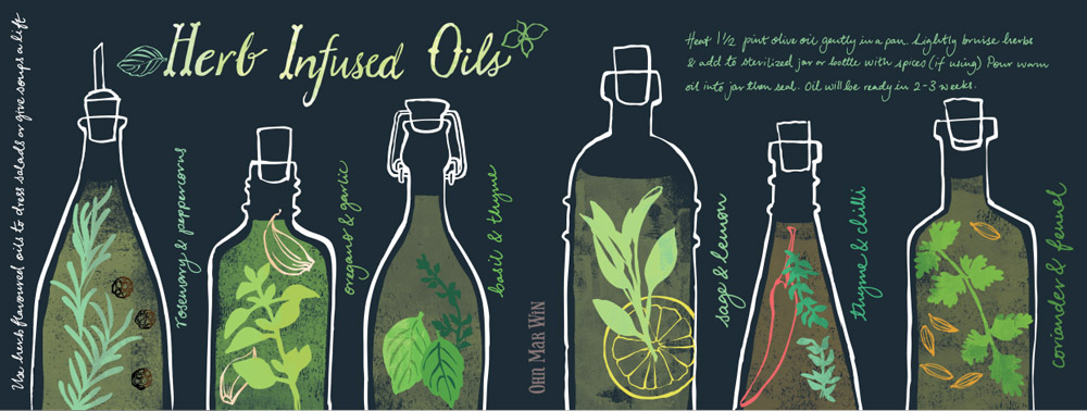
And this weeks was Herb Infused Oils. I had back to back deadlines and knew had had to come up with something simple but effective. I researched the different flavours then in one evening I drew a sheet of herbs and a sheet of various oil bottle shapes.

I have enjoyed researching, planning and trying out new layouts for each recipe. I have learnt to work quicker and hopefully not lose any freshness. Whilst I'm very pleased with these and have played and explored , this month I'm going to try adding some new elements and expand things a little further stylistically.