Practicing watercolours with #The100DayProject

At the beginning of this year whilst making plans, I wished to take a Skillshare class on fashion illustration which would use watercolour as a medium. I had virtually no experience of watercolour, or even attempted to try it for any length of time even in my college days.

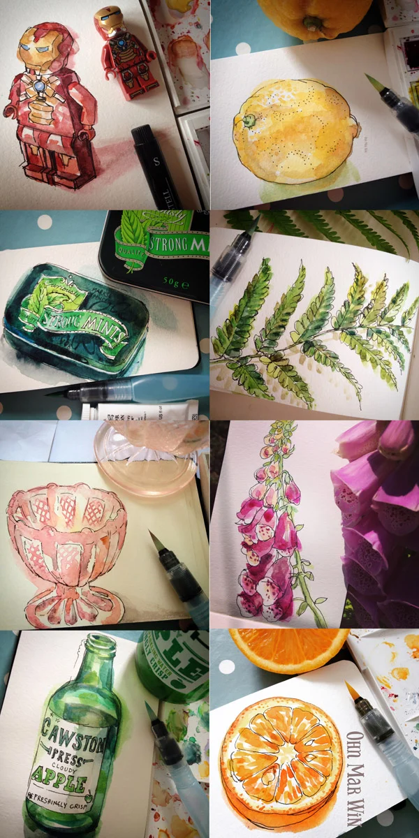
I bought myself a small watercolour Moleskine in February and decided to try a little sketch everyday. The following images are set chronologically. At first I used a small Winsor and Newton brush with their pan set. I became frustrated that pencil lines made my painting 'tight'  and overworked for some reason.

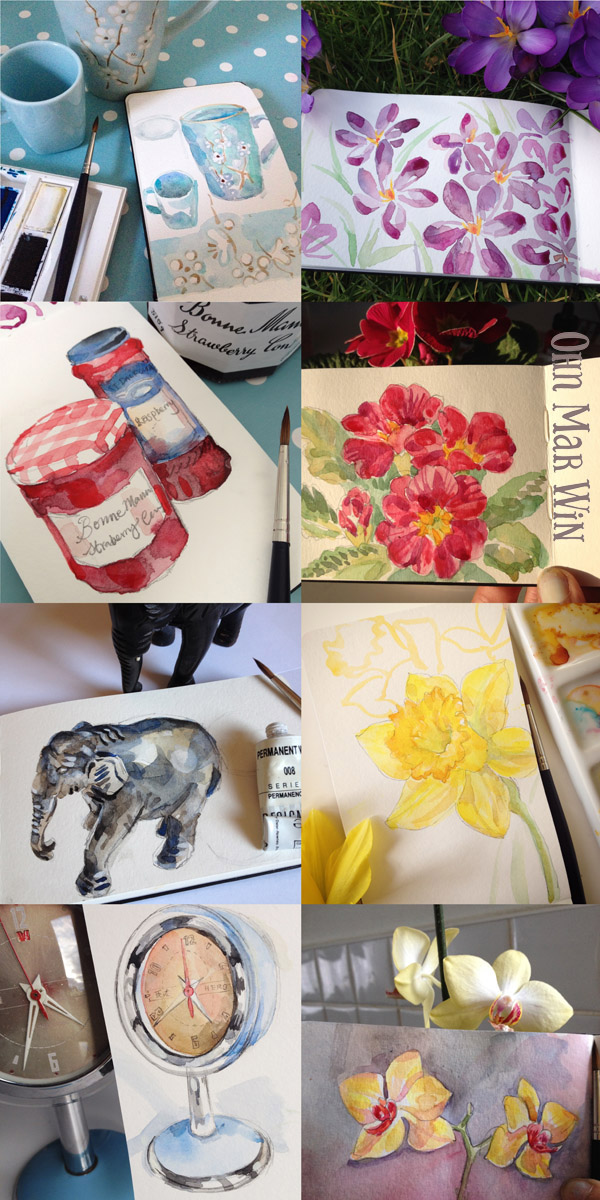
I found a happy place with a fine black Pitt artist pen - a basic outline to provide a frame gave me confidence to be looser and freer with the paint. I received a kind response from Instagram as I posted each daily sketch. It soon fell into a little routine, and I alternated between flowers, packaging and a decorative item. It's just what I have around to house, and I was just keen to explore.

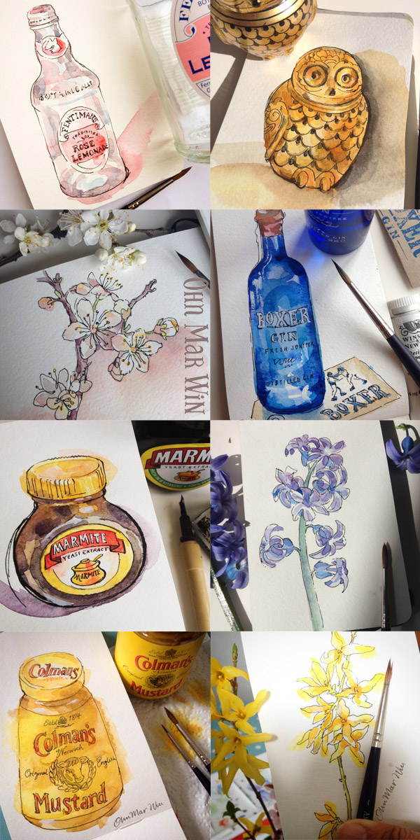
My friend Stephanie Corfee suggested I might try a Pentel watercolour brush pen as the washes dry quicker and saves a lot of time. It worked a treat and I very much preferred it to the sable brush. It's also very handy to pack when you are away for weekends and want to continue with a watercolours.

Ohn_Mar_Win_#100days_3.jpg

Making this part of a daily routine  (usually just after I've picked up the kids & during the time they are having a snack) is something I have come to look forward to. It also shows up more clearly what I am attracted to most for subject matter- with packaging I like a slight vintage or retro vibe.

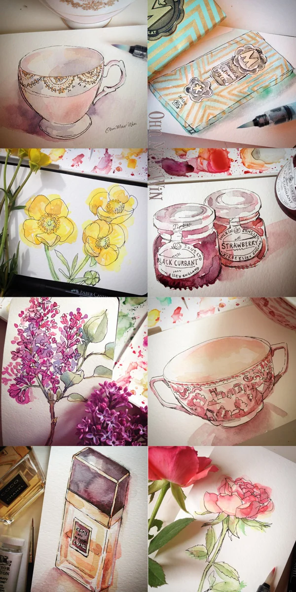
As Spring continued I was very much inspired by the seasonal flowers. Florals rarely appear in my pattern or illustration work but after drawing a few each week I have a better understanding of what specifically attracts me, and perhaps I can incorporate them in the future.

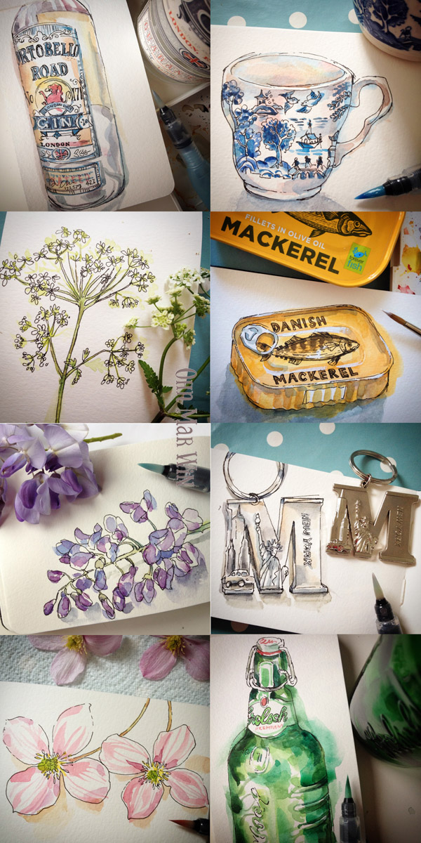
I feel studying an object in this manner everyday I can judge contrasts better, both in shapes,  colours, and tone.

When I started my daily watercolour challenge I had just under 500 followers on Instagram. But as the months have passed they have grown steadily, I know much of this is down to these watercolours. Due to the number of comments and questions I received I started using Iconosquare to keep track of everything. This is a great platform to view statistics about your content, follower growth and even when the most optimal time to post for interactions with followers (mine is apparently 2pm on a Monday or 10pm on a Thursday!!)

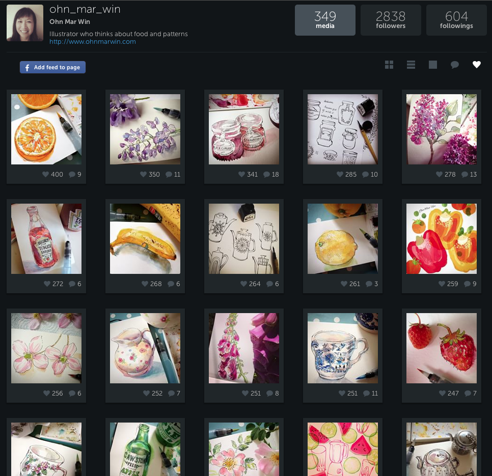
The above is the amount of 'likes' for my IG images (you can choose to see this grid based on amount of 'comments' too) As you can see 16 out of the top 20 are my little watercolour sketches. I still consider myself as a learner. I have not attempted to paint anything outside of the little Moleskine. I've just passed half way mark, 50 out of the 100 days. There was no prior motive other than to have fun and enjoy a quiet 20mins each day. The practice everyday also helps me to step away from my computer, its almost like having a break to recharge.

So I shall fill you in again in another 50 days and see where that takes me

Deli2Go snack range for Shell garage & providing options

These days you hear much talk about adding value to your work, so you are better placed to find ideal customers or clients. Whilst illustrating a commission for Shell garages' Deli2Go range I was able to explore this theme further.

I have always been interested in packaging, especially those of food and drinks. So when I was asked by Conran Design to illustrate a snack range at the end of last year I was delighted and very excited to be involved.

I worked in house for two days at their design studio off Camden High Street in London. On the first morning I was met by the account handler and introduced to the senior designer who would be overseeing this project. Shell launched their Deli2Go range a few years back and have been expanding with new products every year. They already had a 'house' style and I was to illustrate a extended snack range with the same feel. Images would be needed for 6 small snack packs including Bombay Mix, Chilli coated peanuts and Trail Mix.

There was a long list of different ingredients for each pack, which would include a wide range of foods from dried coconut, salt crystals, chilli, peanuts, lentils, and dried papaya to name just a few of the 17 separate ingredients. I set to work with my trusty brush pen as always. They remarked how great it was to see hand drawn elements & pleased I would be lifting artwork from these sketches - they really enjoyed seeing my brush pen drawings.

The designers were mindful of the tight timeframe and wanted the almonds arranged in such a way so each icon could be viewed easily & pick out which were working the best. So I arranged them like this after adding textures...

Two days of in house illustrating to produce 17 different illustrations with many textural options as seen above was a challenge. I was not asked to work on the actual design layout for the packaging - but I played around with some of the Pantone reference from the Shell style guide. At the end of the two days - we were in a 'happy place ' as they designer put it. It had been a fantastic learning curve and I learnt more about process of illustrating for packaging. So if you pull up at a Shell garage look out for these and I would be delighted if you could send me a pic!

deli2go packaging Ohn Mar.jpg

Since this project I have been providing my clients with a few different versions of the same icon. I thoroughly enjoy drawing and am blessed with fast drawing ability and since clients like to have options - that's a win/win. The image below is part of a recent illustration project where I've sketched several different versions of the same icon. This expedites the process, reducing the need for additional rounds of revisions. And it also shows that I understand the project from their perspective and am eager to work diligently to accomplish fine artwork.


Good Food Show - part 2....Olive Branch

Near the end of the day eventually found Olive Branch Foods tucked away in the corner of the main hall. They had been left off the plan and index so it was better late than never when I bumped into their booth. I had worked with them earlier in the year on a series of illustrations for their tapenade packaging. And I was lucky enough to be asked again this time to illustrate sweet biscuits, imported from Greece flavoured with orange, almonds and cinnamon. 

I had a huge smile on my face as I saw the jars lined up at their booth and a steady stream of people milling about tasting their products. When I tweeted about my day I realised they had used the biscuits as their cover photo on Twitter which was a lovely end to a rather fun packed jolly day. 

Olive Branch - Chunky olive tapenade packaging

I work with Bright Green Brands now and again who specialise in packaging design, mainly of food products. They had been approached by a small start up company who imported olive based products from small farms in Greece. I had just started using texture in my art and they were very keen to see this new style on the olive jars.

It was a case of illustrating each item separately - olives, rosemary, peppers, feta cheese etc and the designer would put them together in the layout that best suited the product. I have to say it was a very long drawn out process and a steep learning curve.

However I am very pleased with the results and can't wait to actually get my hands on some of these yummy products. Also it will sit very nicely in my portfolio in my quest to gain food & drink editorial illustration commissions in the near future. The photographs of the jars really do them justice too.