Front Street Foods Banner - Toronto Union Station

Today will be the opening day of a 8 week long foodie event outside Toronto's Union Station. Run by the Toronto Market Company, the Front Street Foods @Union Summer will feature over 28 food and drink vendors. It will showcase some of Toronto's best chefs, restaurants, bakers, and food entrepreneurs showcasing their delectable fresh food & drink items.

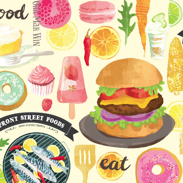
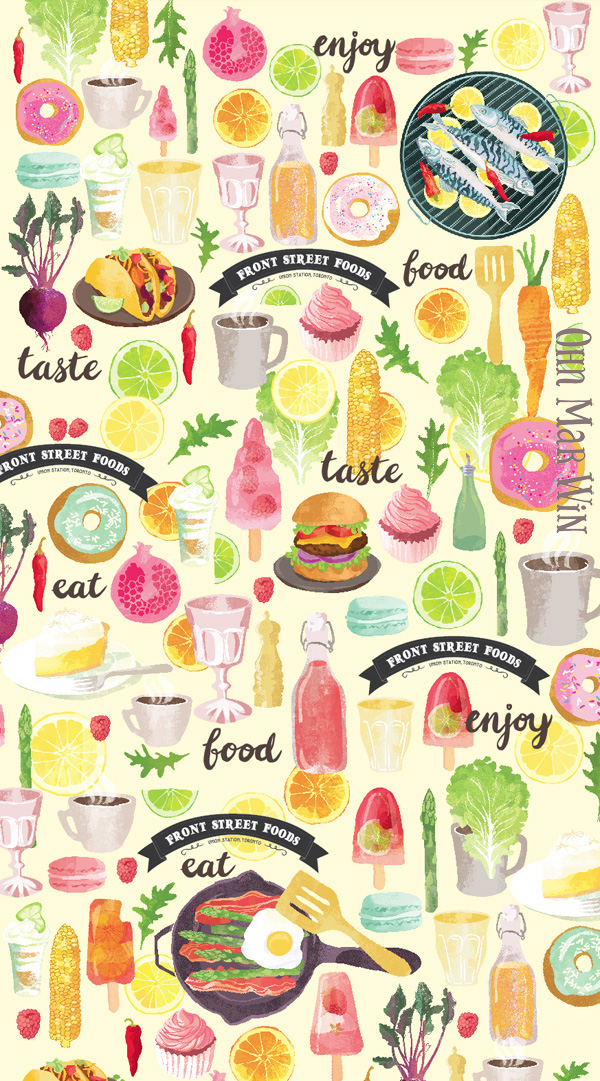
I'm very excited to say I am involved with this summer venture. I illustrated the 80ft x 9ft banner that wraps around some of the food booths. When FRS first approached me we talked through some of the options for the layout of this banner - how best to maximize the dimensions. In the end it was decided that arrangement of food icons in a pattern of sorts would be best to fulfill the need to incorporate as many different foods and beverages.

One of the major considerations was the resolution of all the different images used - potentially a donut could be enlarged to over 2ft across while a raspberry popsicle could be 3 ft high !! The FSF logo also had to be incorporated at various points along the banner together with larger than life gourmet burger, tacos etc and hand lettering. Being mindful of these considerations I randomly repeated over 40 different food icons across the length of the 80ft.

As I am based in the UK I would be most grateful if anyone who lives or will be visiting Toronto between now and August 30th ( maybe during the PanAm Games?) to please email, or post any pics of this banner, and enjoying themselves at this foodie pop up.

Instagram @torontomarketco . Tag me in @ohn_mar_win 

#frontstfoods #frontstreetfoods #unionstation

Email any pics to ohnmar@ohnmarwin.com

MANY MANY THANKS in advance !!!


Tall pins...great tool for illustrators on Pinterest

Just a really quick blog post as I add more of my illustrated recipes from They Draw and Cook to my website. As you may well know the layout for TDAC is very long horizontally (5000px x 1875px ) Not a problem - I love the challenge of finding exciting ways of filling this space.

However I did encounter a small drawback of this format - it doesn't work very well on Pinterest. On this site each image will be displayed at a maximum of 192px wide. My illustrated recipes were not shown in their best light. So with each new blog post and website update I would rearrange the different food, map, sketch etc elements into whats referred to as a 'tall pin.' Pinterest does not restrict the HEIGHT of pins. So if an image is (much) taller than its is wider it will be displayed in a way that will get you a lot of screen space - people will be able to view it for longer as they scroll down.

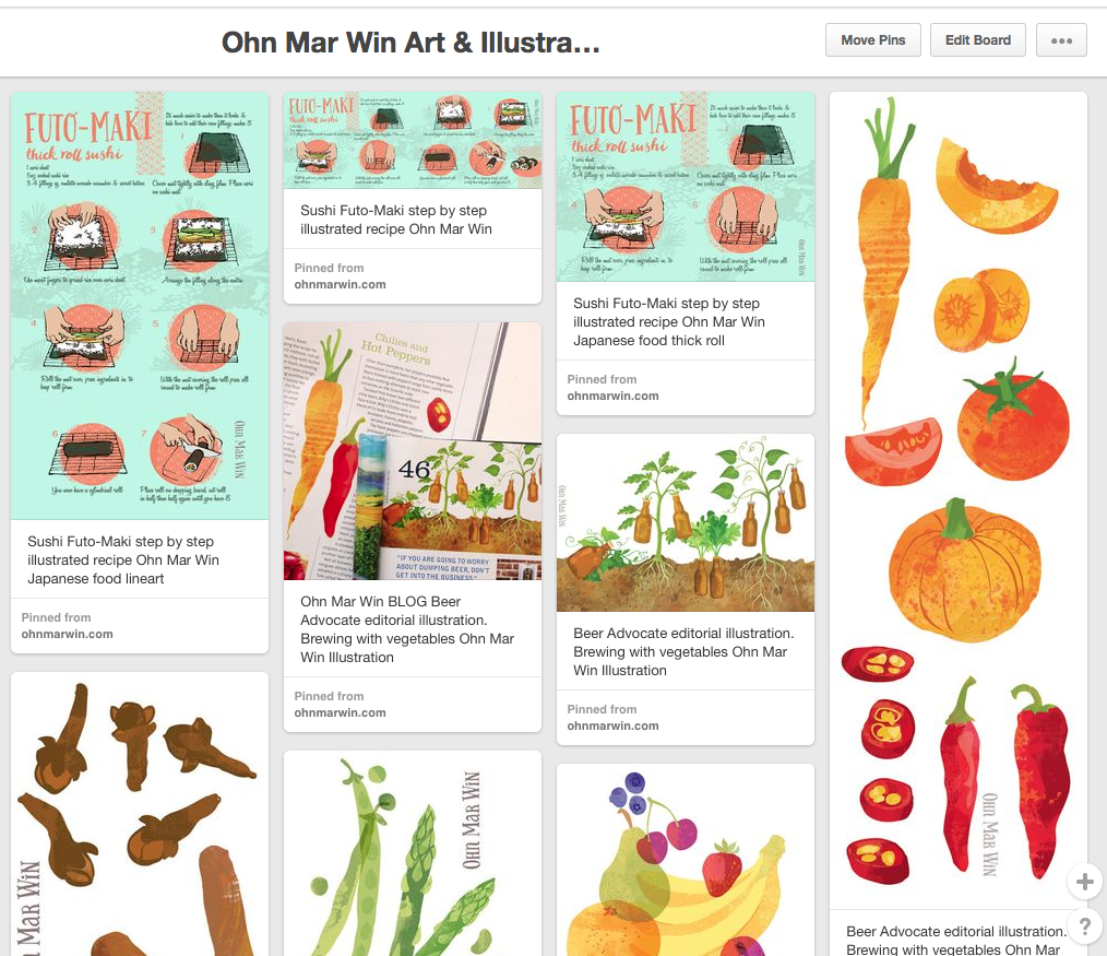
Let me demonstrate with the latest TDAC uploads pinned from my website...

Here the Futo-Maki sushi roll with the TDAC layout is in the middle. To the left you can see a version where I've rearranged the steps vertically so they do indeed take up more screen space.

On the far left are my illustrations from Beer Advocate magazine, and step by step pizza illustrations from TDAC arranged into tall pins - this is how they appear on the Pinterest feed. Both are approx 800-900px tall.

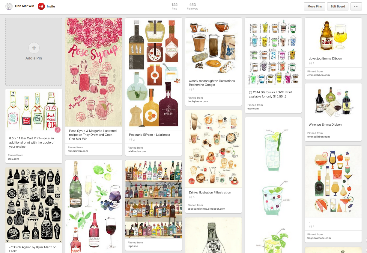
Darn it my Rose Syrup & Margarita illustrated recipe is not quite tall enough in this feed!!

Tall pins are so quick to create out of your existing artwork, and I can vouch that they do pay dividends. Pinterest can be used advantageously like any other social media and I'm certainly open to exploring this platform further.

Beer Advocate Magazine....the beginnings of the TDAC effect?

Way back in February I received an email '....I stumbled across your autumn vegetable illustrations online, and they are exactly what I was looking for so I wanted to get in touch...' It was from Beer Advocate magazine and they wanted me to illustrate an editorial about brewing with vegetables. It was a perfect opportunity & I jumped at the chance.

First of all I was so so excited to hear they had found my work via They Draw and Cook. By late autumn of last year it was dawning on me with TDAC huge following on Facebook (over 200,000 likes) and other social media platforms their reach was wide and varied. As long as I kept producing considered illustration, used the best of my abilities, and kept exploring, then TDAC would be a great vehicle for showing my artwork. And it looks like its beginning to pay off...slow and steady as it is with these things.

So here we are...beer and vegetables. The concept for the leading spread was beer bottles growing like vegetables. And spot illustrations of the vegetables mentioned in the article.

Beer advocate 1
beer advocate 2 veg
beer advocate 4

Finally I want to end on another positive - I am in the middle of another exciting project where the art director found my illustrations on Pinterest, once again via a They Draw and Cook recipe artwork from last year. A Pinterest inspired blog post coming up soon.

ย 

ย 

My They Draw and Cook challenge

Some of you may know that I've submitted a few illustrated recipes to They Draw and Cook over the last year. There wasn't any plan behind the recipes I chose to illustrate - sometimes it was inspired by what was in my vegetable box that week. Other times it was just a random idea I decided to act upon. Either way I very much enjoyed the challenge of filling that 2000 x 1400 pt layout. It helped me to explore my style further and hasten the process I had found. And it was always great to receive great supportive comments from the TDAC team, Salli & Nate.

I saw their newsletter at the beginning of this year which announced some exciting treats, including a new website and the printing of 4 books of recipes by 4 artists under the TDAC banner. Each would contain approx 30 illustrated recipes....well I pretty much dismissed my chances after that as I only had 4 on their site.

However many of my friends thought this would be the perfect vehicle for my work. A WHOLE book filled with my foodie images would be a dream. I started to calculate how long it would take to illustrate 26 recipes. There were submission deadlines for March, June, September and December. Well it turned out I would need to submit ONE RECIPE A WEEK- taking me to the end of July !!!! - to be in with a chance.
At first glance I SERIOUSLY doubted I could handle this pace. In the past its taken me weeks for a single spread while I mull over minor details. It occurred to me that I already had many fruit and vegetable images from collections I have worked on. I could easily adapt and rearrange most of these to suit the recipe. And it could be a whole load of fun.

So I started last week with 'Fruity FIlled Popsicles' as my first submission. This week I decided to make it much simpler with 'Roasted Asparagus with Bacon & Eggs' I only have another 22 recipes left to illustrate. If you would like to follow my challenge look out for #TDACchallenge on Instagram

Good Food Show - part 2....Olive Branch

Near the end of the day eventually found Olive Branch Foods tucked away in the corner of the main hall. They had been left off the plan and index so it was better late than never when I bumped into their booth. I had worked with them earlier in the year on a series of illustrations for their tapenade packaging. And I was lucky enough to be asked again this time to illustrate sweet biscuits, imported from Greece flavoured with orange, almonds and cinnamon. 

I had a huge smile on my face as I saw the jars lined up at their booth and a steady stream of people milling about tasting their products. When I tweeted about my day I realised they had used the biscuits as their cover photo on Twitter which was a lovely end to a rather fun packed jolly day. 

First visit to BBC Good Food Show - part 1

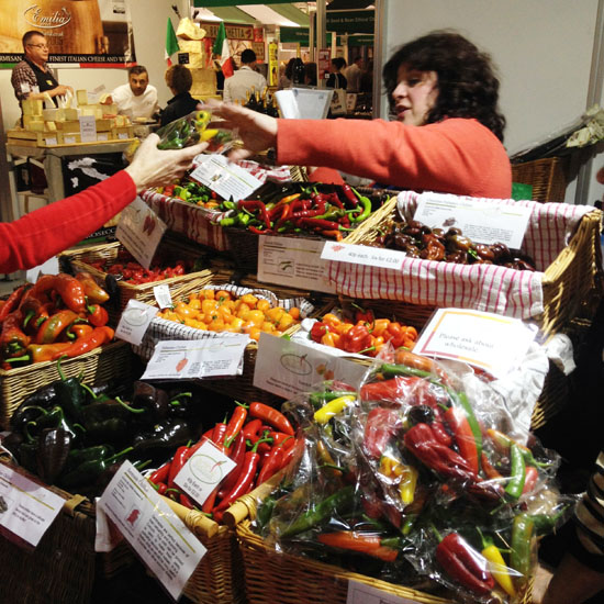
It hadn't occurred to me till a week before the event to attend the Good Food Show at Olympia. As stated previously I do like food and I have been drawing an awful lot of food so visiting the show was surely a win/win situation. I picked up my hastily prepared postcards ( featuring a bowl of fruit below) on the way to the train station. 

I'd been to Olympia exhibition centre last month to check out Brand Licensing Europe which I found very big, brash and corporate. So it was a pleasant surprise not be be greeting by costumed turtles. Instead within half an hour I had sampled artisan cheeses, gins and many health giving anti-oxident filled juices. 

Amongst the other delights I sampled were gourmet fudge, smoked trout, rye breads, cocktails ( amongst many many alcohol samples) and a array of coconut milk based products . After a while I plucked up the courage to ask one of a whole host of chilli sauce & dips producers if they would mind me illustrating their jar in the near future. I received such a positive response when showing them my Instagram photos I was encouraged to ask a few other producers as the day drew to a close including pesto, macaroons, ketchup and a canelles seller.

A few days after the event I'm not entirely sure I have a grand plan of what will follow, but I mulling over several ideas. It was certainly worth visiting, and explore even more flavours.

Why do I draw so much food?

I ADORE food, looking at it, smelling it, tasting it, cooking it. Pretty much ticks all the boxes for me - food is one of my favourite things EVER. There's such a variety of shapes colours and textures that I could never get bored.

Here's the thing - I had many food images in the  1990's ( yes last century!! ) Back in the day when I had to schlep a physical A3 black portfolio around London visiting art editors and senior designers I DID have illustrations of langoustines and pasta, even griddled vegetables with halloumi. I used pen and ink and washes with a bit of wax resist to add texture. Despite being well received I never actually received any editorial commissions - thats the only market I knew back then.

I see right now, in this moment, as a second chance. I'm hoping to use what I've learnt about the different markets in MATS to carve out a niche. Lilla's words are forever ringing in my ear...'find your joy... gotta do what you love (was that Steve Jobs though?) The knowledge of having my work 'out there' makes me feel vulnerable on many levels and I am coming to terms with it. I'm so utterly captivated by the work I'm producing that I am able to find joy in sharing my art which is a good start.

Mulled Cider illustrated recipe

Its taken me a while to get my head round the 'leveraging' my art aspect of this creative business. I was thinking how can I get more work into my portfolio quickly, with maximum impact and create potential work for my (soon) Etsy shop? Answer was create one body of mighty fine work then work it work it (!!) into many different areas/ markets - well thats a plan.

Last month I doodled food for 30 days, and amongst what I drew were cloves, star anise, cinnamon sticks and oranges. My little grey cells had a ponder....it came to me during my entry for last months Tigerprint competition where we were asked to overlay hand lettering over an image. One of them was associated with mulled wine - nice enough image but I felt I could inject a bit more 'flavour'.

spices-TALL.jpg

I knew I wanted to 'overlap' all the different ingredients as 'mulling' really infuses the cider with lovely delicious layers of flavour. Technically it was the most complex illustration I'd done, testing the limits of my Mac's output. It turned out to be a fruit & spice ho-down and I felt there where many wonderful things happening. You can see the full illustrated recipe at They Draw and Cook


Sneak peak of next Foodie project

We get a local vegetable box delivery every week. Its seasonal so we don't always know what to expect. Sometimes theres a real glut and I'm at a loss what to do with the over abundance of a particular veg. This gave me an idea for a recipe thats a little time consuming bit totally worth it as the kids devour the end result within seconds ...which is a win/win situation since they don't realise they've actually eaten vegetables.

I will reveal all in the coming weeks. The sketches were drawn on the kitchen floor with the kids doing there own versions of carrots and beetroot with my brush pens. And a quick play around in PS just now.

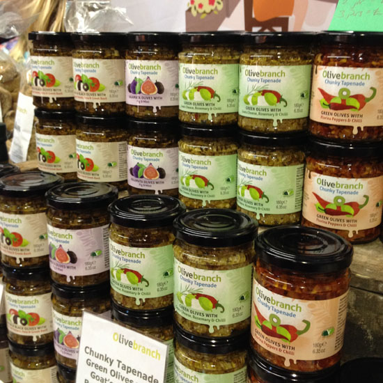
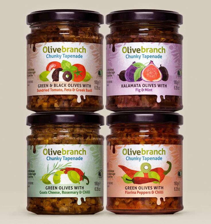
Olive Branch - Chunky olive tapenade packaging

I work with Bright Green Brands now and again who specialise in packaging design, mainly of food products. They had been approached by a small start up company who imported olive based products from small farms in Greece. I had just started using texture in my art and they were very keen to see this new style on the olive jars.

It was a case of illustrating each item separately - olives, rosemary, peppers, feta cheese etc and the designer would put them together in the layout that best suited the product. I have to say it was a very long drawn out process and a steep learning curve.

However I am very pleased with the results and can't wait to actually get my hands on some of these yummy products. Also it will sit very nicely in my portfolio in my quest to gain food & drink editorial illustration commissions in the near future. The photographs of the jars really do them justice too.

JELLYtastic - MARCH Bootcamp

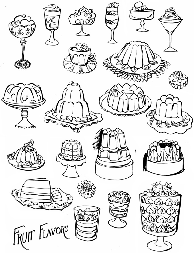
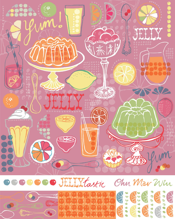
This months assignment started with a mini project to draw jelly moulds, and any associated desserts, and kitcheny stuff ( if we wanted) I left it quite late to start because of greetings cards commitments but had a blast researching the weird and wonderful world of gelatine based foods on Pinterest. I used my trusted brush pen to explore all kinds of translucent beauties.

jelly low OMW

I did have to fight back a small wave of panic when it was revealed the brief was for bolt fabric. I tried to concentrate on Lilla's slogan that 'people buy your joy' and pushed ahead with trying to capture the jelly colours. My 4 year old decided I needed help and joined me in some painterly textures. I was able to use a clipping mask to achieve a really great effect. I'm pretty new to Photoshop so I did find layers & changing hues etc all very frustrating at times.

Week 3 of the course Lilla surprised us with a 'Nougat' colour palette of dusky pinks & neutrals. And a little exercise to create 50 Shades of Taupe !! I've got to be honest this just threw me off course. I just could not see a way through with my icons the way they were - I abandoned them for a few days. I decided on a different path, stick to the basics and enjoy the process rather than getting caught up in making a technical repeat. I was also determined to use some of the new palette and let go of the need for super brights.
Jellytastic OMW

This only the second time I've ever designed for bolt fabric so I'm pretty proud of myself. I'd like to make it into a repeat and mock them up on an apron -just to see if I'd actually wear it! This was a very challenging assignment but I did keep going back to 'finding my joy' core and working from there as its a good place for a flow of ideas. And just keeping the faith that a solution will present itself.

We have a weeks grace before I join MATS B. I have filled up my freezer and plan a mass laundry-thon based on what caused the most domestic headaches last time. I'm learning all the time from the many challenges that MATS and motherhood present.

They Draw & Cook illustration party

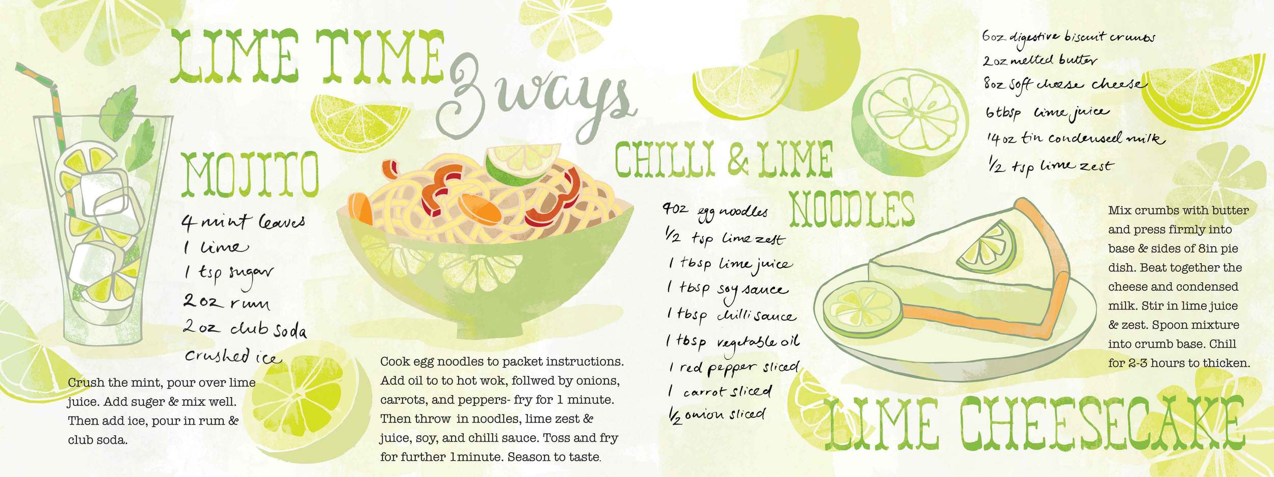
So this is my second competition - they're really making me 'pull my socks up' as we say in the UK. I have been wanting to enter for years, but never had the courage until now. A fellow MATS mate had already entered this Glad sponsored competition where you have to illustrate 3 recipes using the same ingredient. Time was short so I choose lime as I'd drawn quite a few citrus icons for Bootcamp ( more in next blog). I choose the recipes for their easy methods and maximum flavour, and also personal favourites. I really had so much fun and I think it showed. I tend to think about food and travel a lot and very much want to include more in my portfolio. (I'm working in a hush hush foodie illo project that I'll be able to reveal soon)

Mojito OMW
Lime 3 Ways OMW