Tall pins...great tool for illustrators on Pinterest

Just a really quick blog post as I add more of my illustrated recipes from They Draw and Cook to my website. As you may well know the layout for TDAC is very long horizontally (5000px x 1875px ) Not a problem - I love the challenge of finding exciting ways of filling this space.

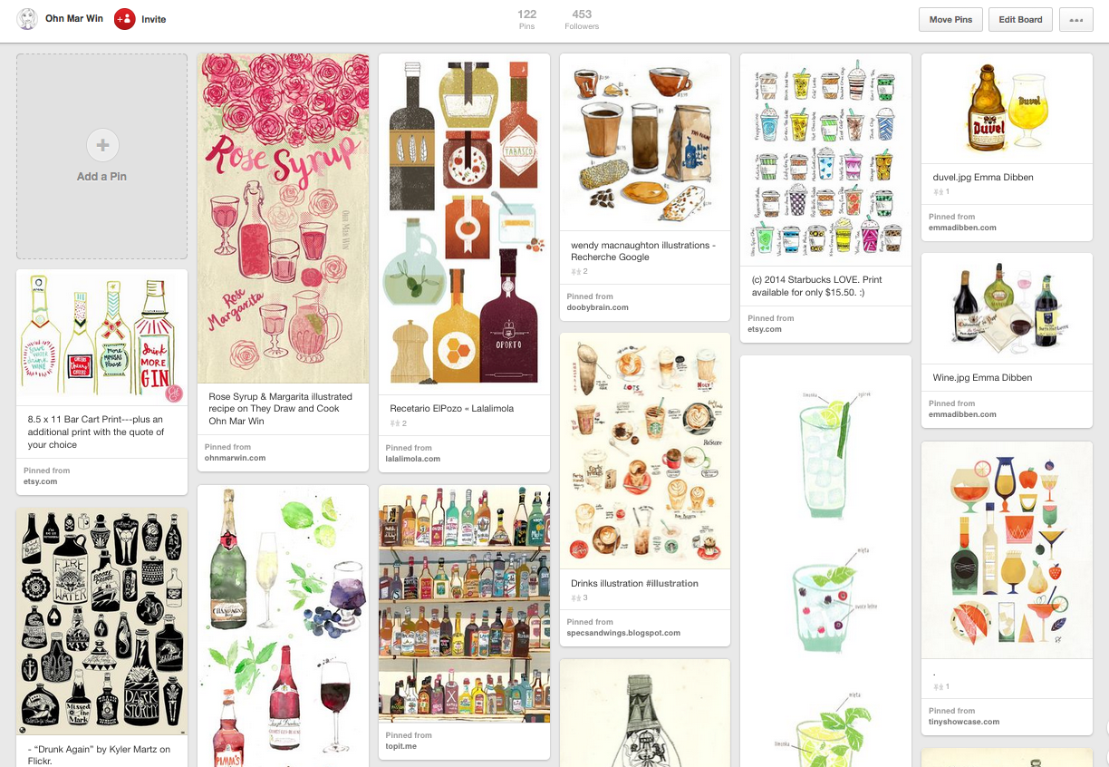
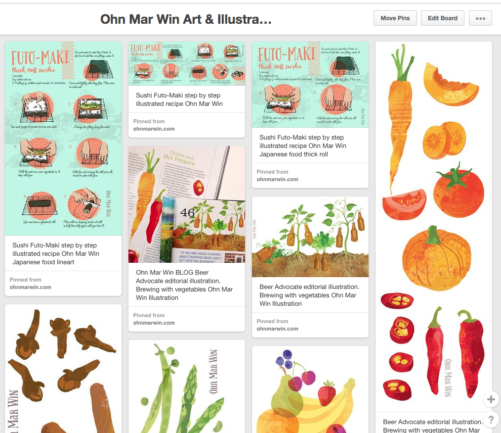
However I did encounter a small drawback of this format - it doesn't work very well on Pinterest. On this site each image will be displayed at a maximum of 192px wide. My illustrated recipes were not shown in their best light. So with each new blog post and website update I would rearrange the different food, map, sketch etc elements into whats referred to as a 'tall pin.' Pinterest does not restrict the HEIGHT of pins. So if an image is (much) taller than its is wider it will be displayed in a way that will get you a lot of screen space - people will be able to view it for longer as they scroll down.

Let me demonstrate with the latest TDAC uploads pinned from my website...

Here the Futo-Maki sushi roll with the TDAC layout is in the middle. To the left you can see a version where I've rearranged the steps vertically so they do indeed take up more screen space.

On the far left are my illustrations from Beer Advocate magazine, and step by step pizza illustrations from TDAC arranged into tall pins - this is how they appear on the Pinterest feed. Both are approx 800-900px tall.

Darn it my Rose Syrup & Margarita illustrated recipe is not quite tall enough in this feed!!

Tall pins are so quick to create out of your existing artwork, and I can vouch that they do pay dividends. Pinterest can be used advantageously like any other social media and I'm certainly open to exploring this platform further.

They Draw & Cook Challenge -update

So last month I wrote about my plan to create a illustrated recipe every week...in the hope of having a book published by They Draw and Cook...well its working out so far. Recipe No 3 was Raspberry & Passionfruit cupcakes which was featured on their Valentines recipe collection. I was able to use the hands making the heart shape from a short animation from last year. And the cupcakes were from a doodle a day exercise from last year also. I'm finally understanding the value of leveraging!

Screen shot 2015-02-20 at 18.25.28.png

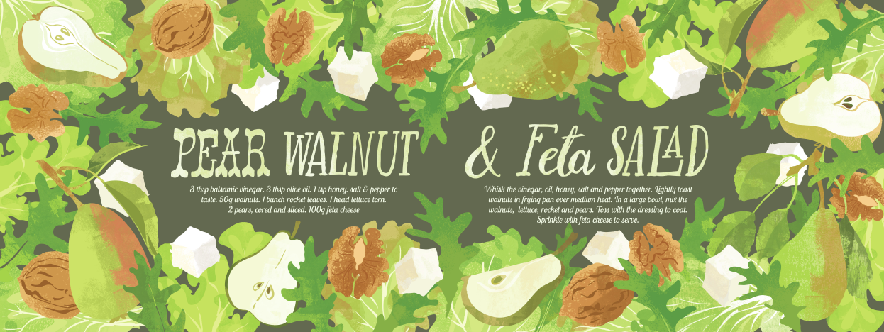
Next up was a crunchy Pear & Walnut Salad. Again the pears were from a Doodle a Day from last Autumn. I did have to come up with rather a lot of various salad leaves and the walnuts.

The next week was Grilled Mackerel with lemon & Chilli. I loved illustrating these mackerel- they are wonderful to cook when super fresh. I was able to use the chilli peppers from a greetings card project. Below are the sketches that I worked from. I have a loose framework of ingredients that I want to work with an have started planning two or three weeks ahead.

Screen shot 2015-02-20 at 18.19.40.png

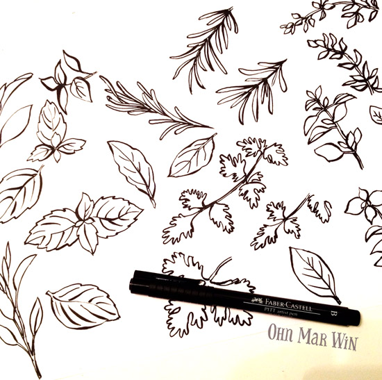
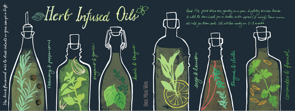
And this weeks was Herb Infused Oils. I had back to back deadlines and knew had had to come up with something simple but effective. I researched the different flavours then in one evening I drew a sheet of herbs and a sheet of various oil bottle shapes.

I have enjoyed researching, planning and trying out new layouts for each recipe. I have learnt to work quicker and hopefully not lose any freshness. Whilst I'm very pleased with these and have played and explored , this month I'm going to try adding some new elements and expand things a little further stylistically.

Mulled Cider illustrated recipe

Its taken me a while to get my head round the 'leveraging' my art aspect of this creative business. I was thinking how can I get more work into my portfolio quickly, with maximum impact and create potential work for my (soon) Etsy shop? Answer was create one body of mighty fine work then work it work it (!!) into many different areas/ markets - well thats a plan.

Last month I doodled food for 30 days, and amongst what I drew were cloves, star anise, cinnamon sticks and oranges. My little grey cells had a ponder....it came to me during my entry for last months Tigerprint competition where we were asked to overlay hand lettering over an image. One of them was associated with mulled wine - nice enough image but I felt I could inject a bit more 'flavour'.

spices-TALL.jpg

I knew I wanted to 'overlap' all the different ingredients as 'mulling' really infuses the cider with lovely delicious layers of flavour. Technically it was the most complex illustration I'd done, testing the limits of my Mac's output. It turned out to be a fruit & spice ho-down and I felt there where many wonderful things happening. You can see the full illustrated recipe at They Draw and Cook