Leverage Pinterest for your Creative Business : Create Successful Pins

Last month I updated or rather replaced my older ‘Tall Pins’ Pinterest Skillshare class with a newer version. It includes all the recent updates and best practices that I’ve learnt over the last 5 years that I’ve been using Pinterest for my illustration & design business. Click on the link below for this new Skillshare class.

Leverage Pinterest for your Creative Business: Strategies for Attracting Clients

Pinterest header SQUARE.jpg


I put forward the notion that Pinterest is actually more of a search engine than a social media platform. And it’s a platform that many art directors, as well as your potential clients and customers turn to first when looking for art, design or illustration. This NEW class gives an informative overview and effective actions to make the most of Pinterest for your creative business. We will dive into the many valuable features it offers for your work to be seen by the right people such as :

- a compelling profile

- creating discoverable boards

- preparing effective pins

- pinning regularly

I used these same tactics outlined in my class and grew my monthly viewers from 479k to 651k in 6 weeks with over 1,500 clicks back to my website in that time.

When I took students through a 14 Day Challenge to implement some of the tips I outlined, many of them were surprised by the results. Most started this challenge with just a few hundred viewers but saw huge increase in their monthly viewers numbers. Below is Misty Segura Bowers example. She started with 907 monthly viewers and had grew her viewers to 11k by the end of the 14 days (and as of writing was up to 16.6k viewers)

7ed71fa7.jpeg

However this update does mean you can no longer view my top tips for creating what were called ‘Tall Pins’ (these now frowned upon by Pinterest) - lets call them optimal pins now. Users who scroll through their Pinterest feed are looking for beautiful images that represent the things they like or want to learn about. Catch their eye with great visuals from your own pictures or images you create with free online tools like Canva or PicMonkey. Here’s my TOP TIPS FOR CREATING SUCCESSFUL PINS


Create Sucessful Pins.png
  1. Vertical Pins are more likely to be repinned than horizontal Pins. They take up more ‘real estate’ in the Pinterest feed and stand out more effectively.

  2. Pinterest states that the ideal pin size is a 2:3 ratio (say 600x900 pixels)

  3. When creating your vertical Pin, think about how to best show off your art and how it’ll look from the user’s perspective. Your user could be a art director or any other potential client/ customer searching for your creative service

  4. When creating a Optimal Pin from your art - don’t forget to add a watermark / logo/ domain, or Business name

  5. I always create a variety of pins using the same art as I find one of them will perform much better than the others ( you just can’t tell sometimes) - see below for what I created today

  6. Arrange your art in a eye catching manner, I find simple is often the most effective.

  7. The most popular pins for me are usually on a light for white background - see below for what I created today

  8. The pin descriptions for most of my pins start with a ‘proper’ sentence which I feel Pinterest favours. You can add hashtags at the end

Screen Shot 2019-08-07 at 17.41.58.png

I hope this Pinterest post will have been useful for you wherever you art in your art journey. Please understand my Pinterest viewers numbers have come about after years on the platform and I’m selective in what I pin.. However it remains my favourite platform for attracting my ideal clients, in packaging, branding and licensing.

Its been quite a while since I published a blog post but its certainly something I’d like to take up again, so stay tuned for more helpful info.

Considerations for Tall Pins and (one) Easy Way to create them

Since folks found the last post about tall pins useful I've added a few more details you may want to be mindful of...

1 - Try to keep the essence of the original illustration/ pattern

This was for the Feast aspect of They Draw and Cook - the normal layout spread....but now rearranged first to this....

...but also this to make best use of viewing in different social media platforms and devices...

2) Create in 'squarish' and 'tallish' formats

3) Make it 'decorative' and appealing

4) Don't forgot your watermark logo

5) Pin all versions for better chance in searches

6) Don't forget to add a brief description to describe your work with key words when you pin

Depending on how I feel about the layout I often place PS artwork into Ai which makes it easier for me to move aspects around....especially when it comes to re-formatting image options for my website and pinning...

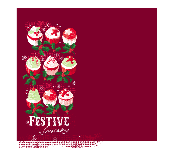
....I take a SCREEN SHOT of the group on the left...

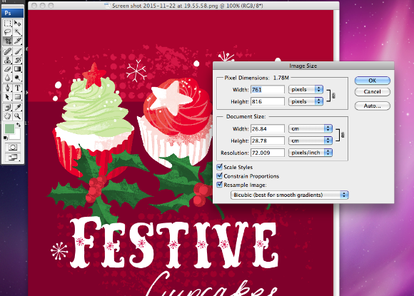
....the screen shot comes out at almost 72dpi. You can leave it as it is or reduce the dimensions slightly .....

Screen shot 2015-11-22 at 19.55.58.png

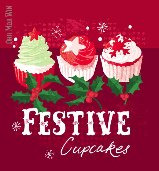
....arrange the cupcakes into a tallish format and take a screen shot....

I'm sure there are other ways to set up images for portfolio websites but this method works for me. So I have just uploaded these images onto my website and pinned directly from there onto my Love Food Illustration and Food Pattern boards on Pinterest.

Screen shot 2015-11-22 at 20.00.50.png

Useful Pinterest advice for designers and illustrators


A few days ago I made a short video on Periscope about Pinterest, tall pins and foodie illustrations. As these videos are only around for 24 hours I've decided to blog about the main points I mentioned, as many folks found it very useful.

I'd like to point out one important aspect of Pinterest:  approx 80% of pins on Pinterest are repins, so the image has kind of been 'recycled' over and over which is great as that's how your work is spread, and found in searches. So only 20% of pins are 'new' - they have been DIRECTLY uploaded onto Pinterest from a website or blog or shop. I do not have any marketing background -  this blog post is just based from my own experience...and I'm not saying this is the correct way or the only way.

First of all I'd like to point out that 8.5k followers is really not that many, there are other creatives with 50k+ followers. I feel my boards are representative of my major interests as a illustrator, and the sort of work I'm wanting to attract as well. I have my own illustrations on a board first then Love Food Illustrations, Pattern and Print, Creative Cards...etc based on how many pins I have on each board.

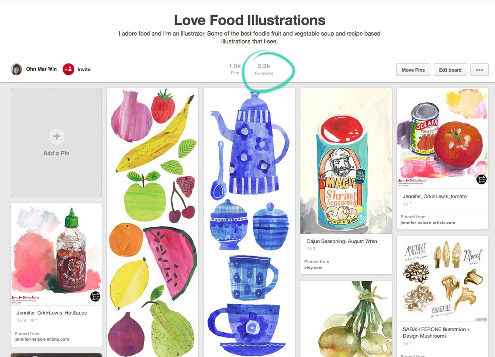
This is my Love Food Illustrations board with its 2.2k followers -I really am a small fish. However I believe its one of the larger food illustrations boards on Pinterest.

I've circled this pin as I want to point out the TDAC layout ( and you know I have a loads of recipes on TDAC) is not the most advantageous format for Pinterest. Which leads me onto this other interesting fact. It's thought that 50 - 80% of Pinterest users use their mobile device - so that's why I think its best to maximize your artwork for different devices and social media platforms. I have blogged about 'tall pins' previously and they are still play an important part - they take up far more space on a feed so viewers would most likely linger on it (create at 72dpi approx 500px wide by approx 1500px high)

Another example of an artist reformatting their TDAC piece into a tall pin is Rachael Schafer

OMW pin15.jpg

...which ended up on this board...with over 13k followers

OMW pin16.jpg

Here we have Harriet Mellor's Infused Waters tall pin (again refomatted from a TDAC recipe layout)....

Clicking on the image will bring up this window that shows its been re-pinned 18 times (from my Love Food board) and gives the option of visiting Harriet's website. Clicking on the '18' will bring up this ....

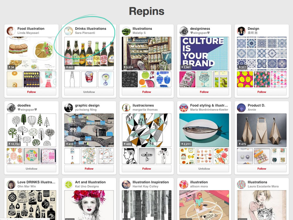
These are the 18 boards and pinners who have pinned the Infused Waters. Note Sara Piersanti's Drinks Illustration board....it has over 57k followers!!

Moving onto my Pattern and Print board with just 1k followers...and Nic Squirrell's tall pin of watercolour birds...

It was repinned onto this board which has 17k followers...

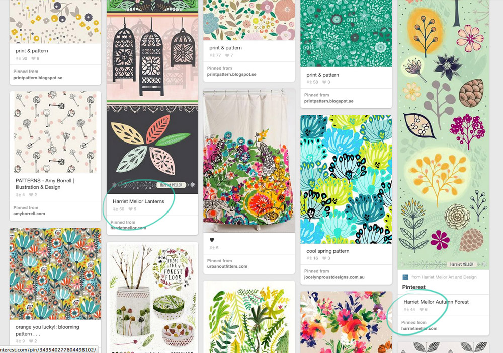
And as we scroll down my Pattern and Print board more of Harriet's tall pins which are proving popular...

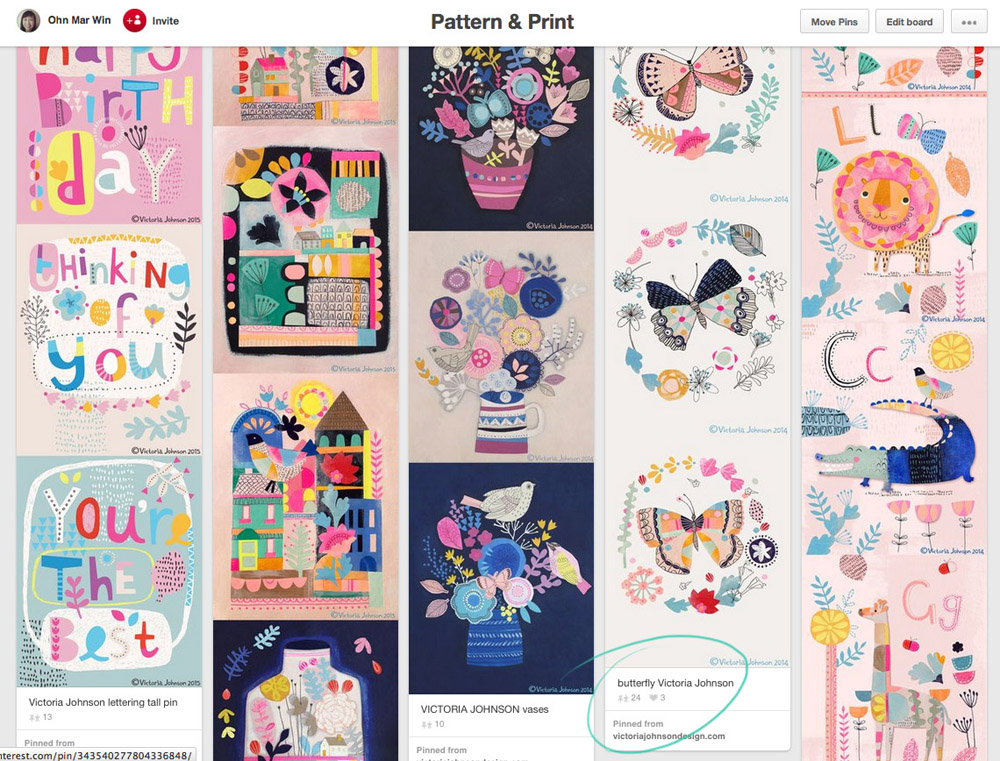
....and scrolling down further is Victoria Johnson's Butterflies tall pin which has been re-pinned 23 times...

OMW pin11.jpg

Here are the boards it was repinned onto...one of which has over 14k followers

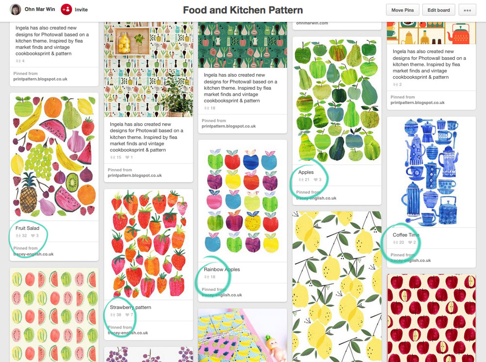
Now moving onto my Food Kitchen Pattern board which was created as I felt there was too much overlap with the Love Food board and I create many patterns with food myself.

As you can see Tracey English's art is very popular and was repinned onto a board with 5.7k followers

I'm not claiming that creating tall pins and having pins picked up by much bigger pinners is a guarantee of success. However because of the way Pinterest's algorithm is set up, art that has been pinned the most and most recently will come higher up in searches! That's something to bare in mind when seen from the viewpoint of a potential commissioning editor or art director.

A little bit of effort on your part could pay dividends as getting seen by the right people is surely a wonderful thing. Please be assured it does happen. As I mentioned at the beginning of this post I am not a big player in the Pinterest stakes BUT as I have a food illustration niche, bigger players follow the Love Food Illustration board in particular. So if you feel inclined to create a tall pin on a foodie or pattern theme please send them my way and I will gladly pin!


Tall pins...great tool for illustrators on Pinterest

Just a really quick blog post as I add more of my illustrated recipes from They Draw and Cook to my website. As you may well know the layout for TDAC is very long horizontally (5000px x 1875px ) Not a problem - I love the challenge of finding exciting ways of filling this space.

However I did encounter a small drawback of this format - it doesn't work very well on Pinterest. On this site each image will be displayed at a maximum of 192px wide. My illustrated recipes were not shown in their best light. So with each new blog post and website update I would rearrange the different food, map, sketch etc elements into whats referred to as a 'tall pin.' Pinterest does not restrict the HEIGHT of pins. So if an image is (much) taller than its is wider it will be displayed in a way that will get you a lot of screen space - people will be able to view it for longer as they scroll down.

Let me demonstrate with the latest TDAC uploads pinned from my website...

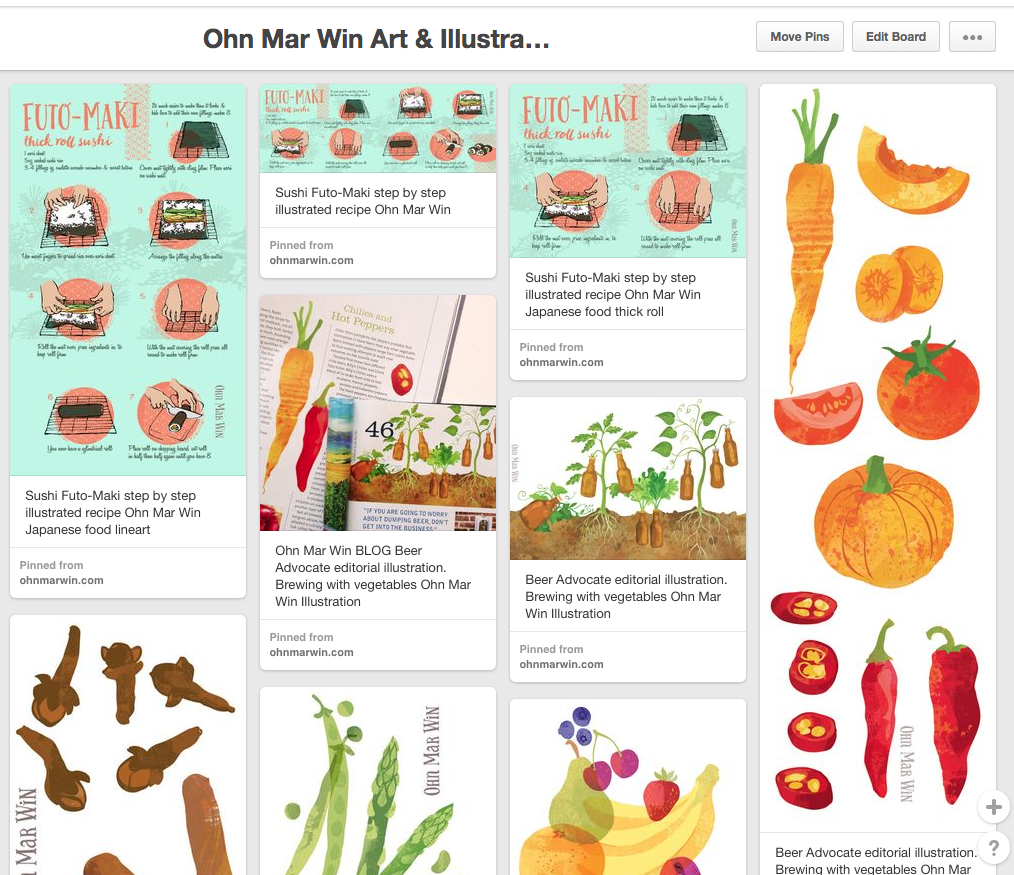
Here the Futo-Maki sushi roll with the TDAC layout is in the middle. To the left you can see a version where I've rearranged the steps vertically so they do indeed take up more screen space.

On the far left are my illustrations from Beer Advocate magazine, and step by step pizza illustrations from TDAC arranged into tall pins - this is how they appear on the Pinterest feed. Both are approx 800-900px tall.

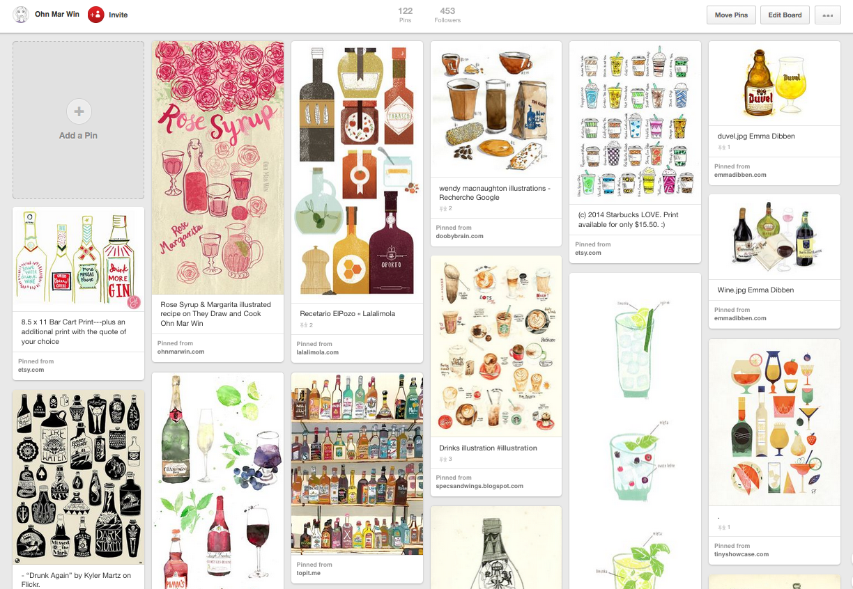
Darn it my Rose Syrup & Margarita illustrated recipe is not quite tall enough in this feed!!

Tall pins are so quick to create out of your existing artwork, and I can vouch that they do pay dividends. Pinterest can be used advantageously like any other social media and I'm certainly open to exploring this platform further.