Since folks found the last post about tall pins useful I've added a few more details you may want to be mindful of...
1 - Try to keep the essence of the original illustration/ pattern
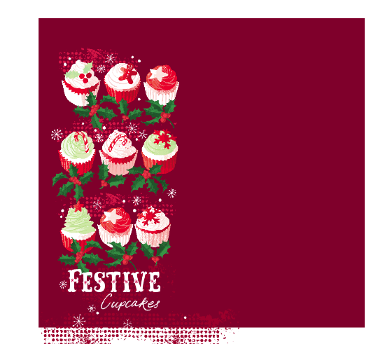
This was for the Feast aspect of They Draw and Cook - the normal layout spread....but now rearranged first to this....
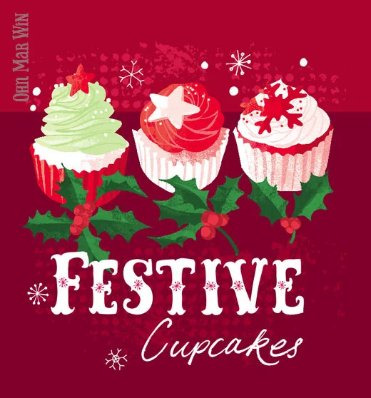
...but also this to make best use of viewing in different social media platforms and devices...
2) Create in 'squarish' and 'tallish' formats
3) Make it 'decorative' and appealing
4) Don't forgot your watermark logo
5) Pin all versions for better chance in searches
6) Don't forget to add a brief description to describe your work with key words when you pin
Depending on how I feel about the layout I often place PS artwork into Ai which makes it easier for me to move aspects around....especially when it comes to re-formatting image options for my website and pinning...
....I take a SCREEN SHOT of the group on the left...
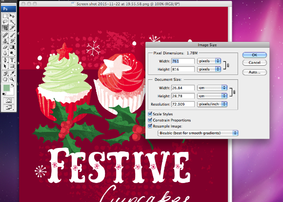
....the screen shot comes out at almost 72dpi. You can leave it as it is or reduce the dimensions slightly .....
....arrange the cupcakes into a tallish format and take a screen shot....
I'm sure there are other ways to set up images for portfolio websites but this method works for me. So I have just uploaded these images onto my website and pinned directly from there onto my Love Food Illustration and Food Pattern boards on Pinterest.


