'The Theory of Everything', Cambridge and working pretty darned quickly...

The opening scenes of 'The Theory of Everything' sees a young Stephan Hawking and his friend on their bikes race through the streets of 1960's Cambridge, along 'The Backs' with Kings College in the background and through the back gate of Trinity College ( I think). I enjoyed the film immensely on many levels. The re-occuring motifs of concentric circles and spirals reflect Professor Hawking's fascination with black holes and abstract ( for me) thoughts about Time.

I had not drawn any of Cambridge's iconic buildings for many many years but felt rather moved to do so after watching 'The History of Everything.' My father worked near Market Square & we would often go for the afternoon in the warmer months. I was also fortunate enough to attend a year's Foundation Course in Art in Cambridge over 20 years ago. One morning a week ( in all weather's I might add) we were sent out to the Botanic Gardens, Fitzwilliam Museum or people watching Parkers Piece or any number of places in Cambridge to hone our drawing skills. So I have many fond memories of this wonderful place.

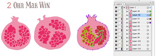
I had been meaning to create a map of this university town for years. And even when I decided to go for it I realised I had to hasten my renderings due to other work deadlines. So instead of transferring elements onto different layers I decide to work much simpler and leave out several stages, working more closely from my sketches - I'll use Kings College as an example...

Initial sketch of King's drawn in brush pen & live traced in Ai

Initial sketch of King's drawn in brush pen & live traced in Ai

The bottom 'layer' or outline as such has been taken away leaving the 'inner' sections of the sketch. Now exported to PS

The bottom 'layer' or outline as such has been taken away leaving the 'inner' sections of the sketch. Now exported to PS

Working in different (& fewer) layers with clipping masks I was able to add colour & texture

Working in different (& fewer) layers with clipping masks I was able to add colour & texture

I felt it still retained the spirit of the sketch ( yes... my Kings College is wonky) and I was able to render the other highlights of my map in this manner and save a huge about of time. It also made me less precious of every detail (aka less anal) I'm pretty proud of my map as it highlights my favourite places and I make a pilgrimage of sorts every year.

Spoonflower Surprise...& sci fi geekery.

On my list of things in 2015 to do was enter a few Spoonflower contests. I was going to check well in advance to see if there were any that grabbed my attention. When I saw 'rockets' I knew that was going to be my first competition.

I really really do love sci fi. The first film I ever watched on a top loading video player was 'The Empire Strikes Back' - heck I didn't even speak much English then, but I was captivated and just understood that Hoth was a secret base. I pretty much watch any sci movies from Flash Gordon ( with Queen soundtrack) to Blade Runner to Intersteller. Maybe its the imagination involved or it just makes me think...I am a bit of a geek in this area.

It also reminds me of being a kid in the early eighties and charging around with my cousins and cheap plastic market bought ray guns ( of course I wanted be Leia with a blaster) So on this nostalgic vibe I made some sketches of vintage tin rocket toys. And I also sought out early imaginings of astronauts and ray guns.

I specifically wanted a vintage colour palette to compliment the older style rockets, and adapted one from a print by Lucienne Day. Again I chickened out and did a simple repeat pulling out different elements from the rocket and adding a numbers countdown.

I was really pleased with the vintage feel I was able to capture. I might here that this is only the third time I've entered Spoonflower - I entered because I liked the subject of rockets and again to become more comfortable with pattern making. So I pretty much fell of my chair when I received an email saying I was in the top 10 ( I was 5th overall) I was  utterly flabbergasted when I received many comments of congratulations from the Spoonflower community. This was not planned - it did not even occur to me that this could happen so I was very very grateful for everyone who voted. I certainly feel more confident about entering future Spoonflower competitions.


My They Draw and Cook challenge

Some of you may know that I've submitted a few illustrated recipes to They Draw and Cook over the last year. There wasn't any plan behind the recipes I chose to illustrate - sometimes it was inspired by what was in my vegetable box that week. Other times it was just a random idea I decided to act upon. Either way I very much enjoyed the challenge of filling that 2000 x 1400 pt layout. It helped me to explore my style further and hasten the process I had found. And it was always great to receive great supportive comments from the TDAC team, Salli & Nate.

I saw their newsletter at the beginning of this year which announced some exciting treats, including a new website and the printing of 4 books of recipes by 4 artists under the TDAC banner. Each would contain approx 30 illustrated recipes....well I pretty much dismissed my chances after that as I only had 4 on their site.

However many of my friends thought this would be the perfect vehicle for my work. A WHOLE book filled with my foodie images would be a dream. I started to calculate how long it would take to illustrate 26 recipes. There were submission deadlines for March, June, September and December. Well it turned out I would need to submit ONE RECIPE A WEEK- taking me to the end of July !!!! - to be in with a chance.

At first glance I SERIOUSLY doubted I could handle this pace. In the past its taken me weeks for a single spread while I mull over minor details. It occurred to me that I already had many fruit and vegetable images from collections I have worked on. I could easily adapt and rearrange most of these to suit the recipe. And it could be a whole load of fun.

So I started last week with 'Fruity FIlled Popsicles' as my first submission. This week I decided to make it much simpler with 'Roasted Asparagus with Bacon & Eggs' I only have another 22 recipes left to illustrate. If you would like to follow my challenge look out for #TDACchallenge on Instagram

Unexpected results from Elizabeth Olwens Skillshare class

For ages I had been meaning to use my free months of classes with Skillshare that a friend had gifted me. And late last year I was invited to join 'In Da House' Facebook group to produce designs based on houses which are trending at the moment. I'm afraid I never did anything about either until two weeks ago. But the two options seemed to fit in quite purposefully when I activated my Skillshare account.

I chose to start with Elizabeth Olwen's Skillshare class as I do lack confidence creating patterns ( I know even now) She's a great teacher with many useful tips which I was able to incorporate when selecting my layout. However I decided to ignore her recommendation NOT to use Livetrace as I felt she was referring to pencil sketches. I pretty much rely on my brush pen or dip pen and ink.

I chose Paris as I have many many fond memories of time spent there over the last 20 years. The streets are so elegant, full of character, and with much attention to detail. You can read more about my process here on the Skillshare site. So I uploaded my final project and thought 'nice project' and didn't expect much feedback. There were a few 'likes' and nice comments so I was pleased anyhow.

However I got rather a shock when it was the featured student project on Skillshare's Instagram feed just a few days later. There were a flurry of more' likes' and more super supportive comments. It gets better... 'Parisian Houses' was then featured on their email as a trending project. I suddenly had new followers on my Instagram, and the numbers have been steadily climbing since.

Screen shot 2015-01-23 at 10.32.34.png
Screen shot 2015-01-23 at 10.17.32.png

All this was certainly unexpected and unplanned. But I'm very grateful for the way its all worked out- even if it could be a fluke.  I feel this could platform could be great for of self promotion. One thing I noticed is there are over 7,000 students enrolled into this class (at time of this bog) but only 157 student projects in the gallery. In fact this seems to be the trend. In the next class I aim to take by Mary Kate McDevitt there are well over 6,00students enrolled but only 50 projects in the class gallery. Why don't people post their projects? Since that is the only way other students and the teachers themselves will understand your process and the finished result. Yes by doing so you would be open to being vulnerable if you don't feel you aren't receive 'likes'. In this instance I choose to be brave and show the Skillshare community and feel I reaped some pretty cool rewards.

Visiting Top Drawer 2015

This year Top Drawer and Home were held in London Olympia, which as I found out is a much much larger venue then Earls Court (where it was in previous years) If I'd known I would have worn comfy shoes- it felt like I'd walked miles by the end of the day.

I met my friend Nic Squirrel and marched past gifts and toys to the greetings card area. Oh my gosh there were rows and rows of eye candy. Luckily I had been stalking a few of the card companies on Instagram and Twitter in the last fortnight and it seemed a great way to strike up a conversation. Jessica Hogarth kindly chatted to me briefly about manufacturing and the quality of her drawing skills over the years.

I was amazed at the sheer amount of beautiful work at Stop The Clocks booth. Most of the designs were on a light or neutral background which gave all of their collections a very unified and harmonious look.

I finally found Nella cards run by Belinda and James at the very far end of the hall. Belinda was my first design manager when I was fresh out of college and we've kept in touch over the years. They gave me a brief glimpse of the highs and lows of manufacturing, dealing with buyers and handling stock. What came across from everyone who was kind enough to talk to me was how much hard work there is involved - I totally salute them for their sheer dedication.

There were also amazing booths in the gift section - I'd forgotten how much I liked ceramics. One of my favourites was by Magpie - I pretty much wanted to everything they were showing. The Gift section was vast and varied from candles and teepees to rugs. I just couldn't take it all in and was suffering from visual exhaustion by the time I reached the Home section.

Tigerprint Say It With Words...competition

It was only last week I saw the details of this months competition - a different way of putting forward a sentimental phrase in a typographic setting. Oh gosh I'm such a sucker of hand lettering I couldn't resist.

First of all was finding a phrase...how does one say 'Happy Birthday' differently? Or any of the other dozen key greetings that come up time and time again. I settled on '365 days Older and Wiser' which is quite polite and not at all offensive as one tots up the years ( and grey hairs) Again I went down the vintage inspired route with a male recipient in mind. 

At the weekend I came up with something quite daft - still thinking along the lines of a sentiment with a twist. I felt the slang 'totes adorbs' could be used on a New Baby card. Keeping it simple and more modern in approach. I had fun with this one too.

Good Food Show - part 2....Olive Branch

Near the end of the day eventually found Olive Branch Foods tucked away in the corner of the main hall. They had been left off the plan and index so it was better late than never when I bumped into their booth. I had worked with them earlier in the year on a series of illustrations for their tapenade packaging. And I was lucky enough to be asked again this time to illustrate sweet biscuits, imported from Greece flavoured with orange, almonds and cinnamon. 

I had a huge smile on my face as I saw the jars lined up at their booth and a steady stream of people milling about tasting their products. When I tweeted about my day I realised they had used the biscuits as their cover photo on Twitter which was a lovely end to a rather fun packed jolly day. 

First visit to BBC Good Food Show - part 1

It hadn't occurred to me till a week before the event to attend the Good Food Show at Olympia. As stated previously I do like food and I have been drawing an awful lot of food so visiting the show was surely a win/win situation. I picked up my hastily prepared postcards ( featuring a bowl of fruit below) on the way to the train station. 

I'd been to Olympia exhibition centre last month to check out Brand Licensing Europe which I found very big, brash and corporate. So it was a pleasant surprise not be be greeting by costumed turtles. Instead within half an hour I had sampled artisan cheeses, gins and many health giving anti-oxident filled juices. 

Amongst the other delights I sampled were gourmet fudge, smoked trout, rye breads, cocktails ( amongst many many alcohol samples) and a array of coconut milk based products . After a while I plucked up the courage to ask one of a whole host of chilli sauce & dips producers if they would mind me illustrating their jar in the near future. I received such a positive response when showing them my Instagram photos I was encouraged to ask a few other producers as the day drew to a close including pesto, macaroons, ketchup and a canelles seller.

A few days after the event I'm not entirely sure I have a grand plan of what will follow, but I mulling over several ideas. It was certainly worth visiting, and explore even more flavours.

Why do I draw so much food?

I ADORE food, looking at it, smelling it, tasting it, cooking it. Pretty much ticks all the boxes for me - food is one of my favourite things EVER. There's such a variety of shapes colours and textures that I could never get bored.

Here's the thing - I had many food images in the  1990's ( yes last century!! ) Back in the day when I had to schlep a physical A3 black portfolio around London visiting art editors and senior designers I DID have illustrations of langoustines and pasta, even griddled vegetables with halloumi. I used pen and ink and washes with a bit of wax resist to add texture. Despite being well received I never actually received any editorial commissions - thats the only market I knew back then.

I see right now, in this moment, as a second chance. I'm hoping to use what I've learnt about the different markets in MATS to carve out a niche. Lilla's words are forever ringing in my ear...'find your joy... gotta do what you love (was that Steve Jobs though?) The knowledge of having my work 'out there' makes me feel vulnerable on many levels and I am coming to terms with it. I'm so utterly captivated by the work I'm producing that I am able to find joy in sharing my art which is a good start.

How I achieve my textures....

Since I've been posting images on Instagram I've received quite a few questions about how I add textures to my work. Its been evolving since last year when I took several Skillshare classes to improve my Ai and PS skills, which were fairly basic. Although the classes were not directly related to what I had in mind ( they were for hand lettering and drawing a character) its been a great spring board for the textural vibe I've always wanted to achieve. 

This is just a quick run down of the process using the pomegranates from the mulled wine. Most of what I do is trial and error with much use of the comd+z keys.

1) Make good pen and ink drawings so its easy to scan

2)Live trace in Ai and 'release to layers' then export to PS tick 'write layers' in options

pom step 3.jpg

3) In PS use different texture brushes depending on what is desired.

Like I said its a learning curve and the more art I do the more i learn - its fun.

Mulled Cider illustrated recipe

Its taken me a while to get my head round the 'leveraging' my art aspect of this creative business. I was thinking how can I get more work into my portfolio quickly, with maximum impact and create potential work for my (soon) Etsy shop? Answer was create one body of mighty fine work then work it work it (!!) into many different areas/ markets - well thats a plan.

Last month I doodled food for 30 days, and amongst what I drew were cloves, star anise, cinnamon sticks and oranges. My little grey cells had a ponder....it came to me during my entry for last months Tigerprint competition where we were asked to overlay hand lettering over an image. One of them was associated with mulled wine - nice enough image but I felt I could inject a bit more 'flavour'.

spices-TALL.jpg

I knew I wanted to 'overlap' all the different ingredients as 'mulling' really infuses the cider with lovely delicious layers of flavour. Technically it was the most complex illustration I'd done, testing the limits of my Mac's output. It turned out to be a fruit & spice ho-down and I felt there where many wonderful things happening. You can see the full illustrated recipe at They Draw and Cook


Tigerprint Christmas typography competition

Its been many months since I felt an itch to enter a Tigerprint competition. I couldn't pass this one up. It was for Christmas inspired typography to be placed over photographic imagery that they kindly provided. I was immediately drawn to the sliced apples and mulling spices. I love mulled wine and always make large batches for friends during the festivities. It evokes a nostalgia for Dickens inspired Christmas', so I used that as my starting point.

Using vintage type from my Pinterest board I was able to compile a layout that worked around the apples. I also didn't realise the deadline was a day earlier than I had noted down. I was in a mild state of panic as I hurried to upload and did not have as much time as I would have liked for a second typographic layout. Neverless I am pleased to have applied my hand lettering in this manner.

A whole month of FOOD doodles....on Instagram

I can't believe we have skipped over into October and its been a while since my last blog. Which is kinda good as I have been very busy with lots of submissions for greetings cards for Spring 2015 ranges amongst other things. 

One of my small successes was 30 days of food doodles which I posted on Instagram everyday. And I gradually worked out how to link onto Twitter and my business Facebook page too. I didn't set out with a grand plan of what to draw it just evolved every few days. I think one of the most popular items were well known English biscuits - which lead to many followers.

Here's a few more high lights from the last months of sketches - some of which were for a live brief. I feel I can now take take these doodles and turn then into art in the next few weeks which excites me and ca't wait to make a start.

What I'm learning from Pinterest

I started 'pinning' Pinterest with an earnest 2 years ago when my youngest was only small, as a way of dipping my toe back into the creative pool so to speak. I was pinning anything that caught my eye, places I'd been, or wanted to go. How I wanted my future studio look, food photography, children's picture books, and pics from Print and Pattern most days.

So what I have now is a Pinterest home page arranged (mainly ) in volume of pins I have on each board. Taking a step back I'm now able to see where my real interests are. Here it is ....

I was mulling over what my next 30 day challenge would be (for October) and the answer was there staring at me....I will reveal on September 30th. Not only is it good for inspiration it gives me valuable clues about my taste that I'm not even aware of. 

A little while ago a few of my friends started Monica Lee's Smart Creative women e-course. I very much wanted to join them but felt as it overlapped the school hols I would not be able to give it my full attention. However I asked two of them to help compile a 'nature' board based in part on childhood memories, pics that resonated with me and particular areas that grabbed my attention. As I mentioned I was surprised by what the collective images revealed.

You can see the full version here...

What transpired is I am very much influenced by my early childhood in Burma (Myanmar) when I lived with both sets of grandparents for extended periods of time. One lived in the north on Burma's longest and most important river- the Irrawaddy, so there were images of water, fishing and lush forests as backdrops. The other lived in Rangoon - her garden was an oasis of greenery and orchids set north of that bustling city. It seems even now 35 years later I just gravitate towards these images like its part of my DNA.

My friend  Vivayne had these words to say...'I see common lines there like parallel lines and or gradual building up of, as if everything is leading up to something, like you see the details but also see the big picture.'

Another surprising conclusion that my friend Jacqui Crocetta found was the link between my appreciation of geology and love of scuba diving and future adventures ...'I think it's important to feel grounded so that you can fly. We need roots and wings....By feeling grounded you can release a long tether that gives you the freedom to explore while still feeling connected and at peace...'

At this stage I am unsure how to use this new found information but never the less I feel it has been an important eye opener for possible future directions.

Monthly doodle challenge - September is FOOD

Another month another daily doodle challenge, and as expected I'm thoroughly enjoying it. Many of these were found in my weekly veg box, from our garden or foraged. I'm finding its a great way of keeping the art flowing and also gives me ideas about the type of art I want to go on to create using these initial sketches. I am now on Instagram - so if you want to follow my doodle challenge its @omwillustration


Autumn Vegetable Crisps

We had a sneak peek of what I had in mind for the beetroot I was drawing from my weekly box delivery. And I started on another self initiated monthly doodle challenge of drawing anything foodie everyday ( more about that tomorrow) I felt another layout for They Draw and Cook would provide me with a good framework for the new images I had been developing. Added to the beetroot were carrot, parsnips and courgettes.

I wanted to create a feel for the harvesting of these root veg as they are coming onto season. And of course its a great way to enjoy these vegetables, the oven baking enhancing the flavours and natural sugars.

I have been wanting to open an Etsy shop for some time but I was never happy with ideas I've had about what I would stock. However I feel at last with these images I have the beginnings of something rather appealing. So over the next month I shall be looking into the logistics of opening the said shop - watch this space. The image below is without the autumnal background - hoping it has a broader generic appeal.

So with this view of launching my art in the near future and some pointing out the terms and conditions for submitting to TDAC were a bit vague or not all together appealing I decided to email Salli at TDAC to clarify. Here is part of her response....

We are actually making changes to the T&C on the new site redesign so artists have options about how we can use their work. We understand that it is a tender topic. But back to you and your fabulous veggies!!! You can use them anywhere in anyway...you can even sell the image you created for TDAC!! .... We really don't make any $ from the site, especially in terms if selling the artists images. We think you will like the new site and features and hopefully it will make artists feel more comfortable about submitting!....

I very much look forward to the new website redesign and I've already got a idea in my head for the next set of foodie illustrations.

Who Inspires Me...? Bloghop

A few weeks back the amazing and lovely, Rachael Schafer asked if I wanted to be part of the ' Whats Inspires Me' blog hop - I was honoured and also rather gobsmaked. Read Rachael's post about myself & Jo Chambers here.

I first met Rachael on Lilla Rogers Make Art That Sells course last autumn. Part of the course was a friendly online community that supported and bounced ideas off each other. We had all come from different backgrounds, careers and experiences and we were all looking to further our creative journeys. I feel Rachael's work reflects her fun loving and blithe nature. Look at these...

...aren't those monkey so gleeful  and having a great time with the giant ice lollies !

...that ship is certainly on a cheerful adventure.

I love this theme..the colours are super happy and joyful.

QUESTION #1 – WHAT ARE YOU WORKING ON RIGHT NOW?

I am putting together foodie related images that I feel would do well in my portfolio and in a on-line shop I'm aiming to open in a few months. Since taking the MATS course I have realised images/ icons do not necessarily have to be stuck within one market and can actually overlap quite easily & successfully. 

QUESTION #2 – WHY DO YOU CREATE WHAT YOU DO?

I've been pinning on Pinterest for about 2 years and after a while realised I was just naturally drawn (no pun) to food and travel images. At the time I had a toddler and was pondering if I should change career. I feel very lucky that I stuck to my guns because I just LOVE TO DRAW- simple as that. I've entered two Spoonflower competitions on a whim, one based on fishing, a past time which I've never done, BUT I loved researching the images, and just draw draw draw with pen and ink. I'm now hoping to turn those images into a collection. So although my primary interest is food and travel there is SO much I feel I could turn into art simply because I'm always eager to learn.

QUESTION #3 – HOW DOES YOUR CREATIVE PROCESS WORK?

Whether the brief is one I set myself or for a competition I usually mull over it for a day or two making mental and actual notes ( I carry a notebook and pen everywhere). I start with a pile of sketches from photos or other reference using pen and ink (it so much easier to scan) I'll see where I'm at after this stage - whether there is a theme or a germ of an idea emerging. Sometimes the sketches go to Ai, but more and more often they are taken to Photoshop for lots of playing around with textures.

Enough about me already. I want to move onto TWO remarkable artists. Each of them has their own unique approach to art. But what strikes me the most is their fearless attitude getting their art out there - I just go along for the ride sometimes.

First off we have the uber talented Wendy Brightbill of A Girl and Her Brush fame. She literally paints her joy, its also therapy for her. Again I met her on MATS last year and she just has not looked back since. Wendy was always breaking through comfort zones and is highly prolific - I've never known anyone work to fast. Added to which is smart and perceptive nature. Take a closer look....

...her examination of colour was featured in Upppercase magazine !!!

....she can combine photos with paint with linework to create gorgeousness

....arn't these animal characters sassy. Wendy had never done characters until a few a months ago - like WOW!!

Now I want to move onto the lovely Harriet Mellor who delights us with fabulous details in all her work. I was lucky enough to meet her on MATS. The funny thing was we would often appear on the same 'page' of Lilla's reviews - similar but different. Harriets work sometimes seems to have a luminosity that gives her art a beautiful depth. Her work is easily recognisable with stunning linework and thoughtfully placed overlapping icons. See what I mean....

...I adore this piece and the similar one featured in They Draw and Cook

...so dreamy and atmospheric - just sheer magic

...what a wonderful idea, colours that pop and beautiful, delightful details


So there we have it. I've throughly enjoyed writing about 3 equally amazing artists, who have had the pleasure of sharing my MATS journey, and now beyond !! They are so creative on many levels, super supportive & caring in different areas and best of all quick to laugh. I do look forward to their blog posts about what inspires them.

30 Days of hand Lettering - week 4

Oh my gosh August has just flown by. The kids start school in a few days, including my youngest which will certainly free up more creative time. I'm setting myself another challenge for September - 30 days of FOOD drawing. Again it will just be line illustrations - I feel not putting myself under too much pressure is key to keeping it loose and joyful. 

I've realised these personal phrases are rather popular on Pinterest and have been gobsmacked by the levels of repins - hopefully this will lead to something exciting in the future.

Global Talent Search - Little Terrariums Wall art

So there about 12 hours before the top 50 artists names are revealed for Lilla Roger's Global Talent Search - the eventual winner will have 2 years representation at her agency. I have a slim chance, one of the 999 who submitted a piece for this first round.

If I'm honest I was nervous about this brief and didn't look at it for several days because I was panicked by it. The little terrarium part of the brief was fine, the wall art aspect was trickier for me. However Lilla had kindly provided within her PDF some top tips for creating wall art that sells & images for inspiration.

Plan A went like this -I was initially drawn to the more modern hanging versions but realised at the sketch stage mine looked like Christmas baubles with bits of greenery sticking out

Plan B - my son found inside his fortune cookie the phrase...'every flower blooms in its own sweet time' I thought that was a sign but soon realised it just wasn't going to work either.

Plan C - paint a scene from The Eden Project in Cornwall where I visited the week before on my summer hols. The only problem here is my skill level on canvas did not match my imagination.

Time was ticking by pretty rapidly. Looking back over my notes I'd jotted down the invention of the terrarium was for the transportation of exotic plant specimens (such as ferns and orchids) from far flung places like Asia and South America during in the 19th Century back to England. The botanists who collected these plants can only be described as intrepid explorers going into unchartered territories for the sake of a beautiful plant.

So we had Plan D in the making. I want to point out that I'm just drawn to tropical plants and monsoonal countries - it must be in my genes being from Burma. My grandma kept 4 or 5 dozen orchids in her garden when I lived with her in Yangon so I have a particular fondness for them too. Using some of the pics I'd taken at Eden I started with my standard pen & ink sketches.

Working with the origins of the terrarium I wanted to convey the exploration aspect of finding all these tropical plants that would be placed inside. I've trekked through rainforests in Thailand and Malaysia and even these days there is still an element of adventure in these lush humid climes (don't get me started on leeches though)

There were many moments of second guessing but I'm becoming better with these bouts of self doubt. I feel for the first time ever I have a piece of art I am incredibly pleased with. So what ever happens tomorrow I've already created a win/win situation for myself which is certainly a positive outcome.