Leverage Pinterest for your Creative Business : Create Successful Pins

Last month I updated or rather replaced my older ‘Tall Pins’ Pinterest Skillshare class with a newer version. It includes all the recent updates and best practices that I’ve learnt over the last 5 years that I’ve been using Pinterest for my illustration & design business. Click on the link below for this new Skillshare class.

Leverage Pinterest for your Creative Business: Strategies for Attracting Clients

Pinterest header SQUARE.jpg


I put forward the notion that Pinterest is actually more of a search engine than a social media platform. And it’s a platform that many art directors, as well as your potential clients and customers turn to first when looking for art, design or illustration. This NEW class gives an informative overview and effective actions to make the most of Pinterest for your creative business. We will dive into the many valuable features it offers for your work to be seen by the right people such as :

- a compelling profile

- creating discoverable boards

- preparing effective pins

- pinning regularly

I used these same tactics outlined in my class and grew my monthly viewers from 479k to 651k in 6 weeks with over 1,500 clicks back to my website in that time.

When I took students through a 14 Day Challenge to implement some of the tips I outlined, many of them were surprised by the results. Most started this challenge with just a few hundred viewers but saw huge increase in their monthly viewers numbers. Below is Misty Segura Bowers example. She started with 907 monthly viewers and had grew her viewers to 11k by the end of the 14 days (and as of writing was up to 16.6k viewers)

7ed71fa7.jpeg

However this update does mean you can no longer view my top tips for creating what were called ‘Tall Pins’ (these now frowned upon by Pinterest) - lets call them optimal pins now. Users who scroll through their Pinterest feed are looking for beautiful images that represent the things they like or want to learn about. Catch their eye with great visuals from your own pictures or images you create with free online tools like Canva or PicMonkey. Here’s my TOP TIPS FOR CREATING SUCCESSFUL PINS


Create Sucessful Pins.png
  1. Vertical Pins are more likely to be repinned than horizontal Pins. They take up more ‘real estate’ in the Pinterest feed and stand out more effectively.

  2. Pinterest states that the ideal pin size is a 2:3 ratio (say 600x900 pixels)

  3. When creating your vertical Pin, think about how to best show off your art and how it’ll look from the user’s perspective. Your user could be a art director or any other potential client/ customer searching for your creative service

  4. When creating a Optimal Pin from your art - don’t forget to add a watermark / logo/ domain, or Business name

  5. I always create a variety of pins using the same art as I find one of them will perform much better than the others ( you just can’t tell sometimes) - see below for what I created today

  6. Arrange your art in a eye catching manner, I find simple is often the most effective.

  7. The most popular pins for me are usually on a light for white background - see below for what I created today

  8. The pin descriptions for most of my pins start with a ‘proper’ sentence which I feel Pinterest favours. You can add hashtags at the end

Screen Shot 2019-08-07 at 17.41.58.png

I hope this Pinterest post will have been useful for you wherever you art in your art journey. Please understand my Pinterest viewers numbers have come about after years on the platform and I’m selective in what I pin.. However it remains my favourite platform for attracting my ideal clients, in packaging, branding and licensing.

Its been quite a while since I published a blog post but its certainly something I’d like to take up again, so stay tuned for more helpful info.

Providing 100+ food & kitchen illustrations for SugarDetoxMe Book

I am delighted to announce the launch of a great healthy eating cook book by Summer Rayne Oakes titled SugarDetoxMe printed by Sterling Publishing.

Below Summer has kindly provided a basic outline of the process for sourcing illustration for her book, some of her requirements, and concepts: 

Initially I was looking to use food illustrations in a specific kind of way for the SUGARDETOXME book, but when planning a book, there is always a back-and-forth with the publisher. My publisher loved the idea of illustrations, but we ultimately used them differently than my original idea. However, the style of what I was looking for was fairly specific and need to fit in with my style of photography and also my house, which is where I did all of the recipe photos for the book.

I had done my initial search on Pinterest and Behance, and really narrowed it down to only a few people. Actually, I was surprised I didn’t find more illustrators with the “style” I was looking for. To be more specific, I was looking for illustrations that had a touch of whimsy and that had a “textured” feel, like something that felt like it was done with a watercolor, paint-stroke, or paper texture. There wouldn’t be any shading, so the graphics would be flat and wouldn’t feel 3D. The edges didn’t need to be perfect—as a matter of fact—the imperfect edge felt right, so having a brushed edge. I have an old charming home and my kitchen itself is unfinished, a myriad of houseplants wend their way in and around the stove, so quite frankly anything “too perfect” would feel out of place.

As far as colors go, I was looking for them to be a bit more saturated—but not too saturated. I wanted it to feel natural, nothing too bright or poppy, but still colorful. Again, my home, my food has color—but given that my book is about clean, sugar-free eating, there wasn’t going to be any unnatural hues coming into the illustrations!
 

Additionally, I knew we would be mixing and matching ingredients, firstly because they’d be added to the Meal Maps in the book, and how I use them in the Meal Maps online, so all the ingredients have to look good next to one another, so uniformity to a certain degree was integral.


This was an absolute dream job and an marvellous opportunity to really stretch myself creatively. I thoroughly enjoyed the challenge, including illustrating all the kitchen equipment and pantry products, as I haven't illustrated many of those before. Summer very kindly provided me with reference for every ingredient she required as we had such a small window before she presented them to her publishers. This was a huge help as there are many varieties of kale! 

As mentioned in Summers quote the 'texture' of the food icons were carefully considered from the outset and we went through several rounds to explore the perfect balance. In the end many of the PS brushes were a mixture from Kylebrush.com and ones I had created previously, that followed to contour of many of the foods to give them more depth.

Summer's book can be purchased from Amazon.com HERE

It's Pancake Day and 'Flipping Good' book launch

Soon after I worked on the Healthy Hedonist cover ( see my last post) I was again approached by Kyle Books  to illustrate another front cover. This time it was for a book about pancakes written by Sudi Pigott , and illustrations would also be needed for chapter openers. These would appear at the beginning of each chapter to introduce breakfast & brunch, snacks and nibbles, main meals, teatime and desserts recipes of each section.

I did set out to illustrate and hand letter the title for the front cover which went through several revisions. What I provided was taken to the Frankfurt Book Fair. However the overwhelming feedback was the cover would work better with photography. These things happen and it was time to move on to the chapter openers. I just want to add the editor very graciously and swiftly negotiated a cancellation/ kill fee as the illustrated cover route was not chosen. 

After several concepts it was decided to use simple linework to explore each chapter theme, and it would not detract from the photography ( provided by Maja Smend ) that appears throughout the book.

Here are a few words from the editor of this book, about book design and illustration...

'Every book is different – sometimes the author asks for illustration, sometimes it is something the editor is keen to include, sometimes it is the book designer who suggests it.  However the decision is arrived at, the choice of illustrator is always something we discuss with the author. Their name goes on the book, so it needs to reflect their vision for the book as well as ours. Some authors like to be closely involved, others are happy for the illustrator to be given a free rein. Illustration has come much more back into fashion recently and offers another dimension to photography.  It can give a book a distinct identity, which may be nostalgic, retro, modern, romantic, humorous, etc – and help to target a specific market.'

This book was a wonderful opportunity to learn more about illustrations for publishing. And of course I'm thrilled to see my linework appear in a cook book too.

The Healthy Hedonist book cover

Last summer I had the pleasure of working on a book cover for Kyle Books. The book was titled 'The Healthy Hedonist' and had the strap line of 'cocktail shake your way to 5 a day...take a refreshing approach to cocktail making using delicious combinations and superfoods...' The author Nicole Herft is a food stylist and chef, and has worked behind the scenes with many a celebrity chef including Tom Kerridge, Gordon Ramsay, Atul Kochar, John Whaite and The Hairy Bikers amongst others.

The majority of the book had already been complied from the photography of each cocktail recipe to the layout. I was contacted by the Senior Editor who felt the front cover would benefit from an illustrated version, as they wanted to approach Urban Outfitters, Oliver Bonas and Anthropologie, along with other major book retailers, with this title.

Time was of the essence, the deadline was incredibly tight for this brief. The author, Nicole tells her story about finding an illustrator:

'When I was told my publisher wanted to go with an illustrative version of y front cover I immediately started searching for food and drink Illustrators on Instagram. Myself and two other friends were searching simultaneously! My friend showed me Ohn Mar's work and I immediately loved it. It had a great detail, a softness and a layering that the others lacked. I forward her details to my publisher so they could find out if she was free. Lucky for me she was!'

I am so so thankful that I ALWAYS hashtag my food images on Instagram! It really paid off this time. At the launch party Nicole explained that she was able to view my Instagram feed as a informal portfolio, before heading to my website.

I was able to make several initial sketches using the photographs they provided as reference. Eventually it was settled that the cover would feature a Pea Cooler (vodka based) and a Blood Orange and Carrot Negroni, placed with a cocktail shaker and mixing spoon.I was asked to leave the top third free for the title, and much of the back cover too, although it features a carrot and a few orange slices.

I also asked the editor I worked with at Kyle Books for a few words about her approach to finding an illustrator :

'When looking for an illustrator for a book, we want the illustrations to fit with the identity of the book. We work closely with our authors and want them to have a connection with the illustrations. However, we also don't like being too prescriptive, so we like someone that can take a brief and interpret it and put their own stamp on it. And, obviously, originality! We like the illustrations in our books to feel fresh and new and exciting!

And I was thrilled to spot The Healthy Hedonist in the Regent Street branch of Anthropologie last week! I must say it did fit in rather well with the rest of the early Spring range they had on display.


Branding for Marlene's Market and Deli

Last summer I was contacted by Seattle based design agency Modern Species about a rebranding project for a organic market in Tacoma. They had seen my foodie illustrations on Pinterest and felt that my approach would be perfect for their client. Marlenes Market and Deli is a natural food store that offers organic, sustainably produced foods, beauty care and household products that was established in 1976, with two stores.

We started with a Skype call to discuss the specific requirements and applications of the illustrations they needed. Much of it would be for in store promotions and signage, that could be changed seasonally. They already had a list of icons they wanted based on seasonal produce. They referred to my images that they'd found on Pinterest ( I'm going to say it again folks - Pinterest is the No 1 go to resource for commissioning art directors) and felt I was well grounded in food illustration. 

So for Spring they considered asparagus, kale, cherries, peas and rainbow chard. Summer was grapes, scallion, strawberry and watermelon. And other associated icons for Autumn and winter, along with hand lettering and a seasonal flower/ foliage.

Branding is a long process as at each stage the client needs to view and make make decisions before moving on. Starting with initial sketches, and I always like to give them a choice of say 3 versions of an acorn, the client gives feedback, I make amendments, move onto several colour versions and wait for feedback again. Often if the client is very specific in what they're wanting to see I have to factor that into my timeframe.

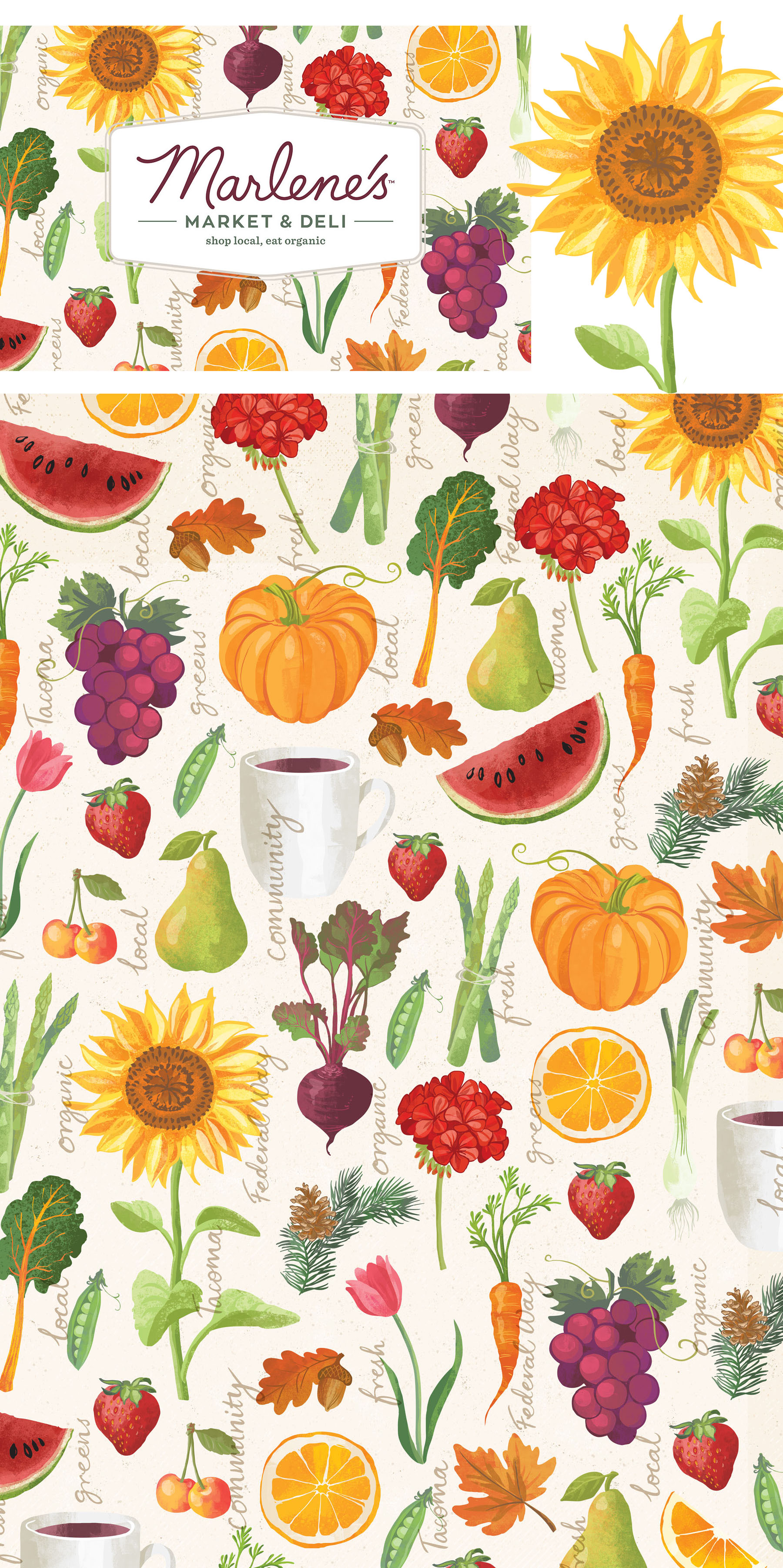
Modern Species were able to take my single icons and create what you see below. They wanted the ability to construct their owns patterns, by mixing and matching the various fruit, vegetable, flowers and hand lettering that I had supplied. So Marlene's promotional materials could be swapped around easily picking food icons from Spring and Fall for example.

I'm thrilled to see my art applied like this and love seeing the considered seasonal approach that this delivers. Although the branding has not been rolled across their stores I cannot wait to see a few pics of their in-store signage when they do.

4 Tips from a New Skillshare Teacher

Last month I launched my first ever Skillshare class entitled 'Food Illustration: Design your Favourite Fruity Recipe' I will admit it sure was a challenge and a long journey, before I hit that final 'publish' button. Here is the intro video to this class.

You can access the class HERE

These are my points to remember if you are considering becoming a Skillshare teacher

TIP 1 - DO NOT BE DAUNTED BY THE CLASS NOTES

Do follow the step by step approach laid out by the Skillshare team. Their advice is plentiful, far reaching and sound - they really want you to succeed !!! If in doubt just email them and they are happy to help.

TIP 2 - DECONSTRUCT THE PROJECT

Think in terms of producing a project that would be EASY for you e.g. watercolour whatever  and turn it around, so you look at it from the eyes of a relative novice student. You may want to ask yourself:

-what materials or programs would they need

-how can I make the class videos as short and to the point as possible without leaving out important content

- what technique(s) will they learn

- what prior knowledge would they need for successful completion of the project ( e.g. basic Photoshop?)

Ohn Mar Skillshare drawing fruit.jpg

TIP 3 - RECORDING THE CLASSES IS EASIER THAN YOU THINK

Make friends with the Modify>split clip> delete step in iMovie to rid videos of all there 'errs' and awkward pauses. I soon realised it was much better simply repeat the sentence again if I fluffed it than to record a whole new screencast ( where you record the screen of the Mac) When it came to editing it was much smoother.

TIP 4 - DO NOT UNDER ESTIMATE THE MARKETING

Skillshare point out that it is vital to have 25 student enrolments in the first two weeks to show in their trending classes.  Here are some of the methods I used to bring awareness to my class:

- a week before the launch I linked my intro video (on Vimeo) to the profile of my IG to direct followers to it

- there were free class enrolment giveaways

-  I created short animation which played on a loop in IG using the food icons created for this class

-  I have reposted illustrated recipes created by students on IG to remind folks of my class 

-  had a giveaway of a set of my foodie postcards for the 1000th student to sign up


As mentioned right at the beginning it has only been a month since this first class launched however I feel that its been a worthwhile undertaking. Such has been the overwhelming positive response I felt compelled to work on another one with more guidance from Skillshare.

Again I chose a particular strength of mine which is drawing, and tried to condense it into a challenge with pen, paper and a timer. It is not a new concept but as creative sometimes we overthink and get in the way of ourselves. Committing to just drawing in three minutes can help with gaining fluency and confidence with drawing, and impact in other areas of your art life. You can watch the intro video to 3 Minute Drawing Challenge below.

And you can access this drawing challenge class HERE

One image - 2 jobs - licensing and packaging illustration

Last week I was proud to announce the launch of a cutting board set by gift manufacturer Demdaco.

demdaco BOARD2.jpg

This particular root vegetable illustration had been found on Pinterest and rearranged to fit this product artwork.

In fact this image has been referenced again and again when a new brief comes through from clients for commissioned work. Today I am pleased to announce another project has come to fruition ( pardon the pun) which again is a result of these root vegetables, first uploaded as an illustrated recipe to They Draw and Cook pinned to Pinterest.

I worked alongside Swedish branding design firm Identity Works who gave a detailed brief of what their client was requiring. The large dairy firm Arla was looking to develop packaging for a new fruit and vegetable based smoothie. As always I sketched out multiple versions of the fruit or vegetable required (carrot, mango, beetroot, grapes and orange)

From these sketches they decided which shape best suited the layout and we proceeded to the next stage for various colour and texture treatments. These in turn where developed further to give a more 3D appearance.

The separate fruit where then placed together within the glass outline (which I provided artwork for) and the smoothie (hi res photo provided by the client) Various options were considered to give the best contrast between the two fruit within each glass. And also to give the impression they were actually sitting within the liquid smoothie.

I also provided the textural elements that feature at the top of each pack and can also be seen in the background of these product shots.

As you can imagine I am absolutely delighted that a sketch initiated almost two years ago after finding a beetroot in my weekly vegetable box could ultimately lead to these projects. I'm very grateful to have been provided with two such wonderful and unique opportunities. It's taken a while but it sure has been worth every step!


Toronto Waterfront Artisan Market

I really need to ask a really big favour for folks who are in Toronto area. I worked with The Toronto Market Company again for another foodie based event. Artwork was needed for promotional material and banners for an artisan market that would be held along Toronto's waterfront.

The booths would be a mixture of food, crafts, jewelry and plant stalls. And the opening of the the event would coincide with the launch of a new cycle route along the waterfront. The concept was a bike laden with goodies ( although most are falling out) after visiting the market.

As you know I am based in the UK and I'd be eternally grateful for anyone who could take some nice photos of the banners when the market runs one weekend in June/July/August/September. Please email any snaps to ohnmar@ohnmarwin.com.

Many many thanks in advance.

Image by indie88toronto

Image by indie88toronto

Tiny steps to 'They Draw and Cook' book

As soon as Nate sent me a link to 'The Most Gorgeous Cookbook Ever' on Amazon I ordered several copies and waited eagerly for their delivery. And they did not disappoint, I was overwhelmingly excited and proud to see my work in print. It had been a long time in coming.

Lets take a look at my first submission though from March 2014...

As you can see I hadn't quite found my style and I was still working out the finer details of PS. If you followed my self imposed TDAC challenge I set myself at the beginning of last year to have 30 recipes submitted by the end of 2015 you'll remember my IG feed being full of food! One of the marvelous outcomes of drawing so much food was I became very quick at it, flitting between dip pens and brush pens, which in turn made me swifter in PS and that in turn gave me further confidence to explore and refine my style.

To reach that magic 30 took over EIGHTEEN MONTHS - the same amount of time I was pregnant my two kids. It was a true labour of love because I knew the goal was worthwhile. Each time I sat down to dip that pen in the ink for the sketching or hand lettering, played about with page layouts was a tiny step towards this book. Goals take time, in some cases some longer than others.

The most important thing is to KEEP taking those steps, however small, to make that dream happen!

I was prepared to be consistent, keeping my eye on the prize, despite the many detours, leading up to that major goal. You can use this approach in most areas of you life. If you allow yourself to take small steps, one day at a time, you are least likely to overwhelm yourself. Planning also plays an important part, plan for progress not perfection!

I don't suppose the returns from selling this book on Amazon will be huge. But I plan to send a copy to many, many art directors in the future so they can reference my style and approach, and fingers crossed send briefs my way.

You can order copies of this book from Amazon.com US

Or Amazon UK

Considerations for Tall Pins and (one) Easy Way to create them

Since folks found the last post about tall pins useful I've added a few more details you may want to be mindful of...

1 - Try to keep the essence of the original illustration/ pattern

This was for the Feast aspect of They Draw and Cook - the normal layout spread....but now rearranged first to this....

...but also this to make best use of viewing in different social media platforms and devices...

2) Create in 'squarish' and 'tallish' formats

3) Make it 'decorative' and appealing

4) Don't forgot your watermark logo

5) Pin all versions for better chance in searches

6) Don't forget to add a brief description to describe your work with key words when you pin

Depending on how I feel about the layout I often place PS artwork into Ai which makes it easier for me to move aspects around....especially when it comes to re-formatting image options for my website and pinning...

....I take a SCREEN SHOT of the group on the left...

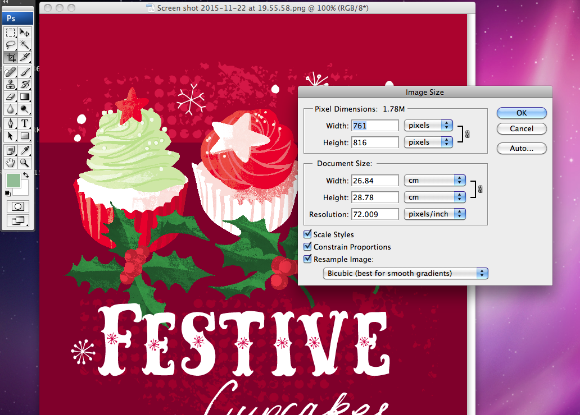
....the screen shot comes out at almost 72dpi. You can leave it as it is or reduce the dimensions slightly .....

Screen shot 2015-11-22 at 19.55.58.png

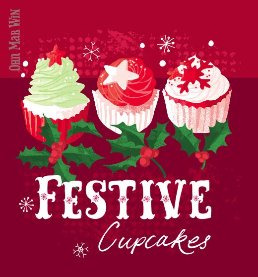
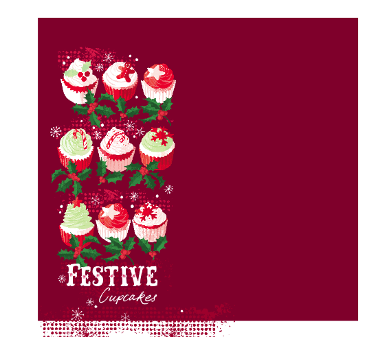
....arrange the cupcakes into a tallish format and take a screen shot....

I'm sure there are other ways to set up images for portfolio websites but this method works for me. So I have just uploaded these images onto my website and pinned directly from there onto my Love Food Illustration and Food Pattern boards on Pinterest.

Screen shot 2015-11-22 at 20.00.50.png

Useful Pinterest advice for designers and illustrators


A few days ago I made a short video on Periscope about Pinterest, tall pins and foodie illustrations. As these videos are only around for 24 hours I've decided to blog about the main points I mentioned, as many folks found it very useful.

I'd like to point out one important aspect of Pinterest:  approx 80% of pins on Pinterest are repins, so the image has kind of been 'recycled' over and over which is great as that's how your work is spread, and found in searches. So only 20% of pins are 'new' - they have been DIRECTLY uploaded onto Pinterest from a website or blog or shop. I do not have any marketing background -  this blog post is just based from my own experience...and I'm not saying this is the correct way or the only way.

First of all I'd like to point out that 8.5k followers is really not that many, there are other creatives with 50k+ followers. I feel my boards are representative of my major interests as a illustrator, and the sort of work I'm wanting to attract as well. I have my own illustrations on a board first then Love Food Illustrations, Pattern and Print, Creative Cards...etc based on how many pins I have on each board.
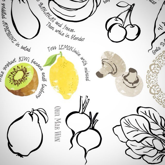
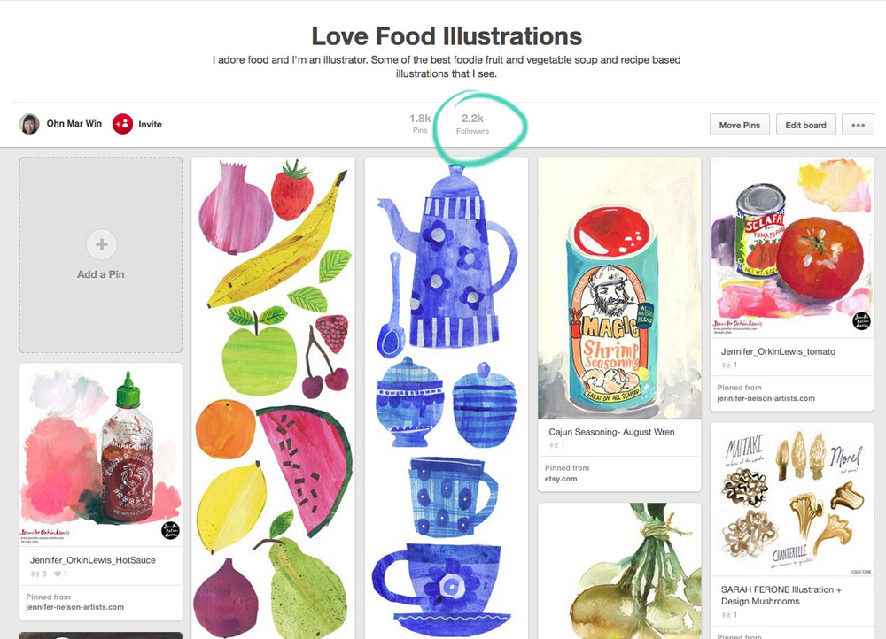
This is my Love Food Illustrations board with its 2.2k followers -I really am a small fish. However I believe its one of the larger food illustrations boards on Pinterest.

I've circled this pin as I want to point out the TDAC layout ( and you know I have a loads of recipes on TDAC) is not the most advantageous format for Pinterest. Which leads me onto this other interesting fact. It's thought that 50 - 80% of Pinterest users use their mobile device - so that's why I think its best to maximize your artwork for different devices and social media platforms. I have blogged about 'tall pins' previously and they are still play an important part - they take up far more space on a feed so viewers would most likely linger on it (create at 72dpi approx 500px wide by approx 1500px high)

Another example of an artist reformatting their TDAC piece into a tall pin is Rachael Schafer

OMW pin15.jpg

...which ended up on this board...with over 13k followers

OMW pin16.jpg

Here we have Harriet Mellor's Infused Waters tall pin (again refomatted from a TDAC recipe layout)....

Clicking on the image will bring up this window that shows its been re-pinned 18 times (from my Love Food board) and gives the option of visiting Harriet's website. Clicking on the '18' will bring up this ....

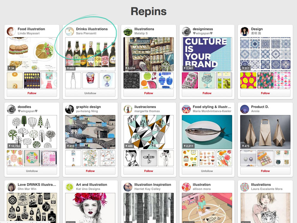
These are the 18 boards and pinners who have pinned the Infused Waters. Note Sara Piersanti's Drinks Illustration board....it has over 57k followers!!

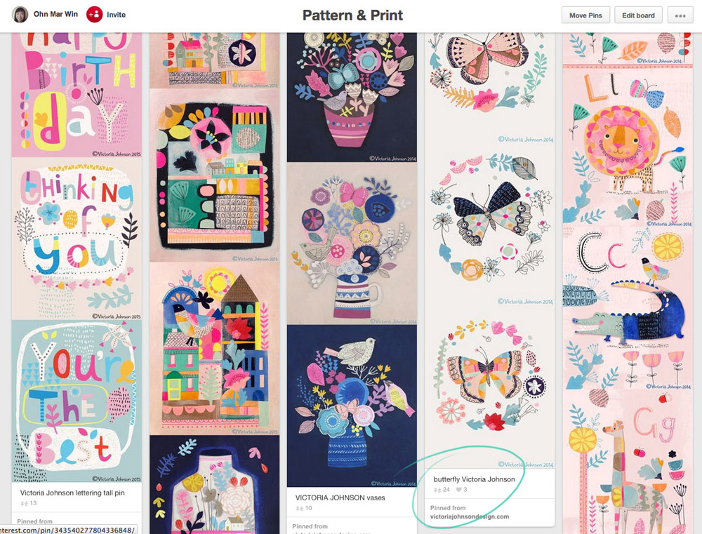
Moving onto my Pattern and Print board with just 1k followers...and Nic Squirrell's tall pin of watercolour birds...

It was repinned onto this board which has 17k followers...

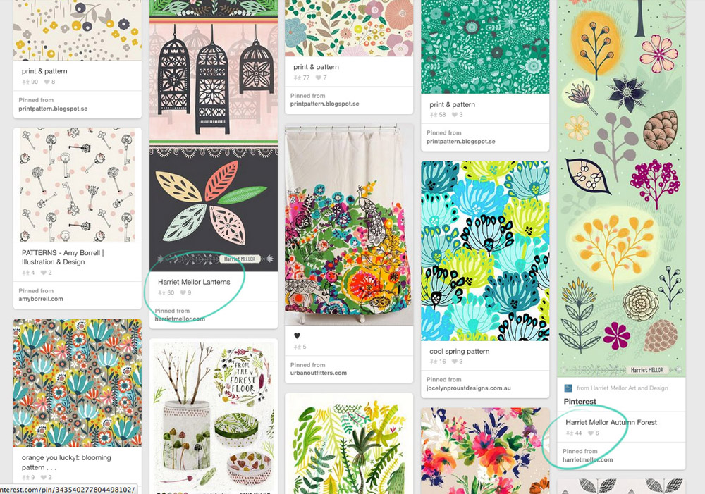
And as we scroll down my Pattern and Print board more of Harriet's tall pins which are proving popular...

....and scrolling down further is Victoria Johnson's Butterflies tall pin which has been re-pinned 23 times...

OMW pin11.jpg

Here are the boards it was repinned onto...one of which has over 14k followers

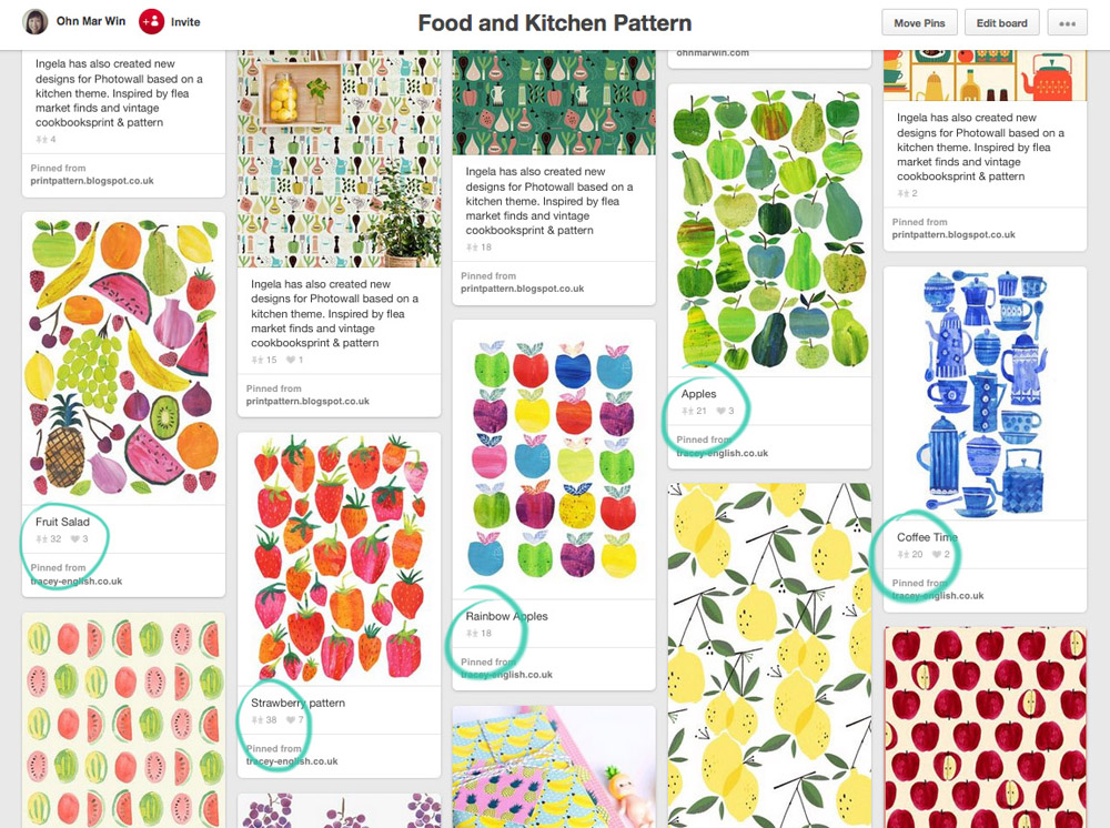
Now moving onto my Food Kitchen Pattern board which was created as I felt there was too much overlap with the Love Food board and I create many patterns with food myself.

As you can see Tracey English's art is very popular and was repinned onto a board with 5.7k followers

I'm not claiming that creating tall pins and having pins picked up by much bigger pinners is a guarantee of success. However because of the way Pinterest's algorithm is set up, art that has been pinned the most and most recently will come higher up in searches! That's something to bare in mind when seen from the viewpoint of a potential commissioning editor or art director.

A little bit of effort on your part could pay dividends as getting seen by the right people is surely a wonderful thing. Please be assured it does happen. As I mentioned at the beginning of this post I am not a big player in the Pinterest stakes BUT as I have a food illustration niche, bigger players follow the Love Food Illustration board in particular. So if you feel inclined to create a tall pin on a foodie or pattern theme please send them my way and I will gladly pin!


Making it to 30 ILLUSTRATED RECIPES and WHY do I draw so much food?

I've just submitted my 30th illustrated recipe for They Draw and Cook, so they can consider publishing them in a book. It's been a true labour of love and far trickier than I anticipated. The trade off is I've received much work from clients seeing my ideas, and I hope they continue to check in on the TDAC site. Here are the last two recipes, for easy baguettes and Christmas gingerbread....

I think this is also a good opportunity to explore the background of my food mania. A while back Wendy Brightbill  asked what was the story behind my food illustrations, why am I attracted food more than anything else? I'm no psychologist, although this is the most probable reason and still valid even 35 years later.

If you read the 'about me' section of my website I mention immigrating from Burma to the UK when I was 5. I'd like to put Burma or Myanmar in context as its important to understand.  This is a overview from World Vision's website ( I used to sponsor a young Burmese boy via their charity)

Whichever way you look at it, Burma is very, very, poor country and that's why my parents decided to leave. My father immigrated to the UK to work as a junior doctor half a year before my sister, my mother and myself. I believe there was a period when money was extremely tight during the intervening months. I distinctly remember my mum's mum (my grandmother) turning up at the gates of our house quite unexpectedly one day and her and my mum just hugged and cried for the longest time. It turns out my mum had pretty much run out of money and all we had was a bag of rice. My grandmother had traveled 3 days from northern Burma by ferry, train and bus to feed us and hand over some of her savings. We were incredibly lucky.

So for me food is a way of showing love, kindness, support and accepting it with much gratitude. I really love to cook, sometimes simple suppers or elaborate biryani's and invite friends to share in this. And I do feel this great fondness for food on the plate and food illustration stems from that day watching my grandmother and mum at the gates. As a family we were so fortunate that my father had skills needed in the UK, so we could grew up never going hungry, with good healthcare and education. But I am always mindful of the millions of children in Burma who are not so lucky.

On November 8th, Burma goes to the polls in an election...of sorts (I will not get into politics here) but I wish for a good outcome overall for the country of my birth. Although I expect it may take many more decades to bring Burma up to the sort of democracy we may understand. Ultimately in 10-20 years time I would like to be in a position where I can help feed, nurture and educate just some of the children in Burma, so they have brighter futures. I have no idea at this present time how this will happen but it's a goal I'd like to aim for anyhow.

'FEAST' - They Draw and Cook's NEW feature

It was with great delight I welcomed the news that They Draw and Cook were now accepting ANY foodie related images to their site. Yes for 'Feast' images can be submitted without a recipe!! Some of you may have seen snippets on IG of my work in progress based on food over the last year. I do have entire food themed collections in the Surface design part of my website now.

However with 'Feast' I felt it was a great chance to pull out a elements and arrange them in the TDAC layout to showcase further the range of work I can produce. And I think a lot of designers agree as there has been a wonderful variety of kitchen and foodie art that has been recently uploaded. And of course with the added bonus of TDAC huge social media following its win/win all round. Check it out HERE

It really is so much fun rearranging cakes!! Also I am very very close to completing the They Draw and Cook Challenge I set myself earlier this year, so I can be considered for a TDAC book. Although its taken far longer than I expected, in some ways has been a good thing - I will explain further in my next blog post.

Playing with 'Creative Playgrounds'

Some of you know I take part in daily arty challenges. Last August it started with month of hand lettering daily, then a month of food, then desserts and biscuits. There was no major thought process behind them, it was to keep up with my drawing skills without engaging my brain as to its final use, if any.

I am still taking part in daily doodles #365doodleswithjohannafritz if I can, and sometimes mashing it up a daily watercolour in my moleskin and even further mashed with #alittleart that Victoria Johnson started (tiny art in any medium no bigger than 2.5") Indulge me I'm getting to the point...

It wasn't until last month when I took part in Build a Freelance Illustration Business that I realized this kind of approach has a name...'creative playgrounds' . I am simply 'playing', its done freestyle, its quick, maybe messy but I'm always having fun. I never realized that also submitting to the Spoonflower and Tigerprint competitions even taking part in Inktober and #the100day project was this 'creative playground. Submitting to They Draw and Cook...some of you know I submit to them a lot... is also a 'creative playground'  

I made a commitment to myself to just spend 10-30mins each day to explore or try something new. You simply don't know until you try how its going to turn out...that new PS brush, shifting the images to 'colour burn' or drawing with a toothpick. And the super outcome is connecting with others who are joining in too, supporting their art and vice versa.

So I said I drew without thinking too much...well I want to show you some outcomes..why its good to play.

First up are these donuts I drew at the suggestion of picture book illustrator Claire Lordon during 'dessert a day' month (November 2014)...

....so these donuts ended up in at a foodie event banner in Toronto, each about 3 ft wide!

Next these very British biscuits were designer Harriet Mellor's request during food doodle month (October 2014)...

...which ended up in a UK adult colouring in publication earlier this year.

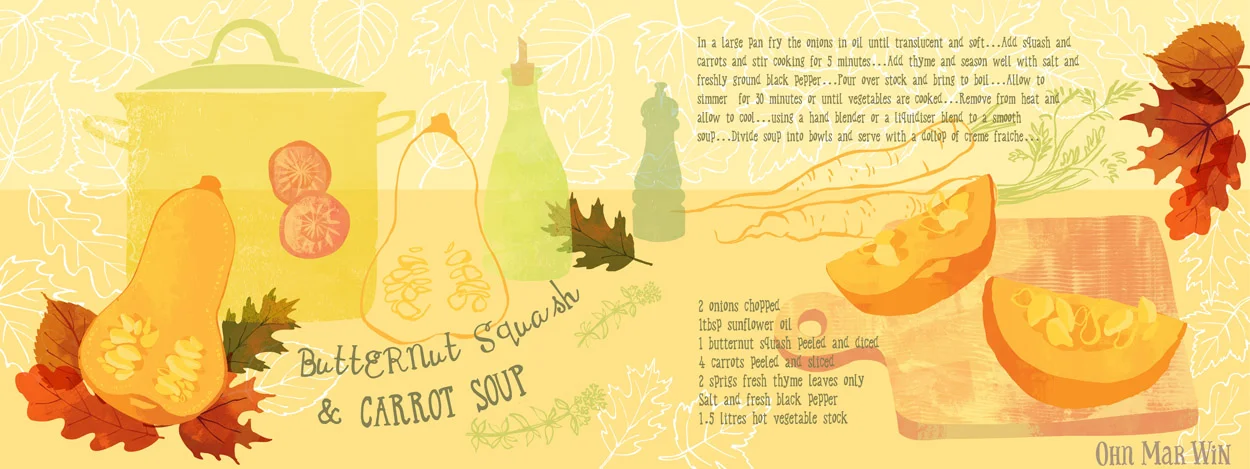
And just this week I started on Este MacLeod 'Explore Colour' painting course. The first assignment much to my delight was simply to draw swiftly the structure of fruits and vegetables, sections, slices, every angle. The butternut squash sketch ended up in this weeks They Draw and Cook submission.

And finally this is one of my very first doodles during hand lettering month last year (on vacation in Cornwall in a old sketchbook)....which will be appear in a publication later this year....

I feel its been truly beneficial to put ward work like this, letting go of the need to always know how the end result will pan out. Some of my doodles take days to a year to be worked into something that can be placed in my portfolio. If you would like to know more about the value of creative playgrounds watch Salli and Nate HERE