Visiting Top Drawer 2015

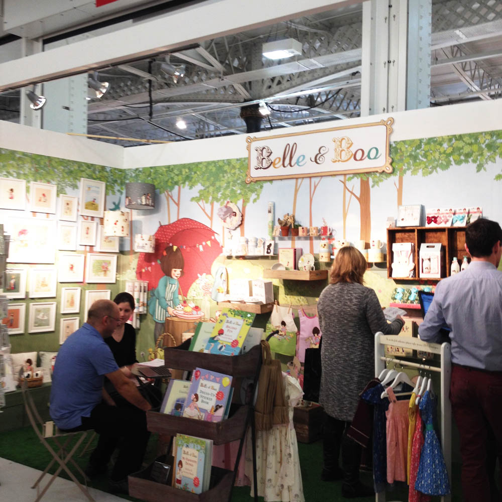
This year Top Drawer and Home were held in London Olympia, which as I found out is a much much larger venue then Earls Court (where it was in previous years) If I'd known I would have worn comfy shoes- it felt like I'd walked miles by the end of the day.

I met my friend Nic Squirrel and marched past gifts and toys to the greetings card area. Oh my gosh there were rows and rows of eye candy. Luckily I had been stalking a few of the card companies on Instagram and Twitter in the last fortnight and it seemed a great way to strike up a conversation. Jessica Hogarth kindly chatted to me briefly about manufacturing and the quality of her drawing skills over the years.

I was amazed at the sheer amount of beautiful work at Stop The Clocks booth. Most of the designs were on a light or neutral background which gave all of their collections a very unified and harmonious look.

I finally found Nella cards run by Belinda and James at the very far end of the hall. Belinda was my first design manager when I was fresh out of college and we've kept in touch over the years. They gave me a brief glimpse of the highs and lows of manufacturing, dealing with buyers and handling stock. What came across from everyone who was kind enough to talk to me was how much hard work there is involved - I totally salute them for their sheer dedication.

There were also amazing booths in the gift section - I'd forgotten how much I liked ceramics. One of my favourites was by Magpie - I pretty much wanted to everything they were showing. The Gift section was vast and varied from candles and teepees to rugs. I just couldn't take it all in and was suffering from visual exhaustion by the time I reached the Home section.

Tigerprint Say It With Words...competition

It was only last week I saw the details of this months competition - a different way of putting forward a sentimental phrase in a typographic setting. Oh gosh I'm such a sucker of hand lettering I couldn't resist.

First of all was finding a phrase...how does one say 'Happy Birthday' differently? Or any of the other dozen key greetings that come up time and time again. I settled on '365 days Older and Wiser' which is quite polite and not at all offensive as one tots up the years ( and grey hairs) Again I went down the vintage inspired route with a male recipient in mind. 

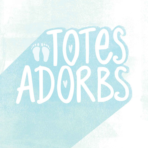
At the weekend I came up with something quite daft - still thinking along the lines of a sentiment with a twist. I felt the slang 'totes adorbs' could be used on a New Baby card. Keeping it simple and more modern in approach. I had fun with this one too.

Hallmark 5 word phrase competition

For a bit of a challenge I penciled in the Hallmark 5 words phrase competition for early August. I did totally forget it would clash with GTS. However it turned out of be a bit of light relief as I was able to tune out when overthinking terrariums. I used some of the pen and ink sketches from Nautical/ ships in bottles themed art from Bootcamp.

Since I have been hand lettering doodles this month I was able to put something together fairly quickly. If time had allowed I would have taken it into PS for extra texture but alas not this time. Even so I was pleased with what I achieved composition wise when faced with a tight deadline ( for me that is) 

Paper Week - MATS part B

So with anticipation, excitement and a little bit of nervousness, part B of Make Art That Sells finally came round. I felt more prepared mentally and physically this time round, as I knew what to expect, so stocked my freezer accordingly.

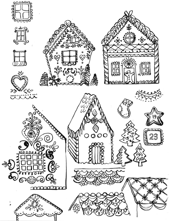
Monday's mini was to draw gingerbread houses. Keeping in mind what makes these houses so distinctive - starting with candy or gum drops dotted around or totally covering the roof in some cases. I always enjoy this first day and got friendly with Pinterest. There was so much to explore and I became fascinated with some of the folksy type icing thats found on gingerbread houses and cookies that are sometimes used as decorations.

There were huge hints before the assignment brief that I would be based on a winter holiday theme. I already knew wanted to create a winter landscape, but hesitated to begin with because the house would not be the main attraction. Since doing several Skillshare courses I've gained much confidence with exploring character work - and I felt this would be a great opportunity to apply what I've learnt. What happened afterwards was a sheer labour of love. My PS file just grew and grew as I added clipping masks upon layers, upon layers, of textures. My greatest hurdle was making all the different elements pop by making sure there was enough contrast. 

I was so very pleased with the end results.  Also in week one of MATS A I was a dreadful mess and felt overwhelmed with the weight of expectation I placed on myself. This time I was a lot easier on myself and understood the power of a deadline and timekeeping. See I'm still learning - learning is good.