Goals Book & Beyond

Last year I eagerly read almost every blog post I could find about artists experience of Surtex, whether the exhibiting or 'walking' the show. I was lucky that my friend Jacqui posted a photo of herself and other artists we knew at Victoria Johnson's booth. This image really sparked my imagination, and I made up my mind I NEEDED to attend in 2015.

So I pasted that image into my goals book, along with 'I am overjoyed to walk Surtex with my friends' - see below

I am now onto my third goals book. I use a sketch book to fill in a goal on each page with any relevant images. Its based on personal,career, health, relationships and spiritual goals. Some of them have changed from year to year but fundamentally my goals remain the same.

The theory goes if you phrase a statement with 'Iam......' and are able to visualize and imagine the fulfillment of this goal, your subconscious brain (and creative mind) will somehow figure out a way of making it come to fruition. It may take a while and involves the right effort but it would be worth it.

At the very beginning of this year I created another goals book- here's one of the pages.

A day later I asked Victoria Johnson Design if she would consider my help at her 2015 Surtex booth. I was so grateful and happy she said yes. Then the creative part of my brain again whirred into action to figure out the practicalities of such a trip.

Another page of my 2015 goals book says 'I am seeing golden opportunities everywhere'

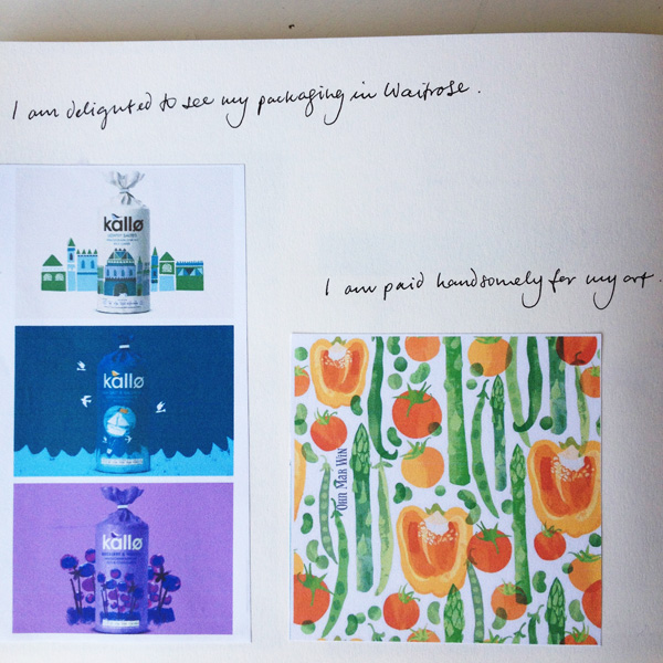
In March a friend suggested I show some of my art to her agent Brenda Manley . I had not considered finding a licensing agent as major goal for this year. After manly emails and questions Brenda came across as persistent, positive, knowledgeable and very easy to communicate with. I was re-assured that any editorial, packaging and advertising commissions would be dealt with by myself. I was more than satisfied by her manner and approach so I am delighted to announce I have an agent who will also be at Surtex !!

Exhibiting at Surtex in 2015 was not a goal...but this opportunity came up and it was great timing. The last 6 weeks have been a steep learning curve, but an exciting one with Brenda to give me direction and advice.

It may take a while for some of my other goals to present themselves but I am open to all possibilities, as long as I stay determined and committed. In the near future I hope to qualify as PADI wreck diver or underwater photographer.


Deli2Go snack range for Shell garage & providing options

These days you hear much talk about adding value to your work, so you are better placed to find ideal customers or clients. Whilst illustrating a commission for Shell garages' Deli2Go range I was able to explore this theme further.

I have always been interested in packaging, especially those of food and drinks. So when I was asked by Conran Design to illustrate a snack range at the end of last year I was delighted and very excited to be involved.

I worked in house for two days at their design studio off Camden High Street in London. On the first morning I was met by the account handler and introduced to the senior designer who would be overseeing this project. Shell launched their Deli2Go range a few years back and have been expanding with new products every year. They already had a 'house' style and I was to illustrate a extended snack range with the same feel. Images would be needed for 6 small snack packs including Bombay Mix, Chilli coated peanuts and Trail Mix.

There was a long list of different ingredients for each pack, which would include a wide range of foods from dried coconut, salt crystals, chilli, peanuts, lentils, and dried papaya to name just a few of the 17 separate ingredients. I set to work with my trusty brush pen as always. They remarked how great it was to see hand drawn elements & pleased I would be lifting artwork from these sketches - they really enjoyed seeing my brush pen drawings.

The designers were mindful of the tight timeframe and wanted the almonds arranged in such a way so each icon could be viewed easily & pick out which were working the best. So I arranged them like this after adding textures...

Two days of in house illustrating to produce 17 different illustrations with many textural options as seen above was a challenge. I was not asked to work on the actual design layout for the packaging - but I played around with some of the Pantone reference from the Shell style guide. At the end of the two days - we were in a 'happy place ' as they designer put it. It had been a fantastic learning curve and I learnt more about process of illustrating for packaging. So if you pull up at a Shell garage look out for these and I would be delighted if you could send me a pic!

deli2go packaging Ohn Mar.jpg

Since this project I have been providing my clients with a few different versions of the same icon. I thoroughly enjoy drawing and am blessed with fast drawing ability and since clients like to have options - that's a win/win. The image below is part of a recent illustration project where I've sketched several different versions of the same icon. This expedites the process, reducing the need for additional rounds of revisions. And it also shows that I understand the project from their perspective and am eager to work diligently to accomplish fine artwork.


Tall pins...great tool for illustrators on Pinterest

Just a really quick blog post as I add more of my illustrated recipes from They Draw and Cook to my website. As you may well know the layout for TDAC is very long horizontally (5000px x 1875px ) Not a problem - I love the challenge of finding exciting ways of filling this space.

However I did encounter a small drawback of this format - it doesn't work very well on Pinterest. On this site each image will be displayed at a maximum of 192px wide. My illustrated recipes were not shown in their best light. So with each new blog post and website update I would rearrange the different food, map, sketch etc elements into whats referred to as a 'tall pin.' Pinterest does not restrict the HEIGHT of pins. So if an image is (much) taller than its is wider it will be displayed in a way that will get you a lot of screen space - people will be able to view it for longer as they scroll down.

Let me demonstrate with the latest TDAC uploads pinned from my website...

Here the Futo-Maki sushi roll with the TDAC layout is in the middle. To the left you can see a version where I've rearranged the steps vertically so they do indeed take up more screen space.

On the far left are my illustrations from Beer Advocate magazine, and step by step pizza illustrations from TDAC arranged into tall pins - this is how they appear on the Pinterest feed. Both are approx 800-900px tall.

Darn it my Rose Syrup & Margarita illustrated recipe is not quite tall enough in this feed!!

Tall pins are so quick to create out of your existing artwork, and I can vouch that they do pay dividends. Pinterest can be used advantageously like any other social media and I'm certainly open to exploring this platform further.

Beer Advocate Magazine....the beginnings of the TDAC effect?

Way back in February I received an email '....I stumbled across your autumn vegetable illustrations online, and they are exactly what I was looking for so I wanted to get in touch...' It was from Beer Advocate magazine and they wanted me to illustrate an editorial about brewing with vegetables. It was a perfect opportunity & I jumped at the chance.

First of all I was so so excited to hear they had found my work via They Draw and Cook. By late autumn of last year it was dawning on me with TDAC huge following on Facebook (over 200,000 likes) and other social media platforms their reach was wide and varied. As long as I kept producing considered illustration, used the best of my abilities, and kept exploring, then TDAC would be a great vehicle for showing my artwork. And it looks like its beginning to pay off...slow and steady as it is with these things.

So here we are...beer and vegetables. The concept for the leading spread was beer bottles growing like vegetables. And spot illustrations of the vegetables mentioned in the article.

Beer advocate 1
beer advocate 2 veg
beer advocate 4

Finally I want to end on another positive - I am in the middle of another exciting project where the art director found my illustrations on Pinterest, once again via a They Draw and Cook recipe artwork from last year. A Pinterest inspired blog post coming up soon.


They Draw & Cook Challenge -update

So last month I wrote about my plan to create a illustrated recipe every week...in the hope of having a book published by They Draw and Cook...well its working out so far. Recipe No 3 was Raspberry & Passionfruit cupcakes which was featured on their Valentines recipe collection. I was able to use the hands making the heart shape from a short animation from last year. And the cupcakes were from a doodle a day exercise from last year also. I'm finally understanding the value of leveraging!

Screen shot 2015-02-20 at 18.25.28.png

Next up was a crunchy Pear & Walnut Salad. Again the pears were from a Doodle a Day from last Autumn. I did have to come up with rather a lot of various salad leaves and the walnuts.

The next week was Grilled Mackerel with lemon & Chilli. I loved illustrating these mackerel- they are wonderful to cook when super fresh. I was able to use the chilli peppers from a greetings card project. Below are the sketches that I worked from. I have a loose framework of ingredients that I want to work with an have started planning two or three weeks ahead.

Screen shot 2015-02-20 at 18.19.40.png

And this weeks was Herb Infused Oils. I had back to back deadlines and knew had had to come up with something simple but effective. I researched the different flavours then in one evening I drew a sheet of herbs and a sheet of various oil bottle shapes.

I have enjoyed researching, planning and trying out new layouts for each recipe. I have learnt to work quicker and hopefully not lose any freshness. Whilst I'm very pleased with these and have played and explored , this month I'm going to try adding some new elements and expand things a little further stylistically.

'The Theory of Everything', Cambridge and working pretty darned quickly...

The opening scenes of 'The Theory of Everything' sees a young Stephan Hawking and his friend on their bikes race through the streets of 1960's Cambridge, along 'The Backs' with Kings College in the background and through the back gate of Trinity College ( I think). I enjoyed the film immensely on many levels. The re-occuring motifs of concentric circles and spirals reflect Professor Hawking's fascination with black holes and abstract ( for me) thoughts about Time.

I had not drawn any of Cambridge's iconic buildings for many many years but felt rather moved to do so after watching 'The History of Everything.' My father worked near Market Square & we would often go for the afternoon in the warmer months. I was also fortunate enough to attend a year's Foundation Course in Art in Cambridge over 20 years ago. One morning a week ( in all weather's I might add) we were sent out to the Botanic Gardens, Fitzwilliam Museum or people watching Parkers Piece or any number of places in Cambridge to hone our drawing skills. So I have many fond memories of this wonderful place.

I had been meaning to create a map of this university town for years. And even when I decided to go for it I realised I had to hasten my renderings due to other work deadlines. So instead of transferring elements onto different layers I decide to work much simpler and leave out several stages, working more closely from my sketches - I'll use Kings College as an example...

Initial sketch of King's drawn in brush pen & live traced in Ai

Initial sketch of King's drawn in brush pen & live traced in Ai

The bottom 'layer' or outline as such has been taken away leaving the 'inner' sections of the sketch. Now exported to PS

The bottom 'layer' or outline as such has been taken away leaving the 'inner' sections of the sketch. Now exported to PS

Working in different (& fewer) layers with clipping masks I was able to add colour & texture

Working in different (& fewer) layers with clipping masks I was able to add colour & texture

I felt it still retained the spirit of the sketch ( yes... my Kings College is wonky) and I was able to render the other highlights of my map in this manner and save a huge about of time. It also made me less precious of every detail (aka less anal) I'm pretty proud of my map as it highlights my favourite places and I make a pilgrimage of sorts every year.

Spoonflower Surprise...& sci fi geekery.

On my list of things in 2015 to do was enter a few Spoonflower contests. I was going to check well in advance to see if there were any that grabbed my attention. When I saw 'rockets' I knew that was going to be my first competition.

I really really do love sci fi. The first film I ever watched on a top loading video player was 'The Empire Strikes Back' - heck I didn't even speak much English then, but I was captivated and just understood that Hoth was a secret base. I pretty much watch any sci movies from Flash Gordon ( with Queen soundtrack) to Blade Runner to Intersteller. Maybe its the imagination involved or it just makes me think...I am a bit of a geek in this area.

It also reminds me of being a kid in the early eighties and charging around with my cousins and cheap plastic market bought ray guns ( of course I wanted be Leia with a blaster) So on this nostalgic vibe I made some sketches of vintage tin rocket toys. And I also sought out early imaginings of astronauts and ray guns.

I specifically wanted a vintage colour palette to compliment the older style rockets, and adapted one from a print by Lucienne Day. Again I chickened out and did a simple repeat pulling out different elements from the rocket and adding a numbers countdown.

I was really pleased with the vintage feel I was able to capture. I might here that this is only the third time I've entered Spoonflower - I entered because I liked the subject of rockets and again to become more comfortable with pattern making. So I pretty much fell of my chair when I received an email saying I was in the top 10 ( I was 5th overall) I was  utterly flabbergasted when I received many comments of congratulations from the Spoonflower community. This was not planned - it did not even occur to me that this could happen so I was very very grateful for everyone who voted. I certainly feel more confident about entering future Spoonflower competitions.


My They Draw and Cook challenge

Some of you may know that I've submitted a few illustrated recipes to They Draw and Cook over the last year. There wasn't any plan behind the recipes I chose to illustrate - sometimes it was inspired by what was in my vegetable box that week. Other times it was just a random idea I decided to act upon. Either way I very much enjoyed the challenge of filling that 2000 x 1400 pt layout. It helped me to explore my style further and hasten the process I had found. And it was always great to receive great supportive comments from the TDAC team, Salli & Nate.

I saw their newsletter at the beginning of this year which announced some exciting treats, including a new website and the printing of 4 books of recipes by 4 artists under the TDAC banner. Each would contain approx 30 illustrated recipes....well I pretty much dismissed my chances after that as I only had 4 on their site.

However many of my friends thought this would be the perfect vehicle for my work. A WHOLE book filled with my foodie images would be a dream. I started to calculate how long it would take to illustrate 26 recipes. There were submission deadlines for March, June, September and December. Well it turned out I would need to submit ONE RECIPE A WEEK- taking me to the end of July !!!! - to be in with a chance.

At first glance I SERIOUSLY doubted I could handle this pace. In the past its taken me weeks for a single spread while I mull over minor details. It occurred to me that I already had many fruit and vegetable images from collections I have worked on. I could easily adapt and rearrange most of these to suit the recipe. And it could be a whole load of fun.

So I started last week with 'Fruity FIlled Popsicles' as my first submission. This week I decided to make it much simpler with 'Roasted Asparagus with Bacon & Eggs' I only have another 22 recipes left to illustrate. If you would like to follow my challenge look out for #TDACchallenge on Instagram

Unexpected results from Elizabeth Olwens Skillshare class

For ages I had been meaning to use my free months of classes with Skillshare that a friend had gifted me. And late last year I was invited to join 'In Da House' Facebook group to produce designs based on houses which are trending at the moment. I'm afraid I never did anything about either until two weeks ago. But the two options seemed to fit in quite purposefully when I activated my Skillshare account.

I chose to start with Elizabeth Olwen's Skillshare class as I do lack confidence creating patterns ( I know even now) She's a great teacher with many useful tips which I was able to incorporate when selecting my layout. However I decided to ignore her recommendation NOT to use Livetrace as I felt she was referring to pencil sketches. I pretty much rely on my brush pen or dip pen and ink.

I chose Paris as I have many many fond memories of time spent there over the last 20 years. The streets are so elegant, full of character, and with much attention to detail. You can read more about my process here on the Skillshare site. So I uploaded my final project and thought 'nice project' and didn't expect much feedback. There were a few 'likes' and nice comments so I was pleased anyhow.

However I got rather a shock when it was the featured student project on Skillshare's Instagram feed just a few days later. There were a flurry of more' likes' and more super supportive comments. It gets better... 'Parisian Houses' was then featured on their email as a trending project. I suddenly had new followers on my Instagram, and the numbers have been steadily climbing since.

Screen shot 2015-01-23 at 10.32.34.png
Screen shot 2015-01-23 at 10.17.32.png

All this was certainly unexpected and unplanned. But I'm very grateful for the way its all worked out- even if it could be a fluke.  I feel this could platform could be great for of self promotion. One thing I noticed is there are over 7,000 students enrolled into this class (at time of this bog) but only 157 student projects in the gallery. In fact this seems to be the trend. In the next class I aim to take by Mary Kate McDevitt there are well over 6,00students enrolled but only 50 projects in the class gallery. Why don't people post their projects? Since that is the only way other students and the teachers themselves will understand your process and the finished result. Yes by doing so you would be open to being vulnerable if you don't feel you aren't receive 'likes'. In this instance I choose to be brave and show the Skillshare community and feel I reaped some pretty cool rewards.

Visiting Top Drawer 2015

This year Top Drawer and Home were held in London Olympia, which as I found out is a much much larger venue then Earls Court (where it was in previous years) If I'd known I would have worn comfy shoes- it felt like I'd walked miles by the end of the day.

I met my friend Nic Squirrel and marched past gifts and toys to the greetings card area. Oh my gosh there were rows and rows of eye candy. Luckily I had been stalking a few of the card companies on Instagram and Twitter in the last fortnight and it seemed a great way to strike up a conversation. Jessica Hogarth kindly chatted to me briefly about manufacturing and the quality of her drawing skills over the years.

I was amazed at the sheer amount of beautiful work at Stop The Clocks booth. Most of the designs were on a light or neutral background which gave all of their collections a very unified and harmonious look.

I finally found Nella cards run by Belinda and James at the very far end of the hall. Belinda was my first design manager when I was fresh out of college and we've kept in touch over the years. They gave me a brief glimpse of the highs and lows of manufacturing, dealing with buyers and handling stock. What came across from everyone who was kind enough to talk to me was how much hard work there is involved - I totally salute them for their sheer dedication.

There were also amazing booths in the gift section - I'd forgotten how much I liked ceramics. One of my favourites was by Magpie - I pretty much wanted to everything they were showing. The Gift section was vast and varied from candles and teepees to rugs. I just couldn't take it all in and was suffering from visual exhaustion by the time I reached the Home section.

Tigerprint Say It With Words...competition

It was only last week I saw the details of this months competition - a different way of putting forward a sentimental phrase in a typographic setting. Oh gosh I'm such a sucker of hand lettering I couldn't resist.

First of all was finding a phrase...how does one say 'Happy Birthday' differently? Or any of the other dozen key greetings that come up time and time again. I settled on '365 days Older and Wiser' which is quite polite and not at all offensive as one tots up the years ( and grey hairs) Again I went down the vintage inspired route with a male recipient in mind. 

At the weekend I came up with something quite daft - still thinking along the lines of a sentiment with a twist. I felt the slang 'totes adorbs' could be used on a New Baby card. Keeping it simple and more modern in approach. I had fun with this one too.

Good Food Show - part 2....Olive Branch

Near the end of the day eventually found Olive Branch Foods tucked away in the corner of the main hall. They had been left off the plan and index so it was better late than never when I bumped into their booth. I had worked with them earlier in the year on a series of illustrations for their tapenade packaging. And I was lucky enough to be asked again this time to illustrate sweet biscuits, imported from Greece flavoured with orange, almonds and cinnamon. 

I had a huge smile on my face as I saw the jars lined up at their booth and a steady stream of people milling about tasting their products. When I tweeted about my day I realised they had used the biscuits as their cover photo on Twitter which was a lovely end to a rather fun packed jolly day. 

First visit to BBC Good Food Show - part 1

It hadn't occurred to me till a week before the event to attend the Good Food Show at Olympia. As stated previously I do like food and I have been drawing an awful lot of food so visiting the show was surely a win/win situation. I picked up my hastily prepared postcards ( featuring a bowl of fruit below) on the way to the train station. 

I'd been to Olympia exhibition centre last month to check out Brand Licensing Europe which I found very big, brash and corporate. So it was a pleasant surprise not be be greeting by costumed turtles. Instead within half an hour I had sampled artisan cheeses, gins and many health giving anti-oxident filled juices. 

Amongst the other delights I sampled were gourmet fudge, smoked trout, rye breads, cocktails ( amongst many many alcohol samples) and a array of coconut milk based products . After a while I plucked up the courage to ask one of a whole host of chilli sauce & dips producers if they would mind me illustrating their jar in the near future. I received such a positive response when showing them my Instagram photos I was encouraged to ask a few other producers as the day drew to a close including pesto, macaroons, ketchup and a canelles seller.

A few days after the event I'm not entirely sure I have a grand plan of what will follow, but I mulling over several ideas. It was certainly worth visiting, and explore even more flavours.

Why do I draw so much food?

I ADORE food, looking at it, smelling it, tasting it, cooking it. Pretty much ticks all the boxes for me - food is one of my favourite things EVER. There's such a variety of shapes colours and textures that I could never get bored.

Here's the thing - I had many food images in the  1990's ( yes last century!! ) Back in the day when I had to schlep a physical A3 black portfolio around London visiting art editors and senior designers I DID have illustrations of langoustines and pasta, even griddled vegetables with halloumi. I used pen and ink and washes with a bit of wax resist to add texture. Despite being well received I never actually received any editorial commissions - thats the only market I knew back then.

I see right now, in this moment, as a second chance. I'm hoping to use what I've learnt about the different markets in MATS to carve out a niche. Lilla's words are forever ringing in my ear...'find your joy... gotta do what you love (was that Steve Jobs though?) The knowledge of having my work 'out there' makes me feel vulnerable on many levels and I am coming to terms with it. I'm so utterly captivated by the work I'm producing that I am able to find joy in sharing my art which is a good start.

How I achieve my textures....

Since I've been posting images on Instagram I've received quite a few questions about how I add textures to my work. Its been evolving since last year when I took several Skillshare classes to improve my Ai and PS skills, which were fairly basic. Although the classes were not directly related to what I had in mind ( they were for hand lettering and drawing a character) its been a great spring board for the textural vibe I've always wanted to achieve. 

This is just a quick run down of the process using the pomegranates from the mulled wine. Most of what I do is trial and error with much use of the comd+z keys.

1) Make good pen and ink drawings so its easy to scan

2)Live trace in Ai and 'release to layers' then export to PS tick 'write layers' in options

pom step 3.jpg

3) In PS use different texture brushes depending on what is desired.

Like I said its a learning curve and the more art I do the more i learn - its fun.

Mulled Cider illustrated recipe

Its taken me a while to get my head round the 'leveraging' my art aspect of this creative business. I was thinking how can I get more work into my portfolio quickly, with maximum impact and create potential work for my (soon) Etsy shop? Answer was create one body of mighty fine work then work it work it (!!) into many different areas/ markets - well thats a plan.

Last month I doodled food for 30 days, and amongst what I drew were cloves, star anise, cinnamon sticks and oranges. My little grey cells had a ponder....it came to me during my entry for last months Tigerprint competition where we were asked to overlay hand lettering over an image. One of them was associated with mulled wine - nice enough image but I felt I could inject a bit more 'flavour'.

spices-TALL.jpg

I knew I wanted to 'overlap' all the different ingredients as 'mulling' really infuses the cider with lovely delicious layers of flavour. Technically it was the most complex illustration I'd done, testing the limits of my Mac's output. It turned out to be a fruit & spice ho-down and I felt there where many wonderful things happening. You can see the full illustrated recipe at They Draw and Cook


Tigerprint Christmas typography competition

Its been many months since I felt an itch to enter a Tigerprint competition. I couldn't pass this one up. It was for Christmas inspired typography to be placed over photographic imagery that they kindly provided. I was immediately drawn to the sliced apples and mulling spices. I love mulled wine and always make large batches for friends during the festivities. It evokes a nostalgia for Dickens inspired Christmas', so I used that as my starting point.

Using vintage type from my Pinterest board I was able to compile a layout that worked around the apples. I also didn't realise the deadline was a day earlier than I had noted down. I was in a mild state of panic as I hurried to upload and did not have as much time as I would have liked for a second typographic layout. Neverless I am pleased to have applied my hand lettering in this manner.

A whole month of FOOD doodles....on Instagram

I can't believe we have skipped over into October and its been a while since my last blog. Which is kinda good as I have been very busy with lots of submissions for greetings cards for Spring 2015 ranges amongst other things. 

One of my small successes was 30 days of food doodles which I posted on Instagram everyday. And I gradually worked out how to link onto Twitter and my business Facebook page too. I didn't set out with a grand plan of what to draw it just evolved every few days. I think one of the most popular items were well known English biscuits - which lead to many followers.

Here's a few more high lights from the last months of sketches - some of which were for a live brief. I feel I can now take take these doodles and turn then into art in the next few weeks which excites me and ca't wait to make a start.

What I'm learning from Pinterest

I started 'pinning' Pinterest with an earnest 2 years ago when my youngest was only small, as a way of dipping my toe back into the creative pool so to speak. I was pinning anything that caught my eye, places I'd been, or wanted to go. How I wanted my future studio look, food photography, children's picture books, and pics from Print and Pattern most days.

So what I have now is a Pinterest home page arranged (mainly ) in volume of pins I have on each board. Taking a step back I'm now able to see where my real interests are. Here it is ....

I was mulling over what my next 30 day challenge would be (for October) and the answer was there staring at me....I will reveal on September 30th. Not only is it good for inspiration it gives me valuable clues about my taste that I'm not even aware of. 

A little while ago a few of my friends started Monica Lee's Smart Creative women e-course. I very much wanted to join them but felt as it overlapped the school hols I would not be able to give it my full attention. However I asked two of them to help compile a 'nature' board based in part on childhood memories, pics that resonated with me and particular areas that grabbed my attention. As I mentioned I was surprised by what the collective images revealed.

You can see the full version here...

What transpired is I am very much influenced by my early childhood in Burma (Myanmar) when I lived with both sets of grandparents for extended periods of time. One lived in the north on Burma's longest and most important river- the Irrawaddy, so there were images of water, fishing and lush forests as backdrops. The other lived in Rangoon - her garden was an oasis of greenery and orchids set north of that bustling city. It seems even now 35 years later I just gravitate towards these images like its part of my DNA.

My friend  Vivayne had these words to say...'I see common lines there like parallel lines and or gradual building up of, as if everything is leading up to something, like you see the details but also see the big picture.'

Another surprising conclusion that my friend Jacqui Crocetta found was the link between my appreciation of geology and love of scuba diving and future adventures ...'I think it's important to feel grounded so that you can fly. We need roots and wings....By feeling grounded you can release a long tether that gives you the freedom to explore while still feeling connected and at peace...'

At this stage I am unsure how to use this new found information but never the less I feel it has been an important eye opener for possible future directions.